About healthreformtrends.com

Health Reform Trends, Research and Analysis Website

This website began in 2009 when the Affordable Care Act (ACA) was being negotiated in Congress. It provides analyses into health care issues in the United States. With the onset of the coronavirus crisis, new posts are being added that address modifications to the ACA that can have a major impact on reducing health care costs for millions, not just to pull through the virus crisis but for longer term as well.

The analyses on this site rely primarily on data provided by non-partisan government agencies, long-established research institutions, and enterprises whose business is to analyze aspects of health care, be it health insurance or hospitals or health care providers. The following two paragraphs date back a number of years but are still valid.

With the aging U.S. population, there will be a significant increase in demand for health care services.  Under the status quo, these demands will place an extremely heavy burden not only on Federal and state governments but on citizens as health care costs continue to rise faster than inflation, wages, salaries, and benefits.

In 2011 there was an increased interest in 2011 on funding issues. In response, the site adds analyses dealing with wealth and income that may provide potential funding sources, not just for health care but to reduce deficits that have grown sharply during the “great” recession. Analyses focusing on income and wealth issues are now noted separately on the “Research-Analysis” tab on this website.

For more information about this site click on “About” tab.

For information about 8 ways to navigate to articles on this site click on the “Help” tab.

To read the full text of any article, CLICK ON THE TITLE.

Coronavirus Response – ACA Reinsurance Saves $ Billions

coronavirus

Download PDF Report: ACA Reinsurance Saves $ Billions

Summary:  The Corona pandemic is causing health and financial concerns for millions. This analysis focuses on health insurance premium relief for all citizens except those covered by Medicare or Medicaid. The justification behind this solution is the highly skewed nature of healthcare costs

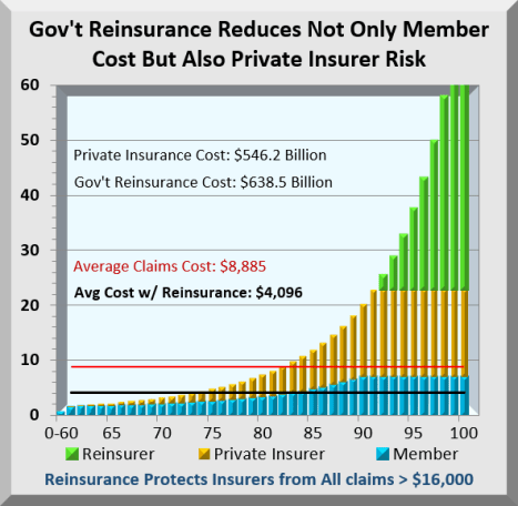
The chart below tracks ordered claims costs for 100 identically sized groups. About 60% of insured members never even reach their maximum deductible. On the other hand, costs at the highest end are off the chart. The gold bars in the chart are costs private insurers pay while the green bars are costs shifted from private insurers to Government. The blue bars are members’ Out-of-Pocket costs that reach the maximum allowed at about the 90% level.

Because of this skewing, Reinsurance costs more than private insurer costs at a $16,000 threshold, and will force premiums and costs down by over 50% for the entire industry.

Not only will this reduce health costs for millions, monthly savings continue. While initiated during the virus crisis, it is one Affordable Care Act amendment worth retaining.

skewed costs

Base Case: This analysis uses a comprehensive Simulator to accurately track Affordable Care Act (ACA) Exchange processes and costs. A recent upgrade enables the Simulator to track costs for the whole country as Universal Health Insurance. Assumptions here apply to 156 million currently insured via work, plus 14 million Exchange insured, plus 28 million uninsured added for a total of about 200 million.

In the first chart below are cost distributions for 200 million insured where average healthcare cost is $8,000, deductible max is $1,650, and Out-of-Pocket max is $7,000. The Blue slice is Out-of-Pocket costs for member deductibles and copay. Copper is member copay for costs that exceed maximum Out-of-Pocket and shift back to insurers. Gold is insurer formula copay. Red is the mark up insurers apply to both Copper and Gold claims that they paid.

corona base

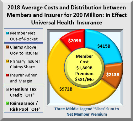
What many don’t realize is that ALL these insurers’ costs get transferred back onto members as premiums. Members pay for the entire chart, in this case, $1.8 Trillion. Not included in the base case are Premium Tax Credits. The legends above left describe the cost components for 200 million enrollees. The middle button shows average monthly premium of $581. But the real issue is shown below.

skew.base

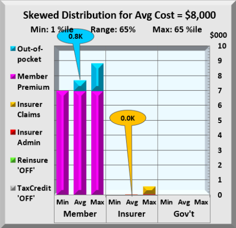
The chart above shows health costs from 1% to 65% split between member, insurer and Government. Average costs for insurers are almost zero, while members’ $800 of Out-of-Pocket costs are completely overwhelmed by premium. To have maximum effect of lowering members’ health costs, the focus should be on reducing premium costs. Government reinsurance does exactly that. It lowers total health costs a bit, but its real impact is to shift costs from member to Government.

Reinsurance Case: Reinsurance is not a new concept. The Out-of-Pocket max is a reinsurance threshold for individuals, above which all costs transfer to the insurer. Government Reinsurance is identical except it applies for insurers. Further, ACA included a temporary reinsurance program.

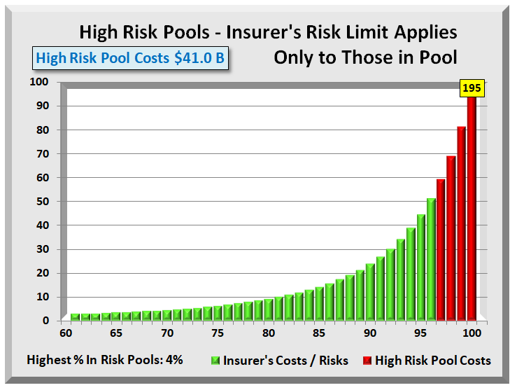
Prior to ACA, 35 states offered high-risk pools for those with pre-existing conditions. Their segregation of 2%-3% high cost individuals has two issues. They protect insurers from known costs but offer no protection from those who may incur high costs or already have unknown high costs. Also, separate risk pools often utilize different providers.

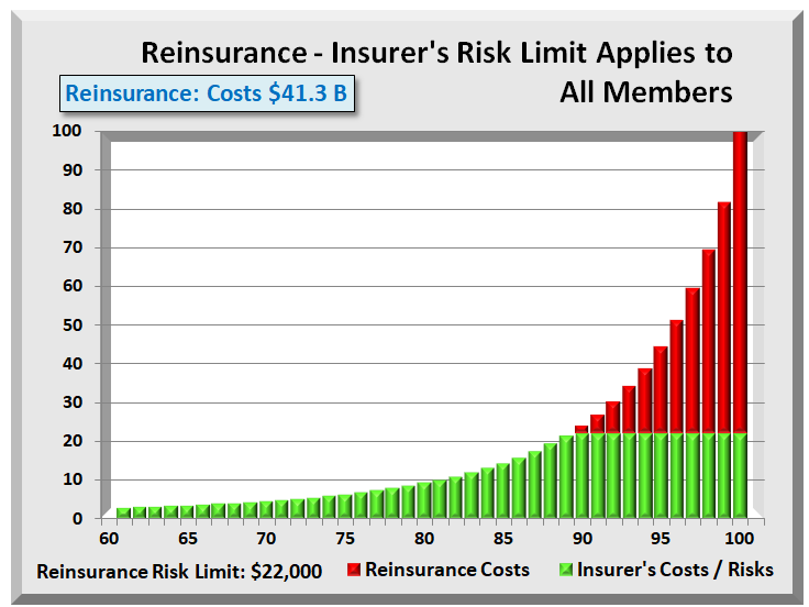
Simulator tests show that an $18,000 reinsurance threshold has similar financial effects as a 3% high-risk pool. However, since all members remain in the main pool, only the insurer, not the employer nor anyone else knows. It maintains complete HIPAA privacy on medical records and other health information. It also requires few administrative changes to implement reinsurance.

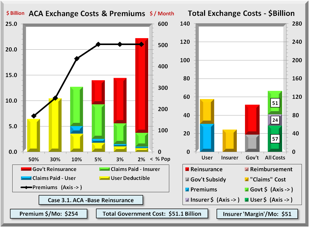
A $16,000 threshold rather than $18,000 drives premiums down by more than half. The chart below shows the impact of shifting all claims costs above it to Government. All dollar figures are per year. Monthly reinsurance costs are $53 Billion and monthly member savings are $76 Billion.

corona.reins.chart

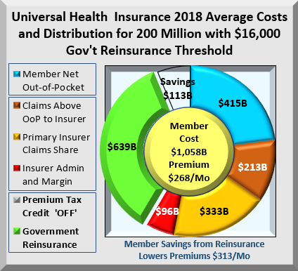
Reinsurance shifts $639 Billion while reducing health costs by $113 Billion. Where did the $113 Billion savings come from? ACA includes a minimum Medical Loss Ratio (MLR) that requires insurers to spend a minimum % of every premium dollar on claims. If claims decline, so must margins, which limits insurer profits. Having lower claims cost, insurers must also reduce their administration and margin amounts. The combination cuts member premiums by $313 to $268 per month, or over 50%. Of course, there is a cost to Government for covering excess costs.

Why are even shifted costs important? Because premiums consume a far greater percent of income from members with lower incomes. Health insurance is priced completely independent of income. For wealthy, health premiums are pocket change. Cutting premiums in half has a major effect on disposable income for lower income members.

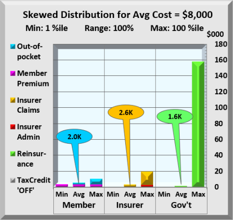
Further, reinsurance doesn’t reduce any insurers’ costs until they reach the highest costs members as highlighted in the two charts below, both showing the costs of the top 10%. The callouts are the color-coded average cost for that range.

top10pct.base

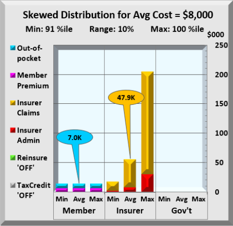
No Reinsurance Above / With Reinsurance Below

top10pct.reins

The upper chart tracks costs with no reinsurance. The lower chart has reinsurance employed. Without reinsurance, insurers claim costs jump to an average $47,900 compared to almost nothing for the lowest 65%. In the lower chart, with reinsurance, insurer costs dropped to an average $16,000 while Government shifted an average cost of $31,900 from insurer to itself. The chart below looks at the entire range.

skew.100pct

This chart is like the prior except that all members costs are included. Member Out-of-Pocket average $2,000 with premiums adding $3,200 to that cost. Insurers spend an average of $2,600, just $600 more than members pay. Clearly, Government reinsurance has a major impact first on insurers costs, which extend to members in the form of lower premiums. With economics favoring the great middle class, how would this be implemented?

Duration: The duration of the COVID-19 crisis has not been determined nor may it be soon settled. However, one can assume that other agencies will continue in crisis mode until some future date Government agrees upon. It is recommended that all or most of these provisions continue beyond the end of the crisis period.

Implementation: First, it extends the already existing Affordable Care Act (ACA) with its rules and infrastructure. In hindsight, several conditions were changed through the years that added complexity. Below are some conditions.

MLR – Medical Loss Ratio: MLR in its simplest form is a formula where claims are greater than or equal to 85% of premium. Through the years, both “claims” and “premiums” have had many fine “additions”. Going forward with this program, the original definition of claims and premiums will be used. Each is defined as follows:

Claims are defined as the accrued amount insurers record during the period. Excluded are any adjustments for IBNR (incurred but not reported) claims, nor any other adjustments other than material accrual errors.

Premiums are defined as income accruals insurers record during the period. Again, except for material accrual errors, all other adjustments are excluded from the premium definition. While some insurers will gain, the amounts are trivial compared to the complexity introduced with tracking and auditing all these other factors. Further, this returns to the original wording and intent of the ACA.

MLR is defined as a minimum of 85% of premiums. This will be uniform across the industry. The great majority of claims are already processed at 85% and any increased cost should be modest and at insurer’s expense during the crisis.

Premium Reductions: Insurers have 60(?) days to amend their claims processes to include Government reimbursements. During this crisis period, there will be 100% payments by Government for claims above threshold. Current period costs will be from January 1, 2020. Only after the crisis has ended may a small insurer copay be charged in lieu of reinsurance premiums. Insurers are also required to reduce premiums at least 50% for 2020 2nd half levels.

Employer Pass-Through: Most employers with health plans contribute variable portions of premium with employees paying the balance. Employers will be required to pass through their current contribution and adjust employee payroll withholding so the combined contribution equals the new insurer premium. Pass-throughs on policies that meet ACA coverage requirements will be listed as a separate income category on their W-2. Congress may choose to treat health premiums as an adjustment to gross income. This would save taxpayers from being taxed on this “income”. Employers already enjoy full premium deductions on their income. Why not employee, especially if it reduces AGI?

Administration: Primary insurers would remain responsible for vetting all claims. Government would enter Account Services Only (ASO) contracts with insurers for the administration of reinsurance. These entities would handle all the claims transferred from primary insurers. Government responsibility is for reimbursements to insurers.

Summary: The steps outlined here take full advantage of existing insurance infrastructure. It favors no income level, but reduces an extremely regressive premium payment system in effect today. It also significantly streamlines current processes that will reduce insurers’ costs. Further, it is not just a one-time payment but an ongoing savings, leaving more money for people to spend on necessities.

APPENDIX

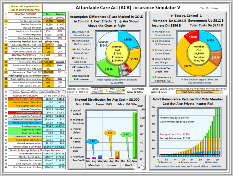
Below is a screen shot of the Affordable Care Act (ACA) Insurance Simulator V. It shows savings and cost distributions for 200 million members with options configured for Universal Health Insurance including Premium Tax Credits. The General Options, Advanced Options, and Results tables are at left. The two charts are Test case and Control case. Both are the set to the size of the larger chart with savings shown as an “empty”. The bottom right bar chart uses Control values and can toggle between Reinsurance and High-Risk Pools. Extreme skewing is apparent with costs below 60% too small and the highest too big to chart.

The lower left chart separates lowest, average, and highest costs each for member, insurer, and Government. Their bar colors match the chart legend and results table colors. Just above the chart is a user configurable range of values to use in the bar chart. With extreme skewing of health costs, members bear the brunt of costs as premium while insurers and Government incur costs only at very high levels.

Titles and subtitles for tables and charts are dynamic and change to reflect the effects of option values. To help understand option descriptions and values click on any table description jumps to a Glossary tab with a full explanation of that item. A “Return” click brings you directly back.

The “Test” shown below is set for 200 million people, enough to insure everyone excluding Medicare and Medicaid. It includes Premium Tax Credits available to lower income members. It also includes Government reinsurance and a Public Option. These two options alone can drive down member premiums to $164 per month from $581 per month while lowering member costs by over $1 Trillion.

This Simulator is a Microsoft Excel program developed over multiple years and several thousand hours. It sorts health claims into 100 evenly sized groups. Their costs are run through a standard claims process that all insurers use. The claims process distributes those costs, Test and Control, between member, insurer, and Government. The Simulator incorporates over 5,000 formulas and adds six tabs of reference data.

For more information on the actual Excel program, email request to: KurzACA@gmail.com

This Excel program (1.5MB) contains no Visual Basic code or macros in which trojans, virus or other malware can be hidden.

With its thousands of computations, Simulator use on higher powered PC’s or laptops is recommended.

Download PDF Report: ACA Reinsurance Saves $ Billions

Exchange Fix Stabilizes and Restores “Affordable” to Affordable Care Act

Download PDF Report: Reinsure ACA

This analysis drew its data and conclusions from an Excel based simulator. Details of this simulator are described in: APPENDIX – METOHDOLOGY and APPENDIX – EXCHANGE SIMULATOR . The downloadable simulator, permits users to change a variety of assumptions and to view the results in graph and table form. This Excel file contains no macros or VBA that may pay pose a security risk to users.

Download Exchange Simulator: ACA simulator

SUMMARY

Before the Affordable Care Act (ACA), people with chronic and costly illnesses, if not buried in debt, were sorely stressed from medical liabilities they incurred. ACA shifted excess costs to insurers when it prohibited any health exclusions and annual and lifetime limits. Government reinsurance could further shift these excess costs away from insurers. This last effect would draw Billions of dollars from the Exchanges and allow premiums and costs more in line with pre ACA days.

Lower costs happen despite retaining all the essential health benefits added by ACA. Of note is that while the government reinsurance costs would rise significantly, subsidies for lower-income users drop by billions. When one includes the lower premiums and deductibles for users, combined savings can significantly exceed any increase in government costs. . Users benefit while government pays out more. The difference is in fact identical to a direct tax cut for the middle class.

BACKGROUND

Few issues generate as much controversy as the Affordable Care Act (ACA). As U.S. health care constitutes nearly 20% of GDP, $3 plus Trillion and over $10,000 for every person, the issues are both economic and political. One cannot easily solve the political issues. However, one can add perspective.

First, the bulk of ACA changes have broad acceptance and help make improvements to many different aspects of health care. Most controversy centers on Exchanges and Medicaid Expansion. Alternatives to Medicaid Expansion have not been very helpful, other than to free up Billions of dollars for other uses. More valid ideas exist for amending Exchanges. This analysis focuses on just one ACA amendment.

ACA removed a financial burden from people by prohibiting medical exclusions and caps on insurer coverage. However, those costs did not just disappear. Now insurers are left “holding the bag” for these costs. Government has helped with subsidies. Nevertheless, the long-term answer would be to shift further all the highest user costs from insurers to the government. Note the difference between “highest user costs” and “highest cost users”, as in high-risk pools. Reinsurance keeps everyone in the main pool and offers the most efficient method to achieve affordability. Not only does reinsurance relieve insurers of a costly burden, it also draws billions of “duplicate” dollars from the entire health care system.

Obviously, any major change will affect stakeholders in different ways. The following section highlights a few.

Health Insurer Stakeholders

This would present a mixed bag for insurers. Reinsurance will drastically lower their costs that are coming from a very small minority. Medical loss ratio (MLR) minimums will force down premiums. Exchange Insurers employ a cost-plus scheme that directly affects profit opportunity. Falling costs lower insurers’ profit opportunity; higher costs raise them.

Favorable for insurers is retaining a customer base on which to market additional services. Solve ACA Exchanges’ cost issue and insurers can expect greater user enrollment as well.

Federal and State Government Stakeholders

Reinsurance proposed here assumes Federal government funding. Medicaid costs do involve state government, but their role regarding Exchanges is little changed.

Small Employer Stakeholders

Reinsurance should be a major boon to small employers. Both before ACA and with ACA, small employer health insurance has always been higher than for large employers, not just from economies of scale, but also from many large employers being self-insured. Self-insurance eliminates the “middle man”, namely, the insurers’ markup that adds major costs for smaller employers. Small employers are more likely than large to grow, which could prove to be a jobs boost.

Individual Stakeholders

Lower cost is an obvious benefit for individuals. Another major benefit for individuals is that reinsurance would bring back insurers leading to far more competition on Exchanges. Network “shrinking” should decline along with some of the frustration with the current Exchange market.

Those not eligible for subsidy, though not by any means rich, will gain from lower premiums, deductibles and co-pays.

Young and Healthy Stakeholders

Most people would accept paying a fair share for insurance. However, the extreme skewing of health costs and ACA restraints tilt this unfairly. This has led many to go without insurance, or to pay the penalty as less onerous options. A major reduction in costs would make coverage palatable. There are always a few to argue that about the need for some female benefits. Perhaps they slept through biology class. ACA assures that males and females are treated equally.

Elderly Stakeholders

With reinsurance drawing billions from Exchange health costs, elderly are likely to benefit as much proportionately as younger, healthier people. Older workers are more likely than younger to be laid off in a downturn, and reform would provide an affordable option until Medicare is available.

Those on Corporate/Government Health Care Plans

By removing dollars from health insurance, Exchange costs will be more comparable to corporate and government plans. This may lead some who have an option to switch to join an Exchange and be insurance independent of their employer. It may also be a precursor to transition health insurance from employer based to individual based, or even single payor.

ACA EXCHANGE INTERACTIVE SIMULATOR

The following analysis draws its data from an interactive simulator explained further in the Appendixes. Six cases compare differences from before ACA to two reinsurance cases that bring user costs down to pre ACA days but with far better coverage. For each case, there are two side-by-side graphs below which are the assumptions for those graphs.

ANALYSIS

CASE 1. Pre Affordable Care Act

The following graph shows Exchange member costs under “Pre-ACA”. ACA will change two key (yellow) assumptions that bear noting. One is the “User Annual Limit” that caps what insurers will pay, and second is the Medical Loss Ratio (MLR) that reflects a typical MLR for individuals and small groups prior to ACA. Prior to ACA, insurers paid only to the annual limit, forcing members to absorb any excess costs. Insurers also could raise premiums to increase their margins, as there were no MLR limits on insurers’ profits.

The first bar in the left graph (50% of members) had costs less than their deductible (no blue bar) where insurers paid no claims. The next two groups (40% combined) did co-share with insurers (green bars), but the three groups at right (top 10%) were also forced to absorb their excess health costs (red bars). As regards premiums (line graph), they were low for healthier members but were often 5 times (or more) higher for older, less healthy members. Premiums averaged nearly $440/ month, not exactly affordable to many.

The right graph shows an often-overlooked cost item. The copper (3rd) bar shows government reimbursements ($18B) to hospitals and providers. It covers medical service costs for uninsured people. Analyses have found that the uninsured incur about half the health costs of insured. Government has always been deeply involved in health cost support prior to ACA, just in a less visible way. The low amounts in first two bars are due to only 10% Exchange members being insured.

10.0 M Exchange Population $15K User Annual Limit
$8,000 Avg Health Costs n/a Reinsurance Premium
$2,000 User Deductible 68% Medical Loss Ratio
40% Co-pay / Co-share 90% % Users Uninsured
$10,000 Max Out-of-pocket $2,000 Provider Reimbursemnt

Finally, bottom right shows a significant Insurer “margin” of $97 per month that insurers received. This is the difference between premium received and costs paid out. Self-insured companies get by with far lower margins, while individuals and small business withstand the brunt of insurers’ profits.

CASE 2.1. ACA 2017 Bronze 60%

Like Case 1, the following graph shows Exchange member costs under “ACA mid 2017” conditions and assumptions.

10.0 M Exchange Population n/a User Annual Limit
$8,000 Avg Health Costs n/a Reinsurance Premium
$6,000 User Deductible 80% Medical Loss Ratio
40% Co-pay / Co-share 70% % Users Subsidized
$10,000 Max Out-of-pocket $3,000 Subsidized Payments

The key change, however, was a shift of some $35 B excess cost (red bars) from ALL 10 million now insured members to insurers. This led to large increases in insurers’ costs that insurers passed back to users as premiums and deductibles.

ACA had hoped that with mandatory enrollment, healther members with lower costs would balance those with higher costs. A 3:1 max premium spread also forced up premiums for younger members. With only mild penalties, enrollment ran below expectations, requiring insurers to increase both premiums ($698) and deductibles (to $6,000). Not visible is how many did not enroll due to the effect of these actions.

In the right graph, Gov’t reimbursements for the uninsured are replaced by ACA subsidies for the poorer insured. These costs exceeded reimbursement savings for a small increase. Meanwhile, the sum of all costs rises to over $200 Billion.

CASE 2.2. ACA 2017 Silver 70%

The following graph shows costs for ACA Silver plans. One would expect user costs to decrease when insurers pay more on claims. However, higher insurer payments lead to higher margins, that rise above $100/month.

Those claims payments and added margins actually exceed initial user claims payments. The net effect is that that users come out worse on average. All this assumes an exact 80% MLR effect on margins. Meanwhile, total costs (last bar at right) remain high at over $200 Billion.

10.0 M Exchange Population $15K User Annual Limit
$8,000 Avg Health Costs n/a Reinsurance Premium
$3,500 User Deductible 80% Medical Loss Ratio
30% Co-pay / Co-share 70% % Users Subsidized
$7,000 Max Out-of-pocket $3,000 Subsidized Payments

Case 2.3. ACA 2017 Gold 80%

The following graph shows costs for ACA Gold plans. This is a repeat of Silver plans addressed just above. The more insurers pay, the more margins rise. Together, that raises user costs. Moreover, government subsidies to poorer insured are dependent only on their income. As health care costs rise, this forces government to increase subsidies to keep these insured users whole. If all 10 million users had gold plans, total costs under current ACA conditions would rise above $220 Billion.

10.0 M Exchange Population n/a User Annual Limit
$8,000 Avg Health Costs n/a Reinsurance Premium
$1,000 User Deductible 80% Medical Loss Ratio
20% Co-pay / Co-share 70% % Users Subsidized
$5,000 Max Out-of-pocket $3,000 Subsidized Payments

CASE 3.1. ACA -Base Reinsurance

With greater insurer payments inflating government subsidies and user costs even more, then one logical way to correct this is to lower what insurers pay. Just as ACA shifted user costs to insurers by increasing user protections, one can increase insurer protections by government reinsuring their highest costs. Reinsurance is not an insurer bailout but an efficient way to reduce their involvement in claims payments. MLR constraints will limit margins and any notion of bailout.

Like all Cases, the graph below shows Exchange member costs under “ACA with Government Reinsurance”. This shifts some $34 B of “excess” costs (red bars), but this time from insurers to government. With this shift in costs, the risk to insurers declines to less than what existed prior to ACA. The premium effects are dramatic. The highest Premiums (for older folks) drop almost in half compared to Pre ACA levels, while the lowest decline as well.

One can see the dramatic reduction of Total Exchange Costs by comparing the right graph above with any of the previous ACA cases. The axes on the right graph are fixed at $140 billion for Users, Insurers, and Government, and $280 Billion for all combined. In each of the ACA cases, the combined costs of all three parties were over $200 Billion.

10.0 M Exchange Population $15K Reinsurance Threshold
$8,000 Avg Health Costs 10% Reinsurance Premium
$3,500 User Deductible 80% Medical Loss Ratio
30% Co-pay / Co-share 70% % Users Subsidized
$5,000 Max Out-of-pocket $3,000 Subsidized Payments

Reinsurance greatly lowers user and insurer costs, though increasing costs to government. The total combined costs drop to $130 Billion, some $70 Billion below curent levels.

Every dollar for which an insurer is liable more than doubles the claims cost. This is because insurers add an overhead margin to claims paid. They then recoup via premiums and deductibles from users. If government is liable, there is that much less for insurers to pay. And if they don’t pay, they they also have to cut their margin to remain MLR compliant.

The government is currently paying some $42-45 Billion in subsidies to insurers. As premiums decline with reinsurance, so do subsidies. The net result is a modest $8 Billion increase to about $52 Billion in government costs. Contrast that with at least a $35 Billion reduction in user costs. That has the same effect as a $27 Billion ($35B-$8B) tax cut, and nearly all of that is for the middle class.

What should surprise nobody is that when risk shifts to government, there is no middle man (private insurer) to add overhead for marketing and profit. This is one reason why Medicare and Medicaid cost materially less per person than does private insurance. Government doesn’t charge extra for “risk.” Medicare also fixes prices, relying on doctors in private practice for input, but that is another story.

Less well known is that many of those same private insurers that ACA forced to reduce margins to “only” 15% to 20% perform nearly all the same administrative tasks for Medicare and Medicaid for less than 5%.

CASE 3.2. ACA -High Reinsurance

There is one more appeal to the reinsurance model. Lowering the threshold from $15K to $5K in graph below, transfers the bulk of insurer risk and related cost. Insurers are at risk only for lesser amounts. As claims bypass the middleman and his markup, Exchange premiums decline to near Medicare levels. All the while, insurers can remain in (or return to) Exchanges with an opportunity to sell additional benefits and find ways to lower costs even more. Reinsurance retains the creativity and inventiveness of private enterprise to reign in costs.

10.0 M Exchange Population $5K Reinsurance Threshold
$8,000 Avg Health Costs 5% Reinsurance Premium
$1,000 User Deductible 80% Medical Loss Ratio
30% Co-pay / Co-share 70% % Users Subsidized
$5,000 Max Out-of-pocket $3,000 Subsidized Payments

CONCLUSION

Without changing essential business processes in use today, one can greatly reduce Exchange costs by implementing ACA reinsurance. Shifting most risk from insurers would be like insuers being third party administers for self-insured companies. One major insurer benefit is they retain a built-in customer base where they can market features beyond ACA’s essential benefits. Like other countries with single payor systems, the U.S. can still have a vital albeit smaller private insurance market able to offer health features beyond basic government benefits. They are also free to adapt to special conditions of their markets.

Best of all, Congress could make the threshold adjustable to rebalance, as needed, consumer affordability and private insurer sustainability. That is a fiscally conservative idea with a major benefit both to the middle class and to the health of all Americans.

.

APPENDIX – METHODOLOGY

 STEP 1 – DEFINE THE HEALTH COST “CURVE”

To find a solution, one needs to understand the problem. Health care insurance is not like most insurance policies about which many are familiar. With most insurance, there is a fairly symmetrical form to their costs: some low, some high, most near the middle. Acceptance occurs when those with lower costs feel the “premium” is worth the protection.

However, health costs are extremely skewed, with a huge majority of low cost members expected to cover extremely high costs of a tiny minority. Adding a mandate to buy health insurance simply adds to the discontent.

The first step was to develop an exponential math equation that would roughly mirror the actual health cost distribution where the top 1 % consumes 20% of all costs, the top 5 % – 50%, and the top 10% – 60% of all costs. Then build a table with 100 cells of equal population sorted by cost. The graph below does this and highlights how skewed health costs are. With an average cost for the U.S. of about $10,000/year, it was necessary to limit the right axis values in order to view any of the lower costs for 90% of the population.

ACA further limits insurers to a maximum ratio between highest and lowest premiums of 3:1. Insurers responded by increasing deductibles in order to maintain reasonable premiums. The result was deductibles rising to the $4,000 to $6,000 range. Even with high deductibles, premiums are still uncomfortably high. Deductibles are often far above 80% of the members. These lower cost members never collect any of the insurer’s co- payments. Even at $2,000, few members exhausted their deductible (red line) in the next graph.

STEP 2 – HIGH-RISK POOLS VS. REINSURANCE

Nearly all agree of the need to shift costs from insurers to government. This analysis considers two ways. In an effort to bring down costs, some favor funding (state run) high-risk pools that remove high cost members from the main pool.

Applying this to the highest 4% cost members yields the graph above. With High-risk Pools, Health Insurers have total protection only from those in the pool. They still retain the risk that one or more of those in the main pool will incur exceedingly high costs. With over 95% of members still at risk for substantial claims, insurers will cover this risk by raising premiums, deductibles, or both. As pools often have stricter conditions, users face obstacles for even small claims.

Another way to shift risks and costs to government is with reinsurance, a form of which ACA included until Congress blocked its funding as a “bailout of insurers.” A permanent form of reinsurance is needed like shown in the next graph.

Several kinds of reinsurance are available. “Treaty” transfers risk when overall costs exceed a threshold. “Facultative” is the recommended form for health reinsurance. It covers only an individual’s excess costs. Insurers already have systems in place, as the logic is identical to annual limits of yesterday. Only now, costs are forwarded to government, not returned to the user. An important conclusion is that reinsurance protects health Insurers from high costs over the entire pool. They can more readily define risk and do not need to add more risk for potentially large claims from any member.

Another advantage is for those with chronic illnesses. If they incur common injuries or sicknesses having nothing to do with their chronic illness, they still have pool coverage common to all. Unlike high-risk pools, reinsurance offers ALL members equal treatment for any illness or injury.

Finally, one can compare the costs of high-risk pools versus reinsurance. In the graphs above, assigning the top 4% to high-risk pools is equivalent in cost (but with greater risk) to setting a $22,000 average reinsurance threshold.

STEP 3 – COMBINE MEMBERS WITH LIKE COSTS

At this point, there are 100 cells (members) each representing 1% of the population. Now consolidate the100 cells into six groups or “buckets”, where the total cost of each is higher and the population is smaller than the preceding group.

This led to population groups (in ascending cost order) of 50, 30, 10, 5, 3, 2 = 100. The result is having the cost for each group and total. The actual total cost is not important. What is important is knowing the percent of total costs are in each group. Applying these percents to any cost total determines the costs for each group. Total cost is simply a product of Exchange members and their average costs.

STEP 4 – BUILD EXACT PROCESS FOR CLAIMS

With costs by group defined, the next step was to build the precise and detailed logic or rules of how insurers process all health claims. All insurers must abide by the same rules in the table below, but not necessarily using the same values.

Step Description Paid by…
1 Deductible Member
2 Co-pay/Co-share % by Member, balance by Insurer
3 Out-of-pocket Maximum Limit on what member pays. With ACA, Insurer liable for excess
4 Reinsurance Threshold Limit on what insurer pays. (Gov’t) Reinsurer liable for excess
5 Who Pays Excess Costs – 3 Cases 1. Pre-ACA – Members paid
2. ACA mid 2017 – Insurers pay
3. ACA Reinsurance – Gov’t pays
6 Derivation of Premiums using cost + accounting All health costs paid by insurer + a Margin to cover overhead – max set by Medical Loss Ratio limits
7 ACA Subsidies /
Reimbursements
% eligible & Avg Gov’t Subsidy or
Pre ACA Provider reimbursements

APPENDIX – EXCHANGE SIMULATOR

All the graphs above drew their data from an interactive simulator that covers 3 Cases or phases of ACA health care.

  • Phase / Case 1: Pre ACA using earlier business processes
  • Phase / Case 2: ACA in 2017 using current processes
  • Phase / Case 3: Amended ACA adding a new process for government reinsurance

In addition to three basic cases, one can change 14 values that determine payment of costs and derivation of premiums:

  1. Exchange Population (+/- 10 million)
  2. Average Health Care Costs (now about $10,000)
  3. Insured member Deductible $
  4. Insured / Insurer Co-payment %
  5. Insured Maximum Out-of-pocket $
  6. Annual Limits for users (now outlawed by ACA)
  7. Government Reinsurance Threshold $
  8. Reinsurance Co-payment % (in lieu of premium)
  9. Medical Loss Ratio (70%+/- pre-ACA, 80% ACA)
  10. Uninsured pre ACA whose costs Gov’t reimbursed
  11. The reimbursement amount paid to providers
  12. Number of subsidized Exchange members
  13. Cost of Gov’t Payments for subsidized members
  14. Finally, toggle between 5:1 or 3:1 premium ratios

All the graphs in this document, plus the table below are available for download and experimentation in an Excel spreadsheet. This Excel file contains NO macros that can interfere with network security. It does contain over 2,400 “formulas”. This interactive ACA simulator is available at “insr.us/reinsureaca”

APPENDIX 2 – EXCHANGE SIMULATOR RESULTS

The table below shows assumptions and results for six cases. One is before ACA, three are cases representing Bronze, Silver, and Gold ACA, and finally two showing ACA with Reinsurance. Identical logic applies to all cases. Focus on the top three rows and their sum, “Total Cost All Sources” row, in yellow. While Government costs go up, User and insurance go down.

Today those combined total costs are running over $200 Billion. Note in the last two columns with reinsurance, total costs drop significantly to about $130 Billion. The $8-10 Billion increase in government is more than offset by member decreases of $40 Billion, and by insurer decreases of $50 billion. Reinsurance literally “drains” billions of dollars from Exchanges.

APPENDIX 3 – EXCHANGE SIMULATOR DETAIL COMPUTATIONS

The table below shows the detailed calculations for the final case, “ACA with High Reinsurance”. The assumptions are in yellow in column D. The eight blue shaded rows describe the computations immediately below each. Section D, “Reassigned Excess Costs” shows who bears excess costs (user, insurer, or this in case, government) and how much are those costs.

Download PDF Report: Reinsure ACA

Download Exchange Simulator: ACA simulator


Highlights for ACA Reinsurance Fix

Below is a process flow diagram of major components that impact ACA reinsurance. It contains three columns representing health claims process [1] before ACA, [2] the current ACA process, and [3] ACA with government Reinsurance.

Initially, the process is identical for all three, but it diverges when handling “excess” costs as shown by the three red bordered boxes. Shifting those excess costs to government as reinsurance dramatically drives down total costs for both insurers and users. The two boxes at top right add the effect of lower health care costs on government subsidies to arrive at the combined net savings from users and government.

This process diagram is a picture of an Excel spreadsheet in which one can change the assumptions in yellow highlighted cells.

Open Process Flow Diagram: ACA Flow Diagram

Download Interactive Spreadsheet: ACA Process Flow

The above diagram captures most of the effects of government reinsurance. An even more comprehensive analysis is provided in the Post titled:

Exchange Fix Stabilizes and Restores “Affordable” to Affordable Care Act

Both posts identify the multiple effects when government reinsurance is reinstated for ACA Exchanges. Both analyses show that government reinsurance when implemented:

  1. Can decrease health insurance costs by 40% or more for small businesses, key generators of jobs in the U.S.
  2. Is equivalent to a $25 Billion middle class tax break for Exchange members (difference between member savings and net new government spending)
  3. Clearly defines maximum risk for insurers, abolishing the costs of unlimited risk, leading to far lower premiums
  4. Increases competition and user choice as health insurers have positive incentives to participate in Exchanges
  5. Provides health insurers with a large built-in market to up-sell additional products and services
  6. Continues reliance on private health insurers to come up with creative solutions for cost containment and reduction

A Single Amendment Makes ACA Affordable and Sustainable

Download PDF Report >>> ACA amendment

This report is superseded by a newer report found at: Exchange Fix Update

The newer report builds upon an interactive ACA Exchange simulator that tracks costs in detail across the population, then “runs” those costs through standard health claims processing. Also included are derivation of premiums and subsidies for low income Exchange members.

SUMMARY

Senator Rubio blocked funding of ACA’s “reinsurance”, a key factor in its current crisis. Just one amendment, adding reinsurance back into ACA would do far more than any other to restore ACA to affordability and sustainability.

It greatly reduces insurers’ risk, leading to billions of dollars in lower insurance costs. Those reductions would in turn reduce (also by billions of dollars) premium and co-pay support that ACA provides to the 85% of people who buy insurance on exchanges.

The net result is to shift billions of costs from people to government, in effect bypassing insurers who have been adding 15 to 20% overhead to all the dollars they now handle. The combined savings will provide the bulk of funds needed to cover reinsurance costs.

Ironically, Republicans now support high-risk pools, a less efficient form of reinsurance.

REPORT

Healthcare costs are extremely skewed with just 1% incurring some 20% of all health costs, and 5% consuming about half. To spread all insurance costs over all members results in less than enthusiastic “return on investment” for most, especially younger and healthier people. Something needs fixing but what. To begin, let us go back to the days before ACA.

Then, health insurers could reject people with pre-existing conditions. This forced millions not only to pay the costs for these conditions but also for all medical attention including ordinary care. ACA prohibiting pre-existing exclusions shifted many billions of dollars of costs to health insurers.

Second, health insurers capped the amount they would pay out in any year or over a lifetime. ACA prohibiting any limits shifted many more billions of dollars to health insurers.

With these huge shifts in costs to insurers, nearly everyone would have to participate in an insurance program in order for insurers to have any hope of financial survival. ACA recognized the need for full participation and included the “dreaded” individual mandate. Note that President Nixon proposed a healthcare reform in the 1970’s that also included an individual mandate and for exactly the same reason.

However, even with full participation, the cost shift to insurers was so great that they would have no choice but to raise premiums and deductibles. ACA also recognized this new imbalance, and added a “Risk Corridor” provision that would provide rebates to insurers who suffered extraordinary losses. The fallacy of this thinking was that after 3 years, the market would stabilize and be self-funding by insurers who had healthier enrollees and who enjoyed extraordinary gains.

In ACA’s first two full years, 2014 and 2015, reimbursable insurers’ losses exceeded $8 billion, but only several hundred million were reimbursed. Senator Rubio had slipped into a spending law a provision claiming to save taxpayers from an “insurance industry bailout.” The chaos from blocked funds was entirely predictable. ACA’s initial concerns became a self-fulfilling prophecy with insurers pulling out of areas with the highest loses and boosting premiums and deductibles in areas where they stayed. Of course, this cannot be sustained.

After years of 60+ failed votes to “repeal and replace” ACA, Republicans went to work with their own plan. One of the key elements in their solution was to fund high-risk pools for people with high medical costs. In effect, by removing high cost people from the general population, costs for the remainder would drop substantially, similar to what existed prior to ACA. Their proposal effectively shifts billions from insurers to the government that would fund these high-risk pools. Ironically, this is 180̊ contradictory to Senator Rubio’s effort to save taxpayers from an “insurance industry bailout.”

However, there is a subtle difference between the ACA and Republican solutions.  With segregated pools, members are either in or out, attaching a stigma to those IN the high-risk pools. It also removes medical confidentiality with regard to members. Finally, if the past is any guide, state run high-risk pools are also prone to manipulation and funding reductions.

On the other hand, ACA reinsurance will allow all members to join in the community pool, and only when an individual’s costs exceed some threshold, reinsurance kicks in and covers those excess costs. This “ceiling” is not a new concept. It is exactly what insurers did when they set annual coverage limits before ACA. Government would assume all payments above some limit. If that limit was still too high for some health insurers, existing private reinsurers could step in to reduce health insurer’s risk. Reinsurers already sell policies to self-insured companies that want to lower their risk.

Reinsurance also offers other advantages. Primary insurers cover everyone’s routine medical costs. Members deal with one insurer for all their healthcare needs. Further, reinsurance requires minimal infrastructure change to process high cost claims. Former insurer “ceilings” simply become thresholds where, instead of denying members’ excess claims, insurers simply forward them to the government for payment.

As noted above, healthcare costs are extremely skewed at the high end. Shifting huge costs from insurers to government lowers insurer’s costs to that near pre ACA. With ACA caps on insurer’s profits, insurers will have to lower premiums and deductibles by billions of dollars. Not only will reductions reflect claims cost transfer to government, but also 15%- 20% overhead that insurers now add to those billions of dollars.

Finally, when premiums and deductibles are lowered, so will premium supports and co-pay help of which some 85% of enrollees receive. With net enrollee payments unchanged, all reductions in insurers’ costs reduce enrollee support costs. Overall, net federal spending increases should be modest.

The solution? Since ACA’s Risk Corridor” has “expired”, all one needs to do is replace it with [a] “Excess of Loss Treaty Reinsurance”, [b] with permanent government financing, and [c] with thresholds adjustable for inflation. One Amendment would have a multi-billion dollar favorable impact on ACA.

Download PDF Report >>> ACA amendment

Senate Filibusters Reveal Deliberate Obstruction

Download PDF Report >>> Senate Filibusters Reveal Deliberate Obstruction

SUMMARY

Americans are holding Congress in low esteem because there is little getting done to solve the nation’s problems. Neither party is blameless. Americans want results, but that requires both parties to govern. One cause analyzed here is the recent dramatic increase in use of the filibuster which has reached extraordinary levels. The source of all graphs is one table from U.S. Senate Archives: Senate Action on Cloture Motions

As much as this huge increase in filibusters stands out, even more striking has been their success or failure. For 93 years, the majority of cloture motions to end filibusters failed. In the 2013-2014 session however, 74% of all filibusters were overridden by super majorities of the Senate.

This is not the majority trampling on the wishes of a large minority, but a small minority trying to impose their wishes on a super majority. Clearly, this was not the intent when the Senate set filibuster rules. Rather, this is simply obstruction by a small group abrogating their responsibility to govern.

DISCUSSION

When the founding fathers created the constitution, they put no restrictions on the senate as to debates. Having no limits was one way to restrain a bare majority from ignoring a large minority. Filibusters offered a protection. While there were some lengthy debates in the 19th century, it was during World War I when filibusters got a bit out of hand as some tried to limit U.S. involvement in the war. But so little else got done that President Wilson urged some limits on debate.

“In 1917, senators adopted a rule (Rule 22) … that allowed the Senate to end a debate with a two-thirds majority vote, a device known as “cloture.” The new Senate rule was first put to the test in 1919, when the Senate invoked cloture to end a filibuster against the Treaty of Versailles.”  In the next 42 years cloture was invoked just 4 times.

The Senate posts its cloture data back to its origin in 1919. First, it is noted that only one senator is needed to start a filibuster. Senate archives track three items: [1] cloture motions filed by at least 16 senators to end a filibuster or debate. Motions are not a vote on the legislation itself, but simply a vote to limit further debate on legislation; [2] votes on cloture that for years this required 2/3 or 67% of all senators, later reduced to 3/5 or 60%; [3] cloture invoked whereby this super majority of senators vote to limit debate to 30 more hours thus ending the filibuster.

The current senate filibuster rule began 95 years ago, and through 2014. 1,624 motions have been filed to end debate. But its use has not been uniform. In its first 50 years, only 49 cloture motions were filed. Prior to 1971, senate filibusters were rarely used with cloture motions averaging about one per year. Rarity was no longer the case from 1971 through 2014 as shown in Graph 1 below. For 36 years, cloture motions trended upwards. However, in the last 8 years, they first jumped to over 100 and then in the last session, rose past 250. In short, the use of filibusters in the last two years was unprecedented in senate history.

motions1

    Graph 1                                                    

An obvious question is what is behind this fairly drastic increase in the use of filibuster. This analysis explores multiple aspects to identify root causes.

The first aspect explored was whether the parties of the President and Senate could explain the use of filibusters. Graph 2 above modifies Graph 1 by color coding the party of the President and Senate for each session. The solid blue bars represent both a Democratic President and Senate. The red blue bars represent both a Republican President and Senate. The green and gold bars represent a mix with the President’s party having a minority in the senate.

motionsparty

    Graph 2                                                     

For all but the last bar, both parties engaged in filibusters to restrain senate legislation. Save for the last session, it is fair to say that both parties used the filibuster to require the majority to consider the minority. Motions were filed, votes were taken, and filibusters were or were not sustained.

This graph shows that both parties increasingly relied on filibusters. In 2007-08, the senate majority changed from the party of the President and it was Democrats who were behind the doubling of cloture motions. In 2013-14, motions doubled again, but something else occurred as shown in Graph 3.

Graph 3 is the same as Graph 1 showing motions filed, but adds yellow bars for the filibusters overridden. For all but the last session, attempts to end filibusters failed over half the time which means they achieved their purpose of enabling minority senators to apply some brakes on the majority.

overridden

    Graph 3                                                    

However, the same cannot be said for the 2013-2014 session where attempts to end filibusters succeeded 74% of the time rather than failing over half the time. This is not the majority trampling on the wishes of a large minority, but a small minority trying to impose their wishes on a super majority. Clearly, this was not the intent when the Senate set filibuster rules. Rather, this is simply obstruction by a small group abrogating their responsibility to govern.

It also demonstrates that blame for recent senate gridlock is not evenly divided between the two political parties. Rather, the evidence clearly places responsibility on a small group of Republicans sometimes associated with the Tea Party. To be clear, this is not to blame Republicans in general, but only a few disruptive Senators and only in the last session.

Another aspect is to view filibusters by President, regardless of the party of the senate. The next Graph 4 shows motions filed per year for Presidents Kennedy through Obama.

motionsyear

   Graph 4                                                     

In this graph there was less than one cloture motion/year (28 in 42 years) to end filibusters from inception up to President Kennedy in 1961. Motions almost doubled under Presidents’ Reagan & Bush 39, then nearly doubled again under Presidents’ Clinton & Bush 41. Finally, under President Obama, motions doubled yet a third time to over 80 per year and more than four times versus President Reagan. Filing   motions to invoke cloture sometimes ends the filibuster.

Failing withdrawal, the Senate then votes on the cloture motion. Graph 5 below shows a fairly flat trend in percent of motions that went to a vote.

Taking votes on cloture has had little effect on filibuster usage. As suggested in Graph 3 above, the same cannot be said for percent success in ending filibusters.

votedon

   Graph 5                                                     

Graph 6 below shows the percent of filibusters defeated by president. For both President Bush 41 and Obama, percents are heavily affected by their two latest years in office. But only in Obama’s presidency is the overall average of filibuster defeats approaching a super majority. Clearly, many minority senators are voting with the majority to at least end debate and allow a vote on the actual legislation. And voting yea or nay is the responsibility of governing.

pctdefeated

   Graph 6                                                     

Yet another view of filibusters is to compare the first six years of Presidents Nixon, Reagan, Clinton, Bush 41 and Obama, the last five presidents who had a second term. In Graph 7 below, the red bar is the number of motions filed. The blue bar is the number of cloture votes which alone suggests strong opposition to the filibuster. Finally, the green bar is the number of filibusters overridden, with 2013-2014 Senate having more overrides than all four previous presidents.

The key takeaway of this graph is that both Democratic Presidents had filibusters more than double over the same period of the Republican presidents before them. Again, this exhibits a greater reliance by Republicans to use filibusters to restrain the incumbent President.

presfilibuster6yr

    Graph 7                                                   

CONCLUSION

Americans are holding Congress in low esteem because there is little getting done to solve the nation’s problems. Neither party is blameless. Americans want achievement, but that requires both parties to govern. Each party blames the other for the gridlock, but is blame really equal? This analysis shows that with regard to filibusters, recent blame falls more heavily on a small group of Republican senators.

Once a rarely used tool, the Senate’s increased use of the filibuster not only has reached extraordinary levels but differs significantly from history. The current senate filibuster rule began 95 years ago, and through 2014, 1,624 motions have been filed to end debate. But its use has not been uniform.

In its first 50 years, only 49 cloture motions were filed. In the 24 years from President Nixon through Bush39, 427 motions (18 per year) were filed. In the 8 years from President Clinton through Bush41, motions increased to 643 (40 per year). Finally in 6 years of President Obama, 505 motions were filed (84+ per year).

As much as this huge increase in filibusters stands out, even more striking was their success or failure. For 93 years, the majority of cloture motions to end filibusters failed. In the 2013-2014 session however, 74% of all filibusters were overridden by super majorities of the Senate.

This is not the majority trampling on the wishes of a large minority, but a small minority trying to impose their wishes on a super majority. Clearly, this was not the intent when the Senate set filibuster rules. Rather, this is simply obstruction by a small group abrogating their responsibility to govern.

Still another apparent trend is for Republicans to sharply increase use of the filibuster when the presidency changes from Republican to Democratic. While not conducive to results, it is a method Republicans have felt very free to use.

Download PDF Report >>> Senate Filibusters Reveal Deliberate Obstruction

SOURCE REFERENCES

Filibuster and Cloture

Institutional Development

Senate Action on Cloture Motions


MORE GRAPHS AND SOURCE DATA

motionbypres

votesbypres

overridebypres

senatearchive

While most senate filibusters are initiated by the minority party, the most controversial filibusters were initiated by senators in the majority, not minority party. “During the 1930s, Senator Huey P. Long effectively used the filibuster against bills that he thought favored the rich over the poor. The Louisiana senator frustrated his colleagues while entertaining spectators with his recitations of Shakespeare and his reading of recipes for “pot-likkers.” Long once held the Senate floor for 15 hours. The record for the longest individual speech goes to South Carolina’s J. Strom Thurmond who filibustered for 24 hours and 18 minutes against the Civil Rights Act of 1957.”


ACA Health Insurance Exchanges – Not All are Competitive

Download PDF Report >>> ACA Exchange Premium Extremes

SUMMARY

The Affordable Care Act (ACA) created state run Insurance Exchanges to stimulate competition among health insurers. Some believe that private insurers are better suited to manage the complex health insurance market. But are they?

Kaiser Health News (KHN) recently published premiums that private insurers charge on ACA Exchanges. KHN identified 10 ACA Exchanges with the highest premiums, and 10 with the lowest. They found extreme differences and attributed them to competition or lack thereof. This analysis confirms those conclusions by comparing actual Medicare costs for those same areas.

Detailed cost data published by Medicare show that medical costs for seniors are fairly consistent across these 20 ACA Exchanges. Though costs for seniors are much higher than for those under 65, they provide a valid proxy for all medical costs when comparing one market area with another.

Medicare payments are based on service costs with pricing input from the American Medical Association. Medicare adjusts for regional differences so costs are consistent across the nation. Medicare essentially ignores hospital and doctor billing prices.

Private insurers, on the other hand, derive their costs more from provider billing prices which have been shown to be highly inconsistent.  (http://insr.us/hospbill) Insurers do negotiate discounts from billing prices, but if the billing basis is inconsistent, it is harder to get a consistent result.

If there are few dominant providers, insurers have less leverage over discounts. If there are few dominant insurers, they are less inclined to aggressively set lower premiums.

Only one conclusion supports the enormous differences in premiums between the high and low cost ACA Exchanges. In areas where little competition exists, whether it be providers or insurers, private insurers are unable or unwilling to offer competitive pricing. The belief that private insurers are better suited to restrain market prices rings false in these instances.

METHODOLOGY

For years, health insurance markets have been divided into areas that coincide with county lines. The ACA insurance Exchanges continue to abide by these market boundaries.

Kaiser Health News (KHN) analyzed these “market areas” and found huge differences in ACA Exchange premiums. They identified 10 most expensive market areas and 10 least expensive areas (listed in Appendices 3 and 4).

ACA Exchanges insure people under 65, and premiums are derived from expected costs based on historical costs in the counties that make up each ACA Exchange.

Medicare publishes medical costs data down to the county level. Though Medicare costs apply primarily to seniors, one can map those costs to align with the 20 market areas. It does not matter that Medicare’s costs are much higher than for those under 65. The relative costs are what are important.

If two market areas have similar Medicare costs, it is fair to assume that medical costs for those not in Medicare will also be similar. Conversely, if Medicare costs are far different, one expects non Medicare costs will also be different.

Medicare data include all costs, while ACA Exchange data is only for premiums. Is this apples and oranges? Well no, because ACA requires insurers to offer plans identical in coverage and which differ only in cost sharing.

With identical coverage, the costs of each plan are identical. All that differs is the cost sharing. Plans called “Bronze” have premiums that cover 60% of expected costs, “Silver” which cover 70%, “Gold” – 80%, and “Platinum” – 90%.

Knowing this, one simply divides the premium by the percent coverage to derive total expected costs. If premiums for a silver plan are $280 per month, total expected costs would be $400 per month (280 / 70% = 400).

Since the KHN report applied to Silver plans for a 40 year old, premium costs were divided by 70% to get total expected costs. Direct cost comparisons can now be made between 40 year olds on ACA Exchanges and seniors on Medicare.

DISCUSSION

Kaiser Health News (KHN) recently published premiums that private insurers charge on ACA Exchanges. KHN identified 10 ACA Exchanges with the highest premiums, and 10 with the lowest. They found extreme differences but did not include an analysis of the causes.

The graph below shows monthly Silver Plan premiums for a 40 year old in the 10 LOWEST ACA Insurance Exchange Areas. As the labels at right show, those market areas occur over multiple geographic regions.

The green bar at bottom of the graph shows the average premium which is just over $170 per month.

Premiums 10 lowest

Like the first graph, the graph below shows monthly Silver Plan premiums for a 40 year old in the 10 HIGHEST ACA Insurance Exchange Areas. Again the labels at right show those market areas occur over multiple geographic regions.

The green bar at bottom of the graph shows the average premium which is more than $400 per month.

Premiums 10 highest

Combing the highest and lowest, the graph below compares the monthly premiums, gold for the highest cost areas and green for the lowest. The differences in premiums are huge. The lowest ACA Exchange areas have average premiums less than half (about 40%) the premiums of the highest.

Prem hi vs lo

Having a direct comparison between high and low premiums, the next step is to compare all these 20 ACA premiums with another measurement common to all the same market areas. Medicare spending fits that bill, as it not only occurs in every area, it also comprises half of ALL medical spending in them.

This works only if Medicare costs are an appropriate proxy for ACA Exchange costs. To test, one needs comprehensive data on personal health care (PHC) spending by age group. Medicare provides that data which covers millions of people though only through 2004 as shown in the graph below.

Health Spend all ages

The top line, seniors 65 and older, incurred a sharp increase in health care spending 1987 – 1996. Since 1996, cost increases have been proportional among all age groups. A closer look within Medicare age groups is done to assure Medicare is an acceptable proxy for all health care spending.

The following graph subdivides Medicare only costs into three age groups. The sharp rise in 1996 average cost was most affected by those 85 and older. Since 1996, all age group’s costs have risen proportionately. As cost trends for all age groups are similar since 1996, Medicare costs offer a good proxy for medical costs of other age groups as well.

Health Spend Medicare

The graph below combines the prior graphs of total Personal Health Care Spending per capita into seven age groups. The four left bars include all groups under 65 years old. The next three bars (aqua, gold and light blue) represent the three Medicare age groups. The last two bars on the right show national averages for all those under 65 (red) and all those 65 and older (green).

HC Spend all n avg

It is clear that health costs rise rapidly with age, accelerating more in senior years. The average costs for 40 year olds are included in the second (yellow) bar from the left which costs average less than $400 per month.

Averages for Medicare health costs, as shown in the far right green bar, are some three times greater than for 40 year olds. While this data is only through 2004, all medical costs have risen at about the same rate. One can expect Medicare costs today to still be about three times that of a 40 year old.

The above graph shows costs. To directly compare these total costs with ACA Exchange premiums, just covert premiums to total costs. As noted in the Methodology, divide premiums by 70% to get expected costs for each ACA Exchange.

The next graph shows these total estimated costs for each of the 20 market areas. For the 10 most expensive areas, costs average about $600 per month. For the 10 least expensive areas, total average costs are about $245 per month, 40% of the high cost areas. The graph is the same as that for premiums above, but with 40+% higher monthly costs.

HC Cost hi vs lo

With total costs available for all, the graph below compares Medicare costs with costs of 40 year olds in each of the 10 lowest cost ACA Exchange areas. The low Medicare costs in the 4th series is Hawaii, which is the only outlier in this series.

In these competitive ACA Exchange areas, the average spread between Medicare and ACA is over four times. On a national average as shown above, the spread is around three times which shows competition really can reduce premiums.

Medicare vs 10 low

Before comparing total Medicare costs with the highest cost ACA Exchange areas, it is helpful to know what Medicare costs are in the highest cost areas relative to lowest cost areas. The graph below shows Medicare costs in all 20 market areas. While there are variations in total Medicare costs between market areas, there are no trends that favor either high or low cost ACA Exchange areas.

Medicare 20 hi n lo

The conclusion drawn from this graph is that high cost ACA Exchange areas have Medicare costs similar to low cost ACA Exchange costs. Nothing is inherently different for seniors.

The next graph compares total Medicare costs with total costs of 40 year olds in each of the 10 highest cost ACA Exchange areas. As expected, seniors’ Medicare costs are higher than are 40 year olds costs. However, with the national average spread around three times for this age group and Medicare, the difference here is one tenth of that, less than a 30%.

Since Medicare costs are not so different between high and low cost areas, the only conclusion is that ACA Exchange costs are too high. These high cost estimates have led to private insurer premiums far higher expected.

Medicare vs 10 hi

In conclusion, Medicare costs do not differ much between high and low cost ACA Exchange areas. By extension, health care costs for a 40 year old should not differ by much. Yet, the difference in premiums is huge.

If the insurer has near monopoly power, it has little reason to demand deep discounts. Insurers’ margins are constrained by ACA law to 20%. In short, 20% of a higher cost is more profitable than 20% of a lower cost. So why press harder for lower costs?

If the provider has near monopoly power, the insurer has little leverage since there are no competitive providers as an alternative. Either way, individuals in some ACA Exchanges are paying higher costs than expected.

Medicare doesn’t worry about either dominant insurers or dominant providers. It has a national payment scale, and with Medicare amounting to half a provider’s business, the providers are virtually forced to accept Medicare’s terms.

ONE SOLUTION IDEA

There is a solution that could remedy this situation. Amend the ACA with a proviso to apply only to any ACA Exchange market area in which the spread between insurers’ premiums and Medicare payments is greater than some threshold.

If the spread exceeds that maximum, ACA could create a public insurance option and where the public option requires providers to accept both Medicare and the option or neither. Public option premiums would key off Medicare payments plus an added profit margin to level the playing field with private insurers. This would force competition regardless of whether the insurer or the provider was dominant.

APPENDIX 1

One further check on Medicare as a proxy is a deeper dive into its major components to see if any are skewing total costs. The two graphs below highlight hospital admissions and emergency room visits per thousand beneficiaries in the 20 ACA Exchange areas. As expected, variations exist, but no consistent pattern appears between Medicare admissions between ACA Exchange areas.

CMS Hospital

CMS ER visit

There is one outlier and that is Medicare costs in the highest cost ACA Exchange area, a ski resort area. Here Medicare hospital and emergency room visits are markedly lower. It is likely that seniors living here may be more active in winter sports. This suggests they may be generally fit than the average senior, and thus incur fewer hospital and ER visits.

APPENDIX 2

Source for the 10 least expensive and 10 most expensive ACA Health Insurance Exchange areas were compiled by Kaiser Health News (KHN) from data developed by the Kaiser Family Foundation Program for the Study of Health Reform and Private Insurance, healthcare.gov, and ACA Exchanges. The costs analyzedwere for a 40 year old person.

KHN is a nonprofit news organization committed to in-depth coverage of health care policy and is an editorially-independent program of the Kaiser Family Foundation, a non-profit private operating foundation, based in Menlo Park, Calif., dedicated to producing and communicating the best possible analysis and information on health issues.

APPENDIX 3: 10 Least Expensive Areas (Counties)

$154: Minneapolis-St. Paul. Anoka, Carver, Dakota, Hennepin, Ramsey, Scott, Sherburne and Washington counties.

$164: Pittsburgh and Northwestern Pennsylvania. Allegheny, Armstrong, Beaver, Butler, Crawford, Erie, Fayette, Greene, Indiana, Lawrence, McKean, Mercer, Warren, Washington and Westmoreland counties.

$166: Middle Minnesota. Benton, Stearns and Wright counties.

$167: Tucson, Ariz. Pima County.

$171: Northwestern Minnesota. Clearwater, Kittson, Mahnomen, Marshall, Norman, Pennington, Polk and Red Lake counties.

$173: Salt Lake City. Davis and Salt Lake counties.

$176: Hawaii. All counties.

$180: Knoxville, Tenn. Anderson, Blount, Campbell, Claiborne, Cocke, Grainger, Hamblen, Jefferson, Knox, Loudon, Monroe, Morgan, Roane, Scott, Sevier & Union counties.

$180: Western and North Central Minnesota. Aitkin, Becker, Beltrami, Big Stone, Cass, Chippewa, Clay, Crow Wing, Douglas, Grant, Hubbard, Isanti, Kanabec, Kandiyohi, Lac qui Parle, Lyon, McLeod, Meeker, Mille Lacs, Morrison, Otter Tail, Pine, Pope, Renville, Roseau, Sibley, Stevens, Swift, Todd, Traverse, Wadena Wilkin and Yellow Medicine counties.

$181: Chattanooga, Tenn. Bledsoe, Bradley, Franklin, Grundy, Hamilton, Marion, McMinn, Meigs, Polk, Rhea and Sequatchie counties.

Source: http://www.kaiserhealthnews.org/Stories/2014/February/13/10-Least-Expensive-Health-Insurance-Markets-In-US.aspx


APPENDIX 4: 10 Most Expensive Areas

$483: Colorado Mountain Resort Region. Eagle, Garfield and Pitkin counties, home of Aspen and Vail ski resorts. Summit County premiums are $462.

$461: Southwest Georgia. Baker, Calhoun, Clay, Crisp, Dougherty, Lee, Mitchell, Randolph, Schley, Sumter, Terrell and Worth counties.

$456: Rural Nevada Esmeralda, Eureka, Humboldt, Lander, Lincoln, Elko, Mineral, Pershing, White Pine and Churchill counties.

$445: Far western Wisconsin. Pierce, Polk and St. Croix counties. (across the border from St. Paul, Minn.)

$423: Southern Georgia. A swath of counties adjacent to the even more expensive region. Ben Hill, Berrien, Brooks, Clinch, Colquitt, Cook, Decatur, Early, Echols, Grady, Irwin, Lanier, Lowndes, Miller, Seminole, Thomas, Tift and Turner counties.

$405: Most of Wyoming. All counties except Natrona and Laramie.

$399: Southeast Mississippi. George, Harrison, Jackson & Stone counties. In Hancock County, the lowest price plan is $447.

$395: Vermont.* (Unlike other states, Vermont does not let insurers charge more to older people and less to younger ones. Its ranking therefore will differ depending on the ages of the consumers)

$383: Connecticut. Fairfield County. (The southwestern-most county, which includes many affluent commuter towns for New York City.)

$381: Alaska. All counties.

Source: http://www.kaiserhealthnews.org/Stories/2014/February/03/most-expensive-insurance-markets-obamacare.aspx?p=1

APPENDIX 5: Source-healthcare spending by age group:

http://www.cms.gov/Research-Statistics-Data-and-Systems/Statistics-Trends-and-Reports/NationalHealthExpendData/downloads/2004-age-tables.pdf


APPENDIX 6: Source-Medicare Costs and Utilization by geographic area:

Table_State County_All_December 2013.zip from Centers for Medicare & Medicaid Services (CMS).

Website: http://www.cms.gov/Research-Statistics-Data-and-Systems/Statistics-Trends-and-Reports/Medicare-Geographic-Variation/Downloads/State_County_Table_All.zip


APPENDIX 7: Some Relevant Provisions of the Affordable Care Act.

It now appears that some market areas have less competition and the only way for an insurer to offer qualified plans is for ACA to ease a bit regarding condition (B) “ensuring sufficient choice of providers”.

Section 1311. AFFORDABLE CHOICES OF HEALTH BENEFIT PLANS (emphasis added)

1311(c) (1) Qualified Health Plans

(1) IN GENERAL.—The Secretary shall, by regulation, establish criteria for the certification of health plans as qualified health plans. Such criteria shall require that, to be certified, a plan shall, at a minimum—

(A) meet marketing requirements, and not employ marketing practices or benefit designs that have the effect of discouraging the enrollment in such plan by individuals with significant health needs;

(B) ensure a sufficient choice of providers (in a manner consistent with applicable network adequacy provisions under section 2702(c) of the Public Health Service Act), and provide information to enrollees and prospective enrollees on the availability of in-network and out-of-network providers;

(C) include within health insurance plan networks those essential community providers, where available, that serve predominately low-income, medically-underserved individuals individuals, such as health care providers defined in section 340B(a)(4) of the Public Health Service Act and providers described in section 1927(c)(1)(D)(i)(IV) of the Social Security Act as set forth by section 221 of Public Law 111–8, except that nothing in this subparagraph shall be construed to require any health plan to provide coverage for any specific medical procedure;

1311(c) (2) Rule of Construction

RULE OF CONSTRUCTION.—Nothing in paragraph (1)(C) shall be construed to require a qualified health plan to contract with a provider described in such paragraph if such provider refuses to accept the generally applicable payment rates of such plan.

.

Download PDF Report >>> ACA Exchange Premium Extremes

Will Reducing Part-Time Hours Avoid the Large Employer Mandate?

Download PDF Report >>> ACA Large Employer Mandate

SUMMARY

There has been much discussion about employers reducing hours for part-time workers to less than 30 hours per week.  The argument is this will exempt employers from penalties under the ACA because penalties apply only to “full-time” workers not offered health insurance.

However, a careful reading of the Act suggests that only for purposes of assessable employer penalties, that “full-time” definition is overridden. What does apply is an aggregate 40 hour week. For instance, two part-time employees working 20 hours would equate to one full time employee.

Depending on the aggregate number of hours of part-time “non-seasonal” employees, and on whether or not a company offers health insurance to any of its employees, a company can be penalized between $2,000 to $3,000 per year per un-insured employee if the number of full-time workers PLUS full-time equivalent workers is 50 or more.  In conclusion, switching from full-time to part-time workers of equal total hours worked may not avoid the ACA employer mandate.

REFERENCE

The discussion includes line references in [bold brackets]. These refer to excerpts from the Affordable Care Act regarding employer shared responsibility. The full path to this excerpt is “TITLE I, Subtitle F, Part II, Section 1513”. For reference, each line in the excerpt is numbered, and key discussion points refer to the Act by those line numbers in [bold brackets].

Website formats do not show these line numbers so a PDF file needs to be downloaded which does show these line numbers in the ACA excerpt. The download link appears both at the beginning and at the end of this analysis.

DISCUSSION

The Affordable Care Act has been shrouded in controversy since well before it even was signed into law in March, 2010. Since then, little has improved. The House of Representatives has passed 38 (and counting) laws to repeal the Act. With the Supreme Court having ruled, a continuing emphasis has been made to circumvent provisions considered onerous.

One of the ways getting media attention is companies cutting back on the hours of part-time employees to insure that they work less than 30 hours per week. 30 hours is the point at which an employee is defined as full-time [lines 78-79] and counts toward the large employer mandate.

Small employers remain exempt from penalties as regards offering health insurance. Large employers, though they have a one year penalty delay, must offer health insurance. An important definition in ACA is that of “large employer.” The ACA does not simply define any large employer, but rather defines an “applicable large employer” [lines 41-44] for which the ACA mandate provisions specifically apply.

For instance, an employer would NOT be considered large if its workforce was [a] less than 50 full- time employees for at least 8 months, and [b] not more than 4 months per year in which [c] seasonal employees cause employment to rise above 50 [lines 44-50]. Agricultural workers bringing in the harvest and extra retail clerks during Christmas are examples of seasonal workers that would not trigger employer liability.

The issue is over smaller companies that have just over 50 full-time employees.  Should they reduce hours of some employees to have less than 50 workers? Apparently, some companies are doing so to avoid the ACA mandate. But that may not work if they employ many part-time workers.

Two examples serve to test this issue. Call these companies “ACME1” and “ACME2”. Each has 35 full-time workers (30+ hours per week) and 60 part-time workers at 20 hours per week each. They differ only in that ACME1 does not offer health benefits for anyone [lines 9-11] while ACME2 offers benefits to its full-time workers [lines 22-24].

Under ordinary worker definition, neither ACME is a “large employer”.  But ACA uses a different definition to determine “applicable large employers” that are subject to the liabilities and penalties of ACA. For “applicable large employers”, the definition of full-time employees INCLUDES the aggregate number of hours of part time employees per month divided by 120, [lines 63-68] which average is 30 hours per week, the minimum for full time employee..

For each ACME, the aggregate hours/month of 60 part-time workers is 4,800 (60 workers x 20 hours/week x 4 weeks) or 40 (4,800 total hours/120 ACA aggregate) full-time equivalents each. Adding 40 full-time equivalents to each ACME workforce results in 75 “full-time” workers. That is above ACA’s 50 worker cutoff and each would be defined as an “applicable large employer”.

Each of these employers is then liable for an assessment under the ACA, but their penalties are different. Both the penalty rate and the employee penalty count are different.

The liability rate for ACME1 that did not offer health insurance [lines 8-11] is $2,000/year [lines 38-39] applied to ALL its employees [lines 16-18]. The liability rate for ACME2 that did offer insurance to full-time workers [lines 19-24] is $3,000/year [lines 29-31] but applicable only to the full-time equivalents of its part-time employees.

The ACA does allow an exemption of 30 employees when determining the assessment liability [lines 56-61]. ACME1’s employee count would be 45 “full-time” employees (35 actual plus 40 full-time equivalents less 30 exemptions). Applied for a full year, the penalty is $90,000 (45 * $2,000).

The 30 employee exemption applicable to ACME2 has a different effect. The 35 full-time employees are excluded. That seems to leave the 30 count exemption to apply to the full-time “equivalents”.  Just like ACME1, the aggregate count of these full-time equivalents is 40. With an exempting 30 of these employees leaves 10 liable to penalty. Applied for a full year, the penalty is $30,000 (10 * $3,000).

In conclusion, switching from full-time to part-time workers of equal total hours worked may not avoid the employer’s responsibility for offering its workers health insurance.

Download PDF Report >>> ACA Large Employer Mandate


DRG Summary for Medicare Hospital Payments


Download PDF Report >>> Medicare Hospital Payments

SUMMARY – Medicare Hospital Payments 

Medicare does not rely on hospital billings but on data built over decades as to the reasonable cost of services. Some may question the absolute amount of Medicare reimbursements but the relative payment scales are extensively validated by actual data.  Conversely, this analysis shows hospital pricing has inconsistencies that cannot be rationally explained.

However, private insurers negotiate discounts from these hospital pricings. If billed prices are inconsistent, then so are discounts based on them. A major constraint on medical costs will occur when patients can make informed cost decisions at the DRG level, not just for overall premiums and co-pays. Currently, few persons can make those informed decisions.

Many states have enacted legislation for hospitals to be more transparent about their prices, but enforcement is spotty.  This Medicare data suggests that the country would be well served if hospitals posted DRG prices for all to compare.

METHODOLOGY

In May, 2013 Medicare released its most comprehensive set ever of statistical data regarding hospital payments.  The data covered fiscal year 2011 and included the top 100 DRG’s (diagnostic related codes) based on inpatient discharges. Data excludes DRG’s for hospitals with fewer than 11 discharges for that DRG. This allows focus on higher volume services and their financial impact.  The final data set of the top 100 DRG’s results in over 166,000 records of nearly 7 million discharges from over 3,300 hospitals.

The data itself lists for DRG’s for each hospital, the number of discharges, the average covered (billed) charges, and the average total payment including Medicare. Each hospital, also includes its HRR (hospital referral region) which is the method governments use to determine “market areas”.

The chart below from Kaiser Foundation indicates that inpatient hospital is just over a quarter of Medicare spend or about $140 billion annually.

image001

This analysis examines inpatient service pricing. Step one was to reduce the extreme data, both high and low. To minimize billing overstatement, this analysis removed 51 discharges that were high cost outliers. To minimize billing understatement, the smallest states totaling 10 % of the population and which tend to be more rural and variable were skipped. The sample data covers 6.3 million discharges from over 145,000 records of 100 DRG bills and costs. Total inpatient payments are $61 billion or 40% of total spend.

The data itself was analyzed five different ways.

  1. Percent of average paid vs. average billed, grouped by percent paid quartile
  2. Percent of average paid vs. average billed, grouped by state
  3. Variance from average of billed charges, grouped by state
  4. Variance from average of paid charges, grouped by state
  5. Extremes of 15 largest DRG groups expressed as a ratio of the maximum to minimum billed, along with the number of discharges included in each group

DISCUSSION

% average paid vs average billed, by % paid quartile

The graph below shows 5 sets of bars representing four quartiles 0% to 100% plus a small number of DRG’s that paid more than was billed. The left (gold) bar is the average bill for the four quintiles while the right (blue) bar is the corresponding average paid for each group. The right axis shows average dollars per discharge. Total average billed dollars is $36,384 and ranges from $54,000 highest to $11,867 lowest. Total average paid dollars is $9,754 and ranges from $14,481 highest to $9,548 lowest.

Note the inverse relationship of billed versus paid. One might expect higher billings to result in a lower percentage paid. What was not expected is that the actual dollars paid goes up as the overbilling goes down closer to paid dollars. Clearly billings for lower cost DRG’s bear little resemblance to cost.

image002

% average paid vs. average billed, grouped by state

The graph below uses the same payment data above but groups results by state.  And rather than two separate bars for billed and paid, there is one bar representing the percent of bill paid. (i.e. paid/billed) equivalent to the blue bar above.

image003

This graph does highlight the extent of overbilling by state. It does not show either the billed amounts or the paid amounts.  The graph begins with the states with the highest overbilling (and hence lower paid percent) and extends to more realistic levels of overpricing. Maryland at the bottom has billed prices very close to paid, with only a 6% discount to bill.

In the above graph, Illinois payments of 27% billed is the average for these 30 states. States listed above Illinois have more severe overpricing issues than states following Illinois.

“Discounts” from billed rates can have serious side effects. Just to call them discounts is something of a misnomer.  For many, there seems little connection between what it costs and what is billed.  Medicare of course ignores billed prices and pays what the procedures cost plus a margin.  But private insurers do not have the extensive national database that Medicare has. Instead they negotiate “discounts” from billed or list price. But as this graph shows, and as one drills down deeper by hospital, these list prices are all over the map, and that alone can skew private insurance payment amounts.

But two other adverse factors also come into play. The most important is that billed rates are what uninsured people are charged when they require treatment. Most of the uninsured cannot afford the insurance, and should they be hospitalized, things get far worse. Over 60% of personal bankruptcies have medical bills as a significant factor.

Another adverse factor is that hospitals report the amount of uncompensated care that they provide, and are provided tax exempt status if that care exceeds a specific target, and/or get reimbursed for some of these expenses. The computations are far from transparent, and it is quite possible that taxes are avoided or reimbursements received that overstate actual uncompensated care were it calculated as Medicare does.

Variance from average of billed charges, by state

The graph below offers a more close-up view of overbilling. It shows how each state’s average dollar amounts differ from the 30 state billing average of $36,384.

image004

Data is sorted from the most overbilling at the top to the least at the bottom. Note that Massachusetts, which state closely resembles the Affordable Care Act, has less overpricing (though still 50%) than all other states except Maryland.

Variance from average of paid charges, by state

The graph below is the same format as the prior except using paid instead of amounts. Its scale is also much lower. In the former graph, Maryland had the least overbilling. But as shown below, Maryland has the second most expensive payments following only slightly behind California.

This graph, more than any other highlights the cost-of-living differences between different parts of the country. Larger urban states tend to have higher costs than smaller less urban states. Nevertheless, the $5,000 difference between the extremes reflects costs nearly double from the lowest cost states to the highest.  The financial effect (+30%/-40) seems larger than justified by differences in cost-of-living alone.

image005

The most obvious difference would be intensity where higher cost states are able to justify more services. Another factor could be the use of more expensive equipment and methods.

Extremes of 15 largest DRG groups expressed as a ratio of maximum to minimum billed, along with the number of discharges included in each group

The graph below represents two different data, each with its own range of values.  The grouping is a selection of 15 of the most frequent DRGs. The wider (green) bars have their value scale shown along the top. The wide bar represents the ratio of the maximum billing divided by the minimum billing – in other words, the ratio of maximum to minimum, the extremes of over-pricing. For instance, the second DRG, “Cellulitis” has its highest billing more than 70 TIMES that of the lowest bill. Bad as that is, the extreme for septicemia is over 100 times the lowest billing. These are extreme differences for closely related illnesses. Sure there are differences in how serious the illness is, but high-low factors greater than 50, not even considering ratios greater than 100 are hard to explain.

image006

Then there are the narrow (gold) bars. They represent the number of discharges in each DRG group and whose values are shown below the graph. There are over 3.6 million discharges in the data.  One may reasonably conclude that hospital pricing bears little relationship to costs of service. While deep discounts mitigate some of this, discounting just reduces the magnitude but not the irrational pricing itself.

Download PDF Report >>> Medicare Hospital Payments

Link to Medicare Provider Charge Data

Response to Essential Health Benefits Bulletin

Download PDF Report >>> Response to Essential Health Benefits Bulletin

SUMMARY

Health and Human Services (HHS) Bulletin sets guidelines for defining Essential Health Benefits (EHB). It ingeniously allows each State to have a say in its own EHB definition, yet provides a method to bring closure to the process should any State not reach an agreement. It also allows States to add benefits, but at their own expense. With federally providing premium assistance to lower income enrollees, it is important that only minimum State EHB premiums be supported.

The bulletin will likely require every State to add or enhance some services that are not now offered to small groups and individuals. This may lead to a premium increase for small groups and individuals not eligible for premium assistance.  Until actuarial efforts identify these costs, this remains an unanswered issue.  Everyone is concerned about higher costs, but Insurers have added concerns about adverse selection. The Affordable Care Act (ACA) mitigates this concern by reinsurance and risk adjustment provisions in the act. Continue reading