Download PDF Report >>> Who pays for healthcare reform
Summary
Health care is expensive and is getting more so. Further, the government is taking on a greater share as people age and move into the Medicare system. Attempts that tweak the current system will likely fail to lower costs. What is needed is a new model that would be phased in.
While the US does enjoy a quality system, it is not the top in comparison to many other industrialized countries. However, the US does pay 50% or more of its GDP than do these same countries. And with its transaction based model, future cost increases will squeeze our productive sector.
Looking at several other countries, there is a clear difference in the health payment model. In the U.S. the model has been relatively unchanged over decades.
One goes to a doctor or hospital, is billed for the encounter and the bill is paid by him, a health insurer or both. It matters less whether the treatment resolved the health issue.
Other countries rely more on outcomes, where “bonus” payments are made to providers who solve the health issue. Of course, it is risky to completely switch to this method overnight. Rather it should be phased in over years.
Short term, however, increased costs are expected. And the fairest way to pay is to tax those who benefited more in the past. Those who did benefit are a small group – the top 5%.
Some will argue that taxing the wealthy will cost jobs. But jobs are created not from income but from net worth, and gains there suggest that other factors weigh more heavily than marginal tax rates in job loss or creation.
Who is paying for healthcare today in the U.S.
The graph below shows 2006 funding of healthcare. With the aging of the population, Medicare creates increased government spending. Close to half of all health care is paid for by government. For those worried about government getting involved, they are a little late. It’s already involved.
Private insurance is a major funds source, and most of that is provided through employers. Consumers with insurance through work see only out-of-pocket expenses. Even with costs rising, and with insured seeing higher cost sharing, they are still somewhat shielded from total health costs.
Conversely, those without insurance are exposed to the full brunt of higher health care costs. Combining all people, the costs are not only a heavy burden, but that burden falls heavily on those who lose and do not have insurance.
 Source: Center for Disease Control – Health, United States 2008 Figure 19
What are others paying for healthcare today
Some believe that the US costs are worth it. We have high quality care and we pay for it. But while quality is high, it is by no means the highest in the world. And as the graph on the right shows, the US stands alone in how much it spends – some 50% more than other highest countries and almost doubles that of Japan. These other countries must be doing something different and they are.
One factor is the payment business model. The US is primarily a transaction based system. Higher rates, more revenue. More procedures, more revenues. The combined effect is healthcare costs that are not only more expensive, but rising faster than in the rest of the world.
As for tomorrow, we can learn by looking at components of growth in US health care spend, and how those trends portend future expenditures.
 Source: OECD Health Data 2009, June 09
What healthcare increases may look like tomorrow
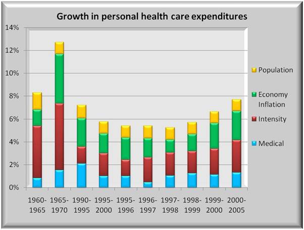
Aside from any current inequities in who pays for health care, these expenditures are not only rising but at an ever-increasing rate. The graph below shows the growth in costs from 1965. The spike in 1965-1970 was Medicare.
Population and general inflation are reasonably expected factors. In addition, however, there is medical (price) inflation and intensity (more procedures) driving up costs.
Unless there is a major change in these trends, healthcare costs will consume an ever greater portion of GDP, and squeeze out productive output.
To bring this under control requires more than tweaking around the edges of the current healthcare model. Other countries spend less on healthcare so how do other countries cover costs for less.
 Source: Center for Disease Control – Health, United States 2008 Table 126
U.S. insurers & Medicare are very Transaction based
For decades, the U.S. has had a primarily transaction based model like figure 1 below. You get treatment from a physician or hospital and pay for their time and expenses.
When Medicare began, it used this traditional model but quickly learned that costs were rising out of control. So they changed to a fixed price model like figure 2 below. But when Medicare squeezed down prices, some providers increased their volume to recoup part of their losses.
Managed care or HMO’s (not shown) had limited success in freezing total payments. But healthier groups can often select traditional coverage at lower cost, leaving HMO’s with more of the higher cost people. In short, reform with only a transaction based model will not likely succeed.

Other countries are more Outcomes based
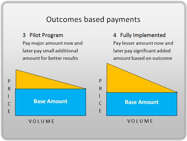
What other countries did was adopt normal profit-making business models like figure 3 below where the goal is to offer rewards for greater productivity and improved quality, in a word — outcomes.
It is the basis for most bonuses. Also many contracts are include a bonus if a project comes in under budget and ahead of time. Healthcare payments in other countries rely far more on outcomes than the does the U.S. And it works.
Medicare is piloting this concept, paying small bonuses to providers who show better outcomes. As data is obtained, base amounts can be reduced and the outcome gradually increased bringing the U.S. closer to the world model.
Will private insurers adopt this model? Unless all insurers are required to do so, it is doubtful. Alternately, a public option using this model would cause private insurers to voluntarily adopt as a way to remain competitive.
Can the U.S. afford more income taxes
Other industrialized countries are clearly providing quality health care at significantly lower costs than in the U.S. But what about other taxes or more specifically, total taxes.
How does the U.S. compare in total taxes with these other countries? The graph below shows tax components. Despite complaints about corporate rates, U.S. take is lower than most countries. Sales taxes are high but discretionary (no buy, no tax) as states rely heavily on this source.
Social Security and income taxes are two mandatory taxes affecting individuals and here the U.S. ranks near the bottom. Without becoming just like Europe, some increase in mandatory taxes should let the U.S. remain competitive with the rest of the world. And if real reform does come, higher initial costs can be expected to result in savings down the road as the U.S. costs approach other countries.
 Source OECD in Figures 2008 – OECD © 2008 – ISBN 9789264055636
Looking at income tax as a source of new funds
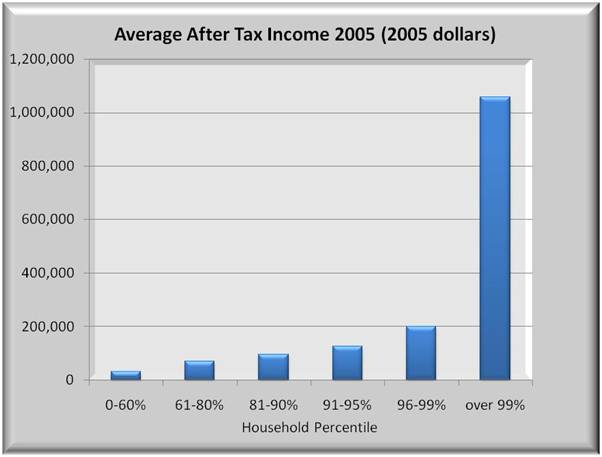
Where does one look for new taxes. While there are several options, one key is to see who is earning what today. The graph below displays the average after tax income for selected percentile groups. The small blip at the furthest left is the average income of 60% of the U.S. Those in the 61% to 95% range average somewhat better. Also noted is the greater number of households in these groups’ results in their paying the majority of income taxes.
But look at the highest 5% earners, and especially the top 1%. That 1% averages over $1 million per household. So if there is a tax increase, should all taxpayers contribute the same percent increase? Or should increases be progressive as is the basic income tax structure.
One way to answer this is to see how income for these same households changed over time.
 Source: Congressional Budget Office-Historical Effective Federal Tax Rates: 1979 -2005
Who benefited from income gains over 25 years
The graph below employs the same groups as above. For several reasons, there has been a substantial income shift with enormous increases in income for the top 1%, with modest increase for the 95%-99% group. ALL the rest of the percentile groups actually lost ground, and the lower the income bracket, the greater the loss.
Over the past 28 years, there has been a very sharp drop in marginal tax rates leading to two results. First, high income earners keep more of their income. But with high marginal rates, companies did not pay extremely high salaries and bonuses as most of it went towards taxes. With lower marginal rates, executive compensation began an upward spiral that far exceeds their counterparts in other countries.
The combined effect of near runaway compensation and lower taxes is primarily responsible for the shift to the rich.
 Source: Congressional Budget Office-Historical Effective Federal Tax Rates: 1979 -2005
Why are so many people afraid of higher tax rates
Some note that total revenues rose when Kennedy cut taxes and apply that logic to every tax change since. But as the graph below shows, the marginal rate at that time was 90%. Had the IRS run amuck? Actually, the U.S. raised taxes to pay down war debts, a good habit missing today.
From the prior graph, one could assume that a fair way to apply new taxes to individuals is to tax those who gained the most relative to others from tax cuts in the past.
Today we have low marginal rates, major gains by the very rich, and a national debt that has been almost ignored. Not to increase taxes but to add to the national debt is to put a heavier burden on the next generations.
In conclusion, a logical and fair place to look for new sources of tax revenue is the top 5% of households.
 Source: IRS – SOI Tax Stats – Historical Table 23
Net worth – the job generating engine
Some complain that taxing the income of the rich will cause a loss of jobs. But income is not the prime determinant in job creation. To start a business, one in fact, may have to give up current income.
Businesses are started by those with net worth. And if they are lucky, they can leverage that net worth with loans to fund their new enterprise.
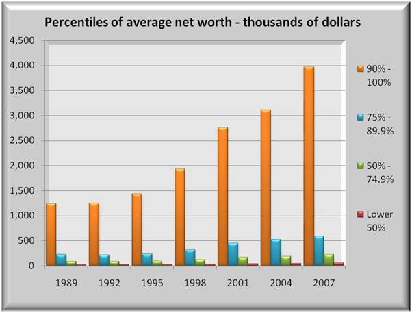
The graph below shows the growth in net worth from 1989 for four selected percentile groups. As one would expect, those less well off tend to work for others and their net worth (lower 50%) makes barely a blip on the scale.
Even the net worth of the 50%-90% groups is modest. The greatest concentration of accumulated wealth is in the top 10%. And that group not only grew more in absolute dollars, but also as a percent gain over prior periods.
 Source: Federal Reserve Board, 2007 Survey of Consumer Finance (March 9, 2009)
New worth grew more when tax rates were higher
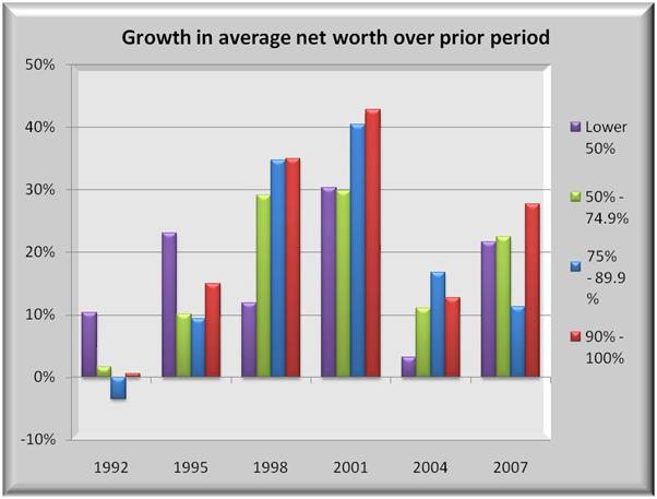
The graph below details the increase in net worth over the prior period. The lower 50% experienced inconsistent gains up and down. Higher groups fared better but all were impacted by recessions. Of note is that the two 3-year periods ending in 1998 and 2001 occurred during Clinton’s term where he had actually raised marginal tax rates.
One should skip the recession period of 2004. By 2007, the tax cuts of Bush’s term resulted in net worth increases, but they were significantly less than those of the Clinton period.
Obviously, there are additional factors at play, but to simply argue that any increase in marginal rates, and especially raises in the top brackets will result in loss of jobs is a tenuous argument not supported by this data.
 Source: Federal Reserve Board, 2007 Survey of Consumer Finance (March 9, 2009)
Download PDF Report >>> Who pays for healthcare reform
Filed under: Analyses, Centers for Disease Control (CDC), Congressional Budget Office (CBO), Federal Reserve, Health Costs, Healthcare Reform, Internal Revenue (IRS), Organization for Economic Cooperation & Development, Wealth and Income | Tagged: cost-plus model, employee paid health hides costs, fee for service, household income, marginal tax rate, net worth, OECD, outcome based, transaction based, US taxes versus Europe | Leave a comment »


About healthreformtrends.com
Health Reform Trends, Research and Analysis Website
The analyses on this site rely primarily on data provided by non-partisan government agencies, long-established research institutions, and enterprises whose business is to analyze aspects of health care, be it health insurance or hospitals or health care providers. The following two paragraphs date back a number of years but are still valid.
With the aging U.S. population, there will be a significant increase in demand for health care services. Under the status quo, these demands will place an extremely heavy burden not only on Federal and state governments but on citizens as health care costs continue to rise faster than inflation, wages, salaries, and benefits.
In 2011 there was an increased interest in 2011 on funding issues. In response, the site adds analyses dealing with wealth and income that may provide potential funding sources, not just for health care but to reduce deficits that have grown sharply during the “great” recession. Analyses focusing on income and wealth issues are now noted separately on the “Research-Analysis” tab on this website.
For more information about this site click on “About” tab.
For information about 8 ways to navigate to articles on this site click on the “Help” tab.
To read the full text of any article, CLICK ON THE TITLE.
Filed under: Analyses, Commentary, Congress, Government Health, Health Costs, Health Insurers, Health Quality, Healthcare Reform, Wealth and Income | Comments Off on About healthreformtrends.com