ACA Health Insurance Exchanges – Not All are Competitive

Download PDF Report >>> ACA Exchange Premium Extremes

SUMMARY

The Affordable Care Act (ACA) created state run Insurance Exchanges to stimulate competition among health insurers. Some believe that private insurers are better suited to manage the complex health insurance market. But are they?

Kaiser Health News (KHN) recently published premiums that private insurers charge on ACA Exchanges. KHN identified 10 ACA Exchanges with the highest premiums, and 10 with the lowest. They found extreme differences and attributed them to competition or lack thereof. This analysis confirms those conclusions by comparing actual Medicare costs for those same areas.

Detailed cost data published by Medicare show that medical costs for seniors are fairly consistent across these 20 ACA Exchanges. Though costs for seniors are much higher than for those under 65, they provide a valid proxy for all medical costs when comparing one market area with another.

Medicare payments are based on service costs with pricing input from the American Medical Association. Medicare adjusts for regional differences so costs are consistent across the nation. Medicare essentially ignores hospital and doctor billing prices.

Private insurers, on the other hand, derive their costs more from provider billing prices which have been shown to be highly inconsistent.  (http://insr.us/hospbill) Insurers do negotiate discounts from billing prices, but if the billing basis is inconsistent, it is harder to get a consistent result.

If there are few dominant providers, insurers have less leverage over discounts. If there are few dominant insurers, they are less inclined to aggressively set lower premiums.

Only one conclusion supports the enormous differences in premiums between the high and low cost ACA Exchanges. In areas where little competition exists, whether it be providers or insurers, private insurers are unable or unwilling to offer competitive pricing. The belief that private insurers are better suited to restrain market prices rings false in these instances.

METHODOLOGY

For years, health insurance markets have been divided into areas that coincide with county lines. The ACA insurance Exchanges continue to abide by these market boundaries.

Kaiser Health News (KHN) analyzed these “market areas” and found huge differences in ACA Exchange premiums. They identified 10 most expensive market areas and 10 least expensive areas (listed in Appendices 3 and 4).

ACA Exchanges insure people under 65, and premiums are derived from expected costs based on historical costs in the counties that make up each ACA Exchange.

Medicare publishes medical costs data down to the county level. Though Medicare costs apply primarily to seniors, one can map those costs to align with the 20 market areas. It does not matter that Medicare’s costs are much higher than for those under 65. The relative costs are what are important.

If two market areas have similar Medicare costs, it is fair to assume that medical costs for those not in Medicare will also be similar. Conversely, if Medicare costs are far different, one expects non Medicare costs will also be different.

Medicare data include all costs, while ACA Exchange data is only for premiums. Is this apples and oranges? Well no, because ACA requires insurers to offer plans identical in coverage and which differ only in cost sharing.

With identical coverage, the costs of each plan are identical. All that differs is the cost sharing. Plans called “Bronze” have premiums that cover 60% of expected costs, “Silver” which cover 70%, “Gold” – 80%, and “Platinum” – 90%.

Knowing this, one simply divides the premium by the percent coverage to derive total expected costs. If premiums for a silver plan are $280 per month, total expected costs would be $400 per month (280 / 70% = 400).

Since the KHN report applied to Silver plans for a 40 year old, premium costs were divided by 70% to get total expected costs. Direct cost comparisons can now be made between 40 year olds on ACA Exchanges and seniors on Medicare.

DISCUSSION

Kaiser Health News (KHN) recently published premiums that private insurers charge on ACA Exchanges. KHN identified 10 ACA Exchanges with the highest premiums, and 10 with the lowest. They found extreme differences but did not include an analysis of the causes.

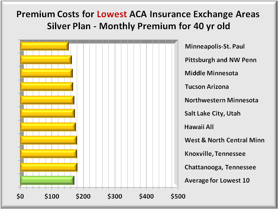
The graph below shows monthly Silver Plan premiums for a 40 year old in the 10 LOWEST ACA Insurance Exchange Areas. As the labels at right show, those market areas occur over multiple geographic regions.

The green bar at bottom of the graph shows the average premium which is just over $170 per month.

Premiums 10 lowest

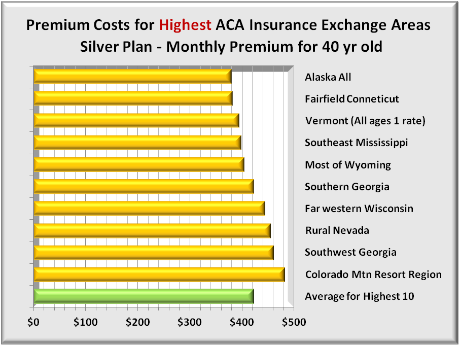
Like the first graph, the graph below shows monthly Silver Plan premiums for a 40 year old in the 10 HIGHEST ACA Insurance Exchange Areas. Again the labels at right show those market areas occur over multiple geographic regions.

The green bar at bottom of the graph shows the average premium which is more than $400 per month.

Premiums 10 highest

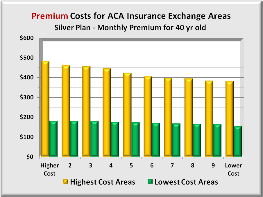
Combing the highest and lowest, the graph below compares the monthly premiums, gold for the highest cost areas and green for the lowest. The differences in premiums are huge. The lowest ACA Exchange areas have average premiums less than half (about 40%) the premiums of the highest.

Prem hi vs lo

Having a direct comparison between high and low premiums, the next step is to compare all these 20 ACA premiums with another measurement common to all the same market areas. Medicare spending fits that bill, as it not only occurs in every area, it also comprises half of ALL medical spending in them.

This works only if Medicare costs are an appropriate proxy for ACA Exchange costs. To test, one needs comprehensive data on personal health care (PHC) spending by age group. Medicare provides that data which covers millions of people though only through 2004 as shown in the graph below.

Health Spend all ages

The top line, seniors 65 and older, incurred a sharp increase in health care spending 1987 – 1996. Since 1996, cost increases have been proportional among all age groups. A closer look within Medicare age groups is done to assure Medicare is an acceptable proxy for all health care spending.

The following graph subdivides Medicare only costs into three age groups. The sharp rise in 1996 average cost was most affected by those 85 and older. Since 1996, all age group’s costs have risen proportionately. As cost trends for all age groups are similar since 1996, Medicare costs offer a good proxy for medical costs of other age groups as well.

Health Spend Medicare

The graph below combines the prior graphs of total Personal Health Care Spending per capita into seven age groups. The four left bars include all groups under 65 years old. The next three bars (aqua, gold and light blue) represent the three Medicare age groups. The last two bars on the right show national averages for all those under 65 (red) and all those 65 and older (green).

HC Spend all n avg

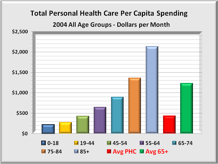
It is clear that health costs rise rapidly with age, accelerating more in senior years. The average costs for 40 year olds are included in the second (yellow) bar from the left which costs average less than $400 per month.

Averages for Medicare health costs, as shown in the far right green bar, are some three times greater than for 40 year olds. While this data is only through 2004, all medical costs have risen at about the same rate. One can expect Medicare costs today to still be about three times that of a 40 year old.

The above graph shows costs. To directly compare these total costs with ACA Exchange premiums, just covert premiums to total costs. As noted in the Methodology, divide premiums by 70% to get expected costs for each ACA Exchange.

The next graph shows these total estimated costs for each of the 20 market areas. For the 10 most expensive areas, costs average about $600 per month. For the 10 least expensive areas, total average costs are about $245 per month, 40% of the high cost areas. The graph is the same as that for premiums above, but with 40+% higher monthly costs.

HC Cost hi vs lo

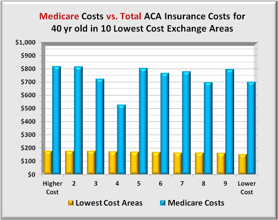
With total costs available for all, the graph below compares Medicare costs with costs of 40 year olds in each of the 10 lowest cost ACA Exchange areas. The low Medicare costs in the 4th series is Hawaii, which is the only outlier in this series.

In these competitive ACA Exchange areas, the average spread between Medicare and ACA is over four times. On a national average as shown above, the spread is around three times which shows competition really can reduce premiums.

Medicare vs 10 low

Before comparing total Medicare costs with the highest cost ACA Exchange areas, it is helpful to know what Medicare costs are in the highest cost areas relative to lowest cost areas. The graph below shows Medicare costs in all 20 market areas. While there are variations in total Medicare costs between market areas, there are no trends that favor either high or low cost ACA Exchange areas.

Medicare 20 hi n lo

The conclusion drawn from this graph is that high cost ACA Exchange areas have Medicare costs similar to low cost ACA Exchange costs. Nothing is inherently different for seniors.

The next graph compares total Medicare costs with total costs of 40 year olds in each of the 10 highest cost ACA Exchange areas. As expected, seniors’ Medicare costs are higher than are 40 year olds costs. However, with the national average spread around three times for this age group and Medicare, the difference here is one tenth of that, less than a 30%.

Since Medicare costs are not so different between high and low cost areas, the only conclusion is that ACA Exchange costs are too high. These high cost estimates have led to private insurer premiums far higher expected.

Medicare vs 10 hi

In conclusion, Medicare costs do not differ much between high and low cost ACA Exchange areas. By extension, health care costs for a 40 year old should not differ by much. Yet, the difference in premiums is huge.

If the insurer has near monopoly power, it has little reason to demand deep discounts. Insurers’ margins are constrained by ACA law to 20%. In short, 20% of a higher cost is more profitable than 20% of a lower cost. So why press harder for lower costs?

If the provider has near monopoly power, the insurer has little leverage since there are no competitive providers as an alternative. Either way, individuals in some ACA Exchanges are paying higher costs than expected.

Medicare doesn’t worry about either dominant insurers or dominant providers. It has a national payment scale, and with Medicare amounting to half a provider’s business, the providers are virtually forced to accept Medicare’s terms.

ONE SOLUTION IDEA

There is a solution that could remedy this situation. Amend the ACA with a proviso to apply only to any ACA Exchange market area in which the spread between insurers’ premiums and Medicare payments is greater than some threshold.

If the spread exceeds that maximum, ACA could create a public insurance option and where the public option requires providers to accept both Medicare and the option or neither. Public option premiums would key off Medicare payments plus an added profit margin to level the playing field with private insurers. This would force competition regardless of whether the insurer or the provider was dominant.

APPENDIX 1

One further check on Medicare as a proxy is a deeper dive into its major components to see if any are skewing total costs. The two graphs below highlight hospital admissions and emergency room visits per thousand beneficiaries in the 20 ACA Exchange areas. As expected, variations exist, but no consistent pattern appears between Medicare admissions between ACA Exchange areas.

CMS Hospital

CMS ER visit

There is one outlier and that is Medicare costs in the highest cost ACA Exchange area, a ski resort area. Here Medicare hospital and emergency room visits are markedly lower. It is likely that seniors living here may be more active in winter sports. This suggests they may be generally fit than the average senior, and thus incur fewer hospital and ER visits.

APPENDIX 2

Source for the 10 least expensive and 10 most expensive ACA Health Insurance Exchange areas were compiled by Kaiser Health News (KHN) from data developed by the Kaiser Family Foundation Program for the Study of Health Reform and Private Insurance, healthcare.gov, and ACA Exchanges. The costs analyzedwere for a 40 year old person.

KHN is a nonprofit news organization committed to in-depth coverage of health care policy and is an editorially-independent program of the Kaiser Family Foundation, a non-profit private operating foundation, based in Menlo Park, Calif., dedicated to producing and communicating the best possible analysis and information on health issues.

APPENDIX 3: 10 Least Expensive Areas (Counties)

$154: Minneapolis-St. Paul. Anoka, Carver, Dakota, Hennepin, Ramsey, Scott, Sherburne and Washington counties.

$164: Pittsburgh and Northwestern Pennsylvania. Allegheny, Armstrong, Beaver, Butler, Crawford, Erie, Fayette, Greene, Indiana, Lawrence, McKean, Mercer, Warren, Washington and Westmoreland counties.

$166: Middle Minnesota. Benton, Stearns and Wright counties.

$167: Tucson, Ariz. Pima County.

$171: Northwestern Minnesota. Clearwater, Kittson, Mahnomen, Marshall, Norman, Pennington, Polk and Red Lake counties.

$173: Salt Lake City. Davis and Salt Lake counties.

$176: Hawaii. All counties.

$180: Knoxville, Tenn. Anderson, Blount, Campbell, Claiborne, Cocke, Grainger, Hamblen, Jefferson, Knox, Loudon, Monroe, Morgan, Roane, Scott, Sevier & Union counties.

$180: Western and North Central Minnesota. Aitkin, Becker, Beltrami, Big Stone, Cass, Chippewa, Clay, Crow Wing, Douglas, Grant, Hubbard, Isanti, Kanabec, Kandiyohi, Lac qui Parle, Lyon, McLeod, Meeker, Mille Lacs, Morrison, Otter Tail, Pine, Pope, Renville, Roseau, Sibley, Stevens, Swift, Todd, Traverse, Wadena Wilkin and Yellow Medicine counties.

$181: Chattanooga, Tenn. Bledsoe, Bradley, Franklin, Grundy, Hamilton, Marion, McMinn, Meigs, Polk, Rhea and Sequatchie counties.

Source: http://www.kaiserhealthnews.org/Stories/2014/February/13/10-Least-Expensive-Health-Insurance-Markets-In-US.aspx


APPENDIX 4: 10 Most Expensive Areas

$483: Colorado Mountain Resort Region. Eagle, Garfield and Pitkin counties, home of Aspen and Vail ski resorts. Summit County premiums are $462.

$461: Southwest Georgia. Baker, Calhoun, Clay, Crisp, Dougherty, Lee, Mitchell, Randolph, Schley, Sumter, Terrell and Worth counties.

$456: Rural Nevada Esmeralda, Eureka, Humboldt, Lander, Lincoln, Elko, Mineral, Pershing, White Pine and Churchill counties.

$445: Far western Wisconsin. Pierce, Polk and St. Croix counties. (across the border from St. Paul, Minn.)

$423: Southern Georgia. A swath of counties adjacent to the even more expensive region. Ben Hill, Berrien, Brooks, Clinch, Colquitt, Cook, Decatur, Early, Echols, Grady, Irwin, Lanier, Lowndes, Miller, Seminole, Thomas, Tift and Turner counties.

$405: Most of Wyoming. All counties except Natrona and Laramie.

$399: Southeast Mississippi. George, Harrison, Jackson & Stone counties. In Hancock County, the lowest price plan is $447.

$395: Vermont.* (Unlike other states, Vermont does not let insurers charge more to older people and less to younger ones. Its ranking therefore will differ depending on the ages of the consumers)

$383: Connecticut. Fairfield County. (The southwestern-most county, which includes many affluent commuter towns for New York City.)

$381: Alaska. All counties.

Source: http://www.kaiserhealthnews.org/Stories/2014/February/03/most-expensive-insurance-markets-obamacare.aspx?p=1

APPENDIX 5: Source-healthcare spending by age group:

http://www.cms.gov/Research-Statistics-Data-and-Systems/Statistics-Trends-and-Reports/NationalHealthExpendData/downloads/2004-age-tables.pdf


APPENDIX 6: Source-Medicare Costs and Utilization by geographic area:

Table_State County_All_December 2013.zip from Centers for Medicare & Medicaid Services (CMS).

Website: http://www.cms.gov/Research-Statistics-Data-and-Systems/Statistics-Trends-and-Reports/Medicare-Geographic-Variation/Downloads/State_County_Table_All.zip


APPENDIX 7: Some Relevant Provisions of the Affordable Care Act.

It now appears that some market areas have less competition and the only way for an insurer to offer qualified plans is for ACA to ease a bit regarding condition (B) “ensuring sufficient choice of providers”.

Section 1311. AFFORDABLE CHOICES OF HEALTH BENEFIT PLANS (emphasis added)

1311(c) (1) Qualified Health Plans

(1) IN GENERAL.—The Secretary shall, by regulation, establish criteria for the certification of health plans as qualified health plans. Such criteria shall require that, to be certified, a plan shall, at a minimum—

(A) meet marketing requirements, and not employ marketing practices or benefit designs that have the effect of discouraging the enrollment in such plan by individuals with significant health needs;

(B) ensure a sufficient choice of providers (in a manner consistent with applicable network adequacy provisions under section 2702(c) of the Public Health Service Act), and provide information to enrollees and prospective enrollees on the availability of in-network and out-of-network providers;

(C) include within health insurance plan networks those essential community providers, where available, that serve predominately low-income, medically-underserved individuals individuals, such as health care providers defined in section 340B(a)(4) of the Public Health Service Act and providers described in section 1927(c)(1)(D)(i)(IV) of the Social Security Act as set forth by section 221 of Public Law 111–8, except that nothing in this subparagraph shall be construed to require any health plan to provide coverage for any specific medical procedure;

1311(c) (2) Rule of Construction

RULE OF CONSTRUCTION.—Nothing in paragraph (1)(C) shall be construed to require a qualified health plan to contract with a provider described in such paragraph if such provider refuses to accept the generally applicable payment rates of such plan.

.

Download PDF Report >>> ACA Exchange Premium Extremes

DRG Summary for Medicare Hospital Payments


Download PDF Report >>> Medicare Hospital Payments

SUMMARY – Medicare Hospital Payments 

Medicare does not rely on hospital billings but on data built over decades as to the reasonable cost of services. Some may question the absolute amount of Medicare reimbursements but the relative payment scales are extensively validated by actual data.  Conversely, this analysis shows hospital pricing has inconsistencies that cannot be rationally explained.

However, private insurers negotiate discounts from these hospital pricings. If billed prices are inconsistent, then so are discounts based on them. A major constraint on medical costs will occur when patients can make informed cost decisions at the DRG level, not just for overall premiums and co-pays. Currently, few persons can make those informed decisions.

Many states have enacted legislation for hospitals to be more transparent about their prices, but enforcement is spotty.  This Medicare data suggests that the country would be well served if hospitals posted DRG prices for all to compare.

METHODOLOGY

In May, 2013 Medicare released its most comprehensive set ever of statistical data regarding hospital payments.  The data covered fiscal year 2011 and included the top 100 DRG’s (diagnostic related codes) based on inpatient discharges. Data excludes DRG’s for hospitals with fewer than 11 discharges for that DRG. This allows focus on higher volume services and their financial impact.  The final data set of the top 100 DRG’s results in over 166,000 records of nearly 7 million discharges from over 3,300 hospitals.

The data itself lists for DRG’s for each hospital, the number of discharges, the average covered (billed) charges, and the average total payment including Medicare. Each hospital, also includes its HRR (hospital referral region) which is the method governments use to determine “market areas”.

The chart below from Kaiser Foundation indicates that inpatient hospital is just over a quarter of Medicare spend or about $140 billion annually.

image001

This analysis examines inpatient service pricing. Step one was to reduce the extreme data, both high and low. To minimize billing overstatement, this analysis removed 51 discharges that were high cost outliers. To minimize billing understatement, the smallest states totaling 10 % of the population and which tend to be more rural and variable were skipped. The sample data covers 6.3 million discharges from over 145,000 records of 100 DRG bills and costs. Total inpatient payments are $61 billion or 40% of total spend.

The data itself was analyzed five different ways.

  1. Percent of average paid vs. average billed, grouped by percent paid quartile
  2. Percent of average paid vs. average billed, grouped by state
  3. Variance from average of billed charges, grouped by state
  4. Variance from average of paid charges, grouped by state
  5. Extremes of 15 largest DRG groups expressed as a ratio of the maximum to minimum billed, along with the number of discharges included in each group

DISCUSSION

% average paid vs average billed, by % paid quartile

The graph below shows 5 sets of bars representing four quartiles 0% to 100% plus a small number of DRG’s that paid more than was billed. The left (gold) bar is the average bill for the four quintiles while the right (blue) bar is the corresponding average paid for each group. The right axis shows average dollars per discharge. Total average billed dollars is $36,384 and ranges from $54,000 highest to $11,867 lowest. Total average paid dollars is $9,754 and ranges from $14,481 highest to $9,548 lowest.

Note the inverse relationship of billed versus paid. One might expect higher billings to result in a lower percentage paid. What was not expected is that the actual dollars paid goes up as the overbilling goes down closer to paid dollars. Clearly billings for lower cost DRG’s bear little resemblance to cost.

image002

% average paid vs. average billed, grouped by state

The graph below uses the same payment data above but groups results by state.  And rather than two separate bars for billed and paid, there is one bar representing the percent of bill paid. (i.e. paid/billed) equivalent to the blue bar above.

image003

This graph does highlight the extent of overbilling by state. It does not show either the billed amounts or the paid amounts.  The graph begins with the states with the highest overbilling (and hence lower paid percent) and extends to more realistic levels of overpricing. Maryland at the bottom has billed prices very close to paid, with only a 6% discount to bill.

In the above graph, Illinois payments of 27% billed is the average for these 30 states. States listed above Illinois have more severe overpricing issues than states following Illinois.

“Discounts” from billed rates can have serious side effects. Just to call them discounts is something of a misnomer.  For many, there seems little connection between what it costs and what is billed.  Medicare of course ignores billed prices and pays what the procedures cost plus a margin.  But private insurers do not have the extensive national database that Medicare has. Instead they negotiate “discounts” from billed or list price. But as this graph shows, and as one drills down deeper by hospital, these list prices are all over the map, and that alone can skew private insurance payment amounts.

But two other adverse factors also come into play. The most important is that billed rates are what uninsured people are charged when they require treatment. Most of the uninsured cannot afford the insurance, and should they be hospitalized, things get far worse. Over 60% of personal bankruptcies have medical bills as a significant factor.

Another adverse factor is that hospitals report the amount of uncompensated care that they provide, and are provided tax exempt status if that care exceeds a specific target, and/or get reimbursed for some of these expenses. The computations are far from transparent, and it is quite possible that taxes are avoided or reimbursements received that overstate actual uncompensated care were it calculated as Medicare does.

Variance from average of billed charges, by state

The graph below offers a more close-up view of overbilling. It shows how each state’s average dollar amounts differ from the 30 state billing average of $36,384.

image004

Data is sorted from the most overbilling at the top to the least at the bottom. Note that Massachusetts, which state closely resembles the Affordable Care Act, has less overpricing (though still 50%) than all other states except Maryland.

Variance from average of paid charges, by state

The graph below is the same format as the prior except using paid instead of amounts. Its scale is also much lower. In the former graph, Maryland had the least overbilling. But as shown below, Maryland has the second most expensive payments following only slightly behind California.

This graph, more than any other highlights the cost-of-living differences between different parts of the country. Larger urban states tend to have higher costs than smaller less urban states. Nevertheless, the $5,000 difference between the extremes reflects costs nearly double from the lowest cost states to the highest.  The financial effect (+30%/-40) seems larger than justified by differences in cost-of-living alone.

image005

The most obvious difference would be intensity where higher cost states are able to justify more services. Another factor could be the use of more expensive equipment and methods.

Extremes of 15 largest DRG groups expressed as a ratio of maximum to minimum billed, along with the number of discharges included in each group

The graph below represents two different data, each with its own range of values.  The grouping is a selection of 15 of the most frequent DRGs. The wider (green) bars have their value scale shown along the top. The wide bar represents the ratio of the maximum billing divided by the minimum billing – in other words, the ratio of maximum to minimum, the extremes of over-pricing. For instance, the second DRG, “Cellulitis” has its highest billing more than 70 TIMES that of the lowest bill. Bad as that is, the extreme for septicemia is over 100 times the lowest billing. These are extreme differences for closely related illnesses. Sure there are differences in how serious the illness is, but high-low factors greater than 50, not even considering ratios greater than 100 are hard to explain.

image006

Then there are the narrow (gold) bars. They represent the number of discharges in each DRG group and whose values are shown below the graph. There are over 3.6 million discharges in the data.  One may reasonably conclude that hospital pricing bears little relationship to costs of service. While deep discounts mitigate some of this, discounting just reduces the magnitude but not the irrational pricing itself.

Download PDF Report >>> Medicare Hospital Payments

Link to Medicare Provider Charge Data

Health Care Reform – Accountable Care Organizations

Download PDF Report >>> Health Care Reform – Accountable Care Organizations

SUMMARY

Kaiser health news recently came out with two documents providing clarification on Accountable Care Organizations or ACO’s that were included in the Affordable Care Act (ACA).

The mainstream media rarely  discussed this. It comprised only seven pages of the health care law and dwelt  with Medicare to which few critics paid serious attention.

For providers of health care, this offers a major change in the way Medicare operates. It delivers care at lower cost while maintaining quality.   The ACO model can also apply to all patients, not just Medicare.  Savings while maintaining quality care can run into the hundreds of billions of dollars.

A study of 4,272 hospitals found utilization levels at two of five most expensive hospitals more than 30% greater than at Mayo Clinics. The study covered Medicare patients who died. If that same service ratio held for all patients, those hospitals could generate annual savings of $170 Billion with no change in prices. The savings occur if they had hospital days and physician visits similar to Mayo. Continue reading

Key Healthcare Provisions – Kaiser Foundation

Download PDF Report >>> Key Healthcare Provisions

Kaiser Foundation Source

Some of the items that go into effect in the first year include:

NEW HELP FOR SOME UNINSURED: People with a medical condition that has left them uninsurable may be able to enroll in a new federally subsidized insurance program that is to be established within 90 days. The legislation appropriates $5 billion for this, although that may not be enough to cover all who apply; it’s not clear how much consumers would pay as their share of the cost. About 200,000 people are covered in similar state programs currently, at an estimated cost of $1 billion a year, says Karen Pollitz, a research professor at Georgetown University.

DISCOUNTS AND FREE CARE IN MEDICARE: The approximately 4 million Medicare beneficiaries who hit the so-called “doughnut hole” in the program’s drug plan will get a $250 rebate this year. Next year, their cost of drugs in the coverage gap will go down by 50 percent. Preventive care, such as some types of cancer screening, will be free of co-payments or deductibles starting this year.

COVERAGE OF KIDS: Parents will be allowed to keep their children on their health insurance plan until age 26, unless the child is eligible for coverage through a job. Insurance plans cannot exclude pre-existing medical conditions from coverage for children under age 19, although insurers could still reject those children outright for coverage in the individual market until 2014.

TAX CREDITS FOR BUSINESSES: Businesses with fewer than 25 employees and average wages of less than $50,000 could qualify for a tax credit of up to 35 percent of the cost of their premiums.

CHANGES TO INSURANCE: All existing insurance plans will be barred from imposing lifetime caps on coverage. Restrictions will also be placed on annual limits on coverage. Insurers can no longer cancel insurance retroactively for things other than outright fraud.

GOVERNMENT OVERSIGHT: Insurers must report how much they spend on medical care versus administrative costs, a step that later will be followed by tighter government review of premium increases.

Some of the major changes the reconciliation proposal would make to the Senate-passed bill:

HEFTIER SUBSIDIES: Compared to the Senate legislation, the reconciliation bill would provide more generous subsidies to low- and moderate-income Americans to help them buy health coverage.

THE “MASERATI” TAX: The levy on high-cost insurance plans is scaled back and delayed, rendering it more a “Maserati” than a “Cadillac” tax. It would apply only to the portion of plans costing more than $10,200 a year for individuals, up from $8,500, and $27,500 for families, up from $23,000. The tax wouldn’t kick in until 2018, reducing the projected revenue to the government by 80 percent. Over time, however, the tax would hit more and more plans, because the tax’s threshold is set to increase at the rate of inflation while premiums are expected to continue to grow much more quickly than that.

CLOSING THE DOUGHNUT HOLE: Unlike the Senate bill, the reconciliation measure would eventually close the coverage gap, called the “doughnut hole,” for Medicare beneficiaries enrolled in Part D drug plans. (Currently, seniors who hit the gap must bear the full cost of their medications until they spend a certain amount, when coverage kicks back in.)

Under the new bill, seniors who hit the gap this year would get $250 to help cover the costs of their medications. Starting next year, they’d get a 50 percent discount on brand-name drugs, with the cost borne by the drug industry. In subsequent years, the discounts would expand and begin covering generic drugs, with the expense picked up by the government. By 2020, the discounts would reach 75 percent.

SHIFT IN MEDICARE ADVANTAGE PAYOUTS: Government payments to Medicare Advantage, the private-health plan alternative to traditional Medicare, would be cut back more steeply than under the Senate bill: $132 billion over 10 years, compared to $118 billion.

The government currently pays the private plans an average of 14 percent more than traditional Medicare. The new bill, besides reducing payments overall, would shift the funding; some high-cost areas would be paid 5 percent below traditional Medicare, while some lower-cost areas would be paid 15 percent more than traditional Medicare. The Senate’s plan that would have shielded some areas of the country such as South Florida from major cuts was largely eliminated.

A RAISE FOR DOCTORS: Primary care doctors would get a Medicaid payment boost in the reconciliation bill. Beginning in 2013 and 2014, the doctors’ payment rates would be on par with Medicare rates, which typically are about 20 percent higher than Medicaid. The goal is to ensure that there will be a sufficient number of doctors willing to care for the millions of additional people who would become eligible for Medicaid under the health care overhaul.

PUSHING UP THE MEDICARE TAX: The Senate bill adds a 0.9 percentage point to the Medicare payroll tax on earned income above $200,000 for individuals, or $250,000 for couples. Under the reconciliation bill, starting in 2013, people in those income brackets also would face a 3.8 percent tax on investment income, such as interest, capital gains and dividends.

PENALTY FOR NOT HAVING INSURANCE: Under the new bill, most Americans without insurance would face an annual penalty, starting in 2014 at $95 – the same as in the Senate bill. But in following years, the penalties in the reconciliation bill are slightly different. Those without insurance in 2016, for example, would pay the greater of two alternatives: a flat fee of $695, down from the Senate’s $750, or 2.5 percent of their income, up from 2 percent in the Senate bill.

EXPANDING MEDICAID: The reconciliation package differs from the Senate-passed bill in several ways. It would delete a provision dubbed the “Cornhusker kickback” that would have exempted Nebraska from paying any cost of a Medicaid expansion included in the bill. But it would provide full federal funding to all states for newly eligible Medicaid recipients for three years. And it would give additional funding to states like Vermont and Maine that have already moved to cover adults without children, which isn’t required under the Medicaid program.

MEDICARE SPENDING BOARD: The Senate bill would create an independent, 15-member board to recommend ways to control Medicare spending. The board remains in the reconciliation package, but would be expected to produce just about half of its original projected savings of $23 billion in the Senate bill. That’s because the new proposal would make greater cuts in Medicare Advantage plans.

Download PDF Report >>> Key Healthcare Provisions


For every 100 people …

Download PDF Report >>> For every 100 people

For every 100 people:

50 will spend   3% of  Total Healthcare Dollars

39 will spend 13% Total of Healthcare Dollars

10 will spend 63% of Total Healthcare Dollars

1 will spend 21% of Total Healthcare Dollars

Or …

For every 100 people:

50 will spend ~ $500/year

39 will spend ~ $2,700/year

10 will spend ~$51,000/year

1 will spend ~ $171,000/year

Health care spending is highly skewed. For 9 out of 10, your health care is fine. If you are the 1 in 10, you could be bankrupted without adequate health insurance. Averages don’t tell the story, a bit like the infamous words of Clint Eastwood, “Do you feel lucky?”    If you had to pick from two guns, one with all empty chambers and the other chambered with a single round, your odds would be lower of selecting a gun with a loaded chamber than of being bankrupted or nearly so if you had inadequate health insurance.  The average is very low, but would you gamble those odds with your family’s health?

But it also explains why so many people do not understand there is any health problem. Being so highly skewed, most people have never encountered a serious illness or accident, and some of them wonder what all the fuss over reform is about.

Source Kaiser Family Foundation: Trends in Health Care Costs and Spending March 2009

Download PDF Report >>> For every 100 people

Rationing or Waste in Healthcare

Download PDF Report >>> Health Rationing or Waste

Summary

Rationing is not getting needed care.  Waste is getting care not needed and causes rationing for those in need. One way to determine if there is waste is to compare large samples of people in areas of highest cost to those in lowest cost.  While some variation will exist because of cost of living factors, larger variations can only be explained by greater use of care in higher areas versus lower areas.

The method used compares selected components of health care.  Each category compares the highest 20% of population with the lowest 20%.  For national data, rankings mean there are two groups of nearly 60 million.  For Medicare and Medicaid, it is over 8 million each.  Age differences among these populations were minimal, though higher cost areas tended to be more urban than the lower cost population.

Differences between the highest and lowest were minor in some cases.  But in a number of categories, differences were huge.  Either millions in the United States are being under-served, or millions are being over-served wasting billions.

For the population as a whole, total health costs in the highest states were nearly 40% higher than the lowest cost states. In hospitals, the spread was slightly over 40%, while physicians were less than 30%.  Highest spreads were nursing home costs that were nearly three times higher.

In Medicare, hospital costs are 30% higher, but physician costs are some 70% higher for similar populations.  With all paying equally into Medicare, rationing already exists.

Despite these higher costs, a number of quality measures suggest that quality is actually better for lower cost states.

Healthcare expenditures for the entire population

In 2006, the U.S. spent over 1.7 trillion dollars on health care. The graph below shows the analysis of expenditures:  37% went to hospitals, 25% to physicians, 7% to nursing homes, 12% to drugs, and 18% to other.

Not only are costs high but they are rising faster than the economy consuming ever more funds that might otherwise go for jobs, education and infrastructure.  The country is also jeopardizing its world competitiveness because other countries are able to offer quality health care at less cost.

The aging of the population is a compounding factor when it comes to Medicare spending.  Here the government plays a greater role at a time when seniors’ health puts greater demands on any healthcare system.  It will be almost 2050 before the baby boomer bubble works its way through and medical costs for seniors stabilize as a % of total spend.

Source: Center for Disease Control – Health, United States 2008 Figure 19.

Cost differences for the entire population

Rather than compare absolute costs, this report focuses on relative costs, high versus low, and for very large samples.  The graph below compares 8 categories comprising over 96% of total health care expenditures. The states included in each group may be different depending on the category.

Total health care spend in the highest states was 38% more than the lowest states. The highest hospitals that comprise 37% of total spend, were 42% above the lowest. Physicians accounting for 25% of spend were 28% higher.

Home health and Nursing home care showed the largest differences, approaching 200% or nearly three times higher than for the lowest cost states. These lowest cost areas may be providing less care than what is considered “enough” and /or have found family sources that help out internally without outside help.

 Source: Centers for Medicare & Medicaid Services, National Health Statistics Group

Medicare, a barometer for the total population

The graph below shows that while government plays an increasing role in the over 65 group, there is still a major portion of costs being paid for by the private sector.  And, after years of steady increase, total costs are accelerating due to the influx of baby boomers into this age group.

Comparing year to year national averages is too broad to draw actionable conclusions. Comparing a single city to another may be too narrow.  Fortunately, the government has in its favor a wealth of statistics for their programs. 

When comparing selected health components for very large populations, costs can only be explained by differences in volume of care.  Other government statistics show little difference in outcomes despite wide differences in service.

Medicare is the biggest government program, and below are some comparisons of interest.

Source: Center for Disease Control – Health, United States 2008 Table 141.

Cost differences for Medicare enrollees

The graph below compares 6 categories comprising over 96% of Medicare expenditures. The drug program Part D did not start in time to be reflected in these 2004 data. The sample is large with 8 million in each group.  States in each group may be different depending on the category.

When compared to the total population, Medicare‘s spread between physician and other professional service costs is far greater while hospital differences are less.

Home health care and nursing home care show similar large differences though the amount spent in these two areas is limited to 10-11% of all costs.  Medicare imposes more restraints in these extended care areas.  That may explain how, with nearly all nursing home residents being seniors, Medicare home and nursing costs are a relatively low proportion of the total.

Source: Centers for Medicare & Medicaid Services, National Health Statistics Group

Cost differences for Medicaid enrollees

The graph below compares 6 categories comprising 92% of Medicaid expenditures. Here there are differences not only in cost (highest cost more than double the lowest) but in the mix. For Medicaid, hospitals and doctors do not play as large a role.  Instead, costs tend more to drugs, nursing home care and other personal care.

This group covers poorer people of all age groups so their needs are more like the broader population in terms of mix with one exception.  Medicaid offers nursing home help with those costs being 19% of total spend.

There is another key difference from Medicare and that is the states contribute significantly to Medicaid, and states cut back some if funds are not available.  This plays a role in the greater difference between the highest and lowest cost states for all categories.  One can fairly assume that the lowest cost states get fewer services.

Source: Centers for Medicare & Medicaid Services, National Health Statistics Group

Hospitalization rate nearly 50% higher

Tracking discharges also tracks admissions and the graph below shows 45% more total discharges in the highest cost states.  Non ambulatory care sensitive (ACS) events have roughly comparable rates of discharge. On the other hand, ACS discharges are more than 50% higher than the lowest cost states.

The number of beds does not appear to be a factor as many lower cost states actually have more beds per capita.  Data is not available as to acute beds, though in any case, it is a doctor admitting a patient.  While higher cost states may have more doctors per capita, that difference is nowhere as high as the difference in admissions. 

One can conclude that there are major differences in how often doctors admit similar patients, especially when you consider some 16 million people in two sample groups.

Source: Kaiser State Health Facts – 50 State Comparison

While reimbursements more than 50% higher 

Of course, for every admission, there is a cost.  Using a still finer “filter”, the graph below shows wide differences depending on what services are performed.

Inpatient short stays are 50% higher.  But long stays are 200% or 3 times those of the lowest states. Diagnostic, laboratory and X-ray services are more than double the costs in the lowest states. Either the first group is getting excess care, or the second group’s care is being rationed.

The biggest difference was in home health and for once, higher may be better as it compare the highest cost states to the lowest cost states.  Home health is a more efficient use of funds than hospitalization or intermediate care facilities, so more may be better.  Or it can simply be more take advantage of the service because it is available.

Source: Dartmouth Atlas of Healthcare – Medicare reimbursement measures

Higher cost states have more specialists per capita

Aside from complaints that insurers make medical decisions there would be no decision to make without a request. In the graph below, the number of primary physicians is about the same with a slight tilt toward lowest cost states.

There is a measurable difference in the number of other physicians, including specialists.  As shown, primary care physicians are outnumbered by specialists.  And with admissions greater for the high cost group, it is logical to assign a greater share of hospitalizations to specialists.

Some people, especially those who are well insured claim that greater hospitalization and its attendant costs are worth it.  Leaving cost considerations aside, one might expect with all this extra care to have a lower mortality rate.  Alas, this is not the case.  More services do not necessarily yield better quality outcomes.

Source: Kaiser State Health Facts – 50 State Comparison

Mortality rate slightly worse in higher cost states

The basis for high and low states is Medicare’s mortality tables.  The data adjust mortality by age so a state with a greater proportion of very old people is not penalized.

As the graph below shows, mortality is consistently higher in more expensive areas.  What is even more interesting is that those without HMO coverage have a higher mortality rate than the total average.  For that to occur, mortality rates for seniors with HMO coverage must be lower than for those without HMO coverage.

For all the cynics who think HMO’s are “too restrictive”, the results for Medicare folks at least, speak otherwise.  And one factor is working in HMO’s favor.  They have a greater tendency to work in teams, and statistics show that better managed providers do work in teams, with perhaps the most familiar name being the Mayo Clinic.

Source: Dartmouth Atlas of Healthcare – 2005 Medicare Mortality Rates

While final services and costs are more than double 

So, did higher mortality result in lower costs? If a person dies, medical care stops.  The graph below compares cost averages in which the patient died.  It tracks costs of that final stay and also costs in the last six months leading to it.

For the highest states, all 7 categories shown costs are more than double those of the lowest states. Remember, this is a sample of 8 million people in each group, from states north and south, east and west. 

The data show that seniors in high cost states are incurring nearly five times the cost of being in intensive care or coronary care units. This applies not only to the final hospitalization but to repeat admissions to ICU/CCU in the six months preceding death.  And despite all that extra cost and effort in the last six months, it does not appear to lead to better quality or lower mortality.

Source: Dartmouth Atlas of Healthcare – State Performance Report

More doctors leads to more utilization

In the previous graphs, there are numerous examples of huge differences between high and low-cost states without a comparable difference in outcomes. That observation alone suggests that cost cutting will not necessarily reduce benefits.  While the majority of spend occurs in hospitals, it is the physicians who make the treatment decisions.

The graph below shows the total number of physicians per population by region.  Though not homogeneous, the New England and Mid Atlantic states tend to include the highest states using different criteria shown in the above graphs. 

And these areas clearly have significantly higher physician ratios than other areas.  True, there is much research occurring here, but only a portion of the difference would be due to those efforts.  In summary, there are numerous areas when cuts could safely occur without losing quality.

 Source: Center for Disease Control – Health, United States 2008 Table 109

 Download PDF Report >>> Health Rationing or Waste