DRG Summary for Medicare Hospital Payments


Download PDF Report >>> Medicare Hospital Payments

SUMMARY – Medicare Hospital Payments 

Medicare does not rely on hospital billings but on data built over decades as to the reasonable cost of services. Some may question the absolute amount of Medicare reimbursements but the relative payment scales are extensively validated by actual data.  Conversely, this analysis shows hospital pricing has inconsistencies that cannot be rationally explained.

However, private insurers negotiate discounts from these hospital pricings. If billed prices are inconsistent, then so are discounts based on them. A major constraint on medical costs will occur when patients can make informed cost decisions at the DRG level, not just for overall premiums and co-pays. Currently, few persons can make those informed decisions.

Many states have enacted legislation for hospitals to be more transparent about their prices, but enforcement is spotty.  This Medicare data suggests that the country would be well served if hospitals posted DRG prices for all to compare.

METHODOLOGY

In May, 2013 Medicare released its most comprehensive set ever of statistical data regarding hospital payments.  The data covered fiscal year 2011 and included the top 100 DRG’s (diagnostic related codes) based on inpatient discharges. Data excludes DRG’s for hospitals with fewer than 11 discharges for that DRG. This allows focus on higher volume services and their financial impact.  The final data set of the top 100 DRG’s results in over 166,000 records of nearly 7 million discharges from over 3,300 hospitals.

The data itself lists for DRG’s for each hospital, the number of discharges, the average covered (billed) charges, and the average total payment including Medicare. Each hospital, also includes its HRR (hospital referral region) which is the method governments use to determine “market areas”.

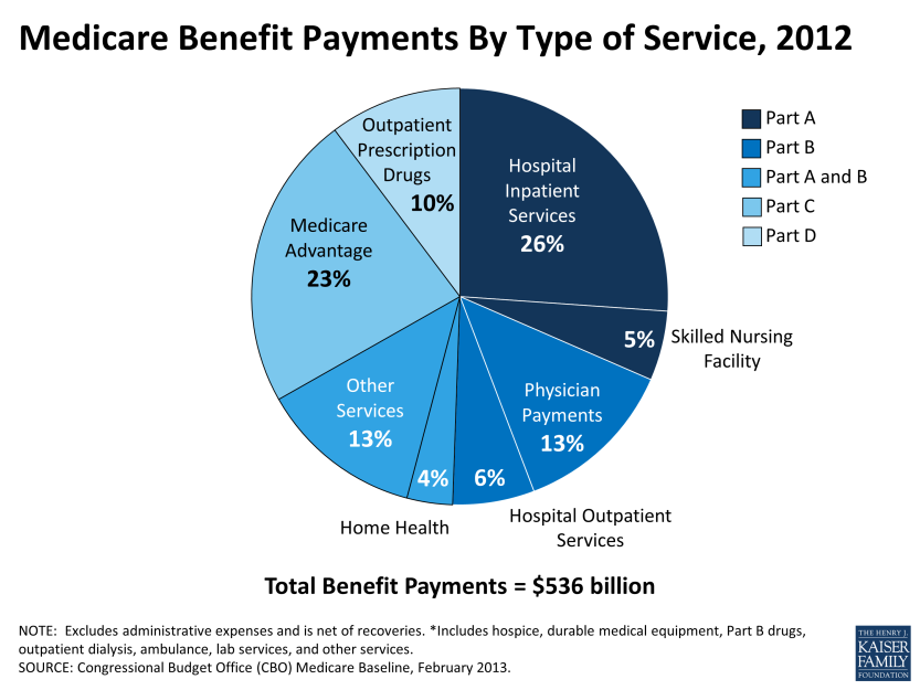
The chart below from Kaiser Foundation indicates that inpatient hospital is just over a quarter of Medicare spend or about $140 billion annually.

image001

This analysis examines inpatient service pricing. Step one was to reduce the extreme data, both high and low. To minimize billing overstatement, this analysis removed 51 discharges that were high cost outliers. To minimize billing understatement, the smallest states totaling 10 % of the population and which tend to be more rural and variable were skipped. The sample data covers 6.3 million discharges from over 145,000 records of 100 DRG bills and costs. Total inpatient payments are $61 billion or 40% of total spend.

The data itself was analyzed five different ways.

  1. Percent of average paid vs. average billed, grouped by percent paid quartile
  2. Percent of average paid vs. average billed, grouped by state
  3. Variance from average of billed charges, grouped by state
  4. Variance from average of paid charges, grouped by state
  5. Extremes of 15 largest DRG groups expressed as a ratio of the maximum to minimum billed, along with the number of discharges included in each group

DISCUSSION

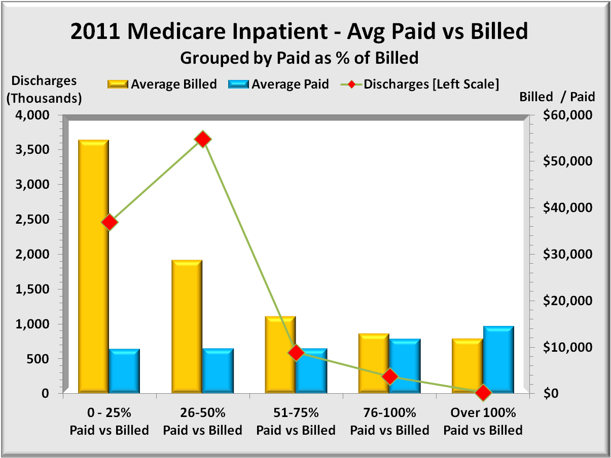
% average paid vs average billed, by % paid quartile

The graph below shows 5 sets of bars representing four quartiles 0% to 100% plus a small number of DRG’s that paid more than was billed. The left (gold) bar is the average bill for the four quintiles while the right (blue) bar is the corresponding average paid for each group. The right axis shows average dollars per discharge. Total average billed dollars is $36,384 and ranges from $54,000 highest to $11,867 lowest. Total average paid dollars is $9,754 and ranges from $14,481 highest to $9,548 lowest.

Note the inverse relationship of billed versus paid. One might expect higher billings to result in a lower percentage paid. What was not expected is that the actual dollars paid goes up as the overbilling goes down closer to paid dollars. Clearly billings for lower cost DRG’s bear little resemblance to cost.

image002

% average paid vs. average billed, grouped by state

The graph below uses the same payment data above but groups results by state.  And rather than two separate bars for billed and paid, there is one bar representing the percent of bill paid. (i.e. paid/billed) equivalent to the blue bar above.

image003

This graph does highlight the extent of overbilling by state. It does not show either the billed amounts or the paid amounts.  The graph begins with the states with the highest overbilling (and hence lower paid percent) and extends to more realistic levels of overpricing. Maryland at the bottom has billed prices very close to paid, with only a 6% discount to bill.

In the above graph, Illinois payments of 27% billed is the average for these 30 states. States listed above Illinois have more severe overpricing issues than states following Illinois.

“Discounts” from billed rates can have serious side effects. Just to call them discounts is something of a misnomer.  For many, there seems little connection between what it costs and what is billed.  Medicare of course ignores billed prices and pays what the procedures cost plus a margin.  But private insurers do not have the extensive national database that Medicare has. Instead they negotiate “discounts” from billed or list price. But as this graph shows, and as one drills down deeper by hospital, these list prices are all over the map, and that alone can skew private insurance payment amounts.

But two other adverse factors also come into play. The most important is that billed rates are what uninsured people are charged when they require treatment. Most of the uninsured cannot afford the insurance, and should they be hospitalized, things get far worse. Over 60% of personal bankruptcies have medical bills as a significant factor.

Another adverse factor is that hospitals report the amount of uncompensated care that they provide, and are provided tax exempt status if that care exceeds a specific target, and/or get reimbursed for some of these expenses. The computations are far from transparent, and it is quite possible that taxes are avoided or reimbursements received that overstate actual uncompensated care were it calculated as Medicare does.

Variance from average of billed charges, by state

The graph below offers a more close-up view of overbilling. It shows how each state’s average dollar amounts differ from the 30 state billing average of $36,384.

image004

Data is sorted from the most overbilling at the top to the least at the bottom. Note that Massachusetts, which state closely resembles the Affordable Care Act, has less overpricing (though still 50%) than all other states except Maryland.

Variance from average of paid charges, by state

The graph below is the same format as the prior except using paid instead of amounts. Its scale is also much lower. In the former graph, Maryland had the least overbilling. But as shown below, Maryland has the second most expensive payments following only slightly behind California.

This graph, more than any other highlights the cost-of-living differences between different parts of the country. Larger urban states tend to have higher costs than smaller less urban states. Nevertheless, the $5,000 difference between the extremes reflects costs nearly double from the lowest cost states to the highest.  The financial effect (+30%/-40) seems larger than justified by differences in cost-of-living alone.

image005

The most obvious difference would be intensity where higher cost states are able to justify more services. Another factor could be the use of more expensive equipment and methods.

Extremes of 15 largest DRG groups expressed as a ratio of maximum to minimum billed, along with the number of discharges included in each group

The graph below represents two different data, each with its own range of values.  The grouping is a selection of 15 of the most frequent DRGs. The wider (green) bars have their value scale shown along the top. The wide bar represents the ratio of the maximum billing divided by the minimum billing – in other words, the ratio of maximum to minimum, the extremes of over-pricing. For instance, the second DRG, “Cellulitis” has its highest billing more than 70 TIMES that of the lowest bill. Bad as that is, the extreme for septicemia is over 100 times the lowest billing. These are extreme differences for closely related illnesses. Sure there are differences in how serious the illness is, but high-low factors greater than 50, not even considering ratios greater than 100 are hard to explain.

image006

Then there are the narrow (gold) bars. They represent the number of discharges in each DRG group and whose values are shown below the graph. There are over 3.6 million discharges in the data.  One may reasonably conclude that hospital pricing bears little relationship to costs of service. While deep discounts mitigate some of this, discounting just reduces the magnitude but not the irrational pricing itself.

Download PDF Report >>> Medicare Hospital Payments

Link to Medicare Provider Charge Data

Rationing or Waste in Healthcare

Download PDF Report >>> Health Rationing or Waste

Summary

Rationing is not getting needed care.  Waste is getting care not needed and causes rationing for those in need. One way to determine if there is waste is to compare large samples of people in areas of highest cost to those in lowest cost.  While some variation will exist because of cost of living factors, larger variations can only be explained by greater use of care in higher areas versus lower areas.

The method used compares selected components of health care.  Each category compares the highest 20% of population with the lowest 20%.  For national data, rankings mean there are two groups of nearly 60 million.  For Medicare and Medicaid, it is over 8 million each.  Age differences among these populations were minimal, though higher cost areas tended to be more urban than the lower cost population.

Differences between the highest and lowest were minor in some cases.  But in a number of categories, differences were huge.  Either millions in the United States are being under-served, or millions are being over-served wasting billions.

For the population as a whole, total health costs in the highest states were nearly 40% higher than the lowest cost states. In hospitals, the spread was slightly over 40%, while physicians were less than 30%.  Highest spreads were nursing home costs that were nearly three times higher.

In Medicare, hospital costs are 30% higher, but physician costs are some 70% higher for similar populations.  With all paying equally into Medicare, rationing already exists.

Despite these higher costs, a number of quality measures suggest that quality is actually better for lower cost states.

Healthcare expenditures for the entire population

In 2006, the U.S. spent over 1.7 trillion dollars on health care. The graph below shows the analysis of expenditures:  37% went to hospitals, 25% to physicians, 7% to nursing homes, 12% to drugs, and 18% to other.

Not only are costs high but they are rising faster than the economy consuming ever more funds that might otherwise go for jobs, education and infrastructure.  The country is also jeopardizing its world competitiveness because other countries are able to offer quality health care at less cost.

The aging of the population is a compounding factor when it comes to Medicare spending.  Here the government plays a greater role at a time when seniors’ health puts greater demands on any healthcare system.  It will be almost 2050 before the baby boomer bubble works its way through and medical costs for seniors stabilize as a % of total spend.

Source: Center for Disease Control – Health, United States 2008 Figure 19.

Cost differences for the entire population

Rather than compare absolute costs, this report focuses on relative costs, high versus low, and for very large samples.  The graph below compares 8 categories comprising over 96% of total health care expenditures. The states included in each group may be different depending on the category.

Total health care spend in the highest states was 38% more than the lowest states. The highest hospitals that comprise 37% of total spend, were 42% above the lowest. Physicians accounting for 25% of spend were 28% higher.

Home health and Nursing home care showed the largest differences, approaching 200% or nearly three times higher than for the lowest cost states. These lowest cost areas may be providing less care than what is considered “enough” and /or have found family sources that help out internally without outside help.

 Source: Centers for Medicare & Medicaid Services, National Health Statistics Group

Medicare, a barometer for the total population

The graph below shows that while government plays an increasing role in the over 65 group, there is still a major portion of costs being paid for by the private sector.  And, after years of steady increase, total costs are accelerating due to the influx of baby boomers into this age group.

Comparing year to year national averages is too broad to draw actionable conclusions. Comparing a single city to another may be too narrow.  Fortunately, the government has in its favor a wealth of statistics for their programs. 

When comparing selected health components for very large populations, costs can only be explained by differences in volume of care.  Other government statistics show little difference in outcomes despite wide differences in service.

Medicare is the biggest government program, and below are some comparisons of interest.

Source: Center for Disease Control – Health, United States 2008 Table 141.

Cost differences for Medicare enrollees

The graph below compares 6 categories comprising over 96% of Medicare expenditures. The drug program Part D did not start in time to be reflected in these 2004 data. The sample is large with 8 million in each group.  States in each group may be different depending on the category.

When compared to the total population, Medicare‘s spread between physician and other professional service costs is far greater while hospital differences are less.

Home health care and nursing home care show similar large differences though the amount spent in these two areas is limited to 10-11% of all costs.  Medicare imposes more restraints in these extended care areas.  That may explain how, with nearly all nursing home residents being seniors, Medicare home and nursing costs are a relatively low proportion of the total.

Source: Centers for Medicare & Medicaid Services, National Health Statistics Group

Cost differences for Medicaid enrollees

The graph below compares 6 categories comprising 92% of Medicaid expenditures. Here there are differences not only in cost (highest cost more than double the lowest) but in the mix. For Medicaid, hospitals and doctors do not play as large a role.  Instead, costs tend more to drugs, nursing home care and other personal care.

This group covers poorer people of all age groups so their needs are more like the broader population in terms of mix with one exception.  Medicaid offers nursing home help with those costs being 19% of total spend.

There is another key difference from Medicare and that is the states contribute significantly to Medicaid, and states cut back some if funds are not available.  This plays a role in the greater difference between the highest and lowest cost states for all categories.  One can fairly assume that the lowest cost states get fewer services.

Source: Centers for Medicare & Medicaid Services, National Health Statistics Group

Hospitalization rate nearly 50% higher

Tracking discharges also tracks admissions and the graph below shows 45% more total discharges in the highest cost states.  Non ambulatory care sensitive (ACS) events have roughly comparable rates of discharge. On the other hand, ACS discharges are more than 50% higher than the lowest cost states.

The number of beds does not appear to be a factor as many lower cost states actually have more beds per capita.  Data is not available as to acute beds, though in any case, it is a doctor admitting a patient.  While higher cost states may have more doctors per capita, that difference is nowhere as high as the difference in admissions. 

One can conclude that there are major differences in how often doctors admit similar patients, especially when you consider some 16 million people in two sample groups.

Source: Kaiser State Health Facts – 50 State Comparison

While reimbursements more than 50% higher 

Of course, for every admission, there is a cost.  Using a still finer “filter”, the graph below shows wide differences depending on what services are performed.

Inpatient short stays are 50% higher.  But long stays are 200% or 3 times those of the lowest states. Diagnostic, laboratory and X-ray services are more than double the costs in the lowest states. Either the first group is getting excess care, or the second group’s care is being rationed.

The biggest difference was in home health and for once, higher may be better as it compare the highest cost states to the lowest cost states.  Home health is a more efficient use of funds than hospitalization or intermediate care facilities, so more may be better.  Or it can simply be more take advantage of the service because it is available.

Source: Dartmouth Atlas of Healthcare – Medicare reimbursement measures

Higher cost states have more specialists per capita

Aside from complaints that insurers make medical decisions there would be no decision to make without a request. In the graph below, the number of primary physicians is about the same with a slight tilt toward lowest cost states.

There is a measurable difference in the number of other physicians, including specialists.  As shown, primary care physicians are outnumbered by specialists.  And with admissions greater for the high cost group, it is logical to assign a greater share of hospitalizations to specialists.

Some people, especially those who are well insured claim that greater hospitalization and its attendant costs are worth it.  Leaving cost considerations aside, one might expect with all this extra care to have a lower mortality rate.  Alas, this is not the case.  More services do not necessarily yield better quality outcomes.

Source: Kaiser State Health Facts – 50 State Comparison

Mortality rate slightly worse in higher cost states

The basis for high and low states is Medicare’s mortality tables.  The data adjust mortality by age so a state with a greater proportion of very old people is not penalized.

As the graph below shows, mortality is consistently higher in more expensive areas.  What is even more interesting is that those without HMO coverage have a higher mortality rate than the total average.  For that to occur, mortality rates for seniors with HMO coverage must be lower than for those without HMO coverage.

For all the cynics who think HMO’s are “too restrictive”, the results for Medicare folks at least, speak otherwise.  And one factor is working in HMO’s favor.  They have a greater tendency to work in teams, and statistics show that better managed providers do work in teams, with perhaps the most familiar name being the Mayo Clinic.

Source: Dartmouth Atlas of Healthcare – 2005 Medicare Mortality Rates

While final services and costs are more than double 

So, did higher mortality result in lower costs? If a person dies, medical care stops.  The graph below compares cost averages in which the patient died.  It tracks costs of that final stay and also costs in the last six months leading to it.

For the highest states, all 7 categories shown costs are more than double those of the lowest states. Remember, this is a sample of 8 million people in each group, from states north and south, east and west. 

The data show that seniors in high cost states are incurring nearly five times the cost of being in intensive care or coronary care units. This applies not only to the final hospitalization but to repeat admissions to ICU/CCU in the six months preceding death.  And despite all that extra cost and effort in the last six months, it does not appear to lead to better quality or lower mortality.

Source: Dartmouth Atlas of Healthcare – State Performance Report

More doctors leads to more utilization

In the previous graphs, there are numerous examples of huge differences between high and low-cost states without a comparable difference in outcomes. That observation alone suggests that cost cutting will not necessarily reduce benefits.  While the majority of spend occurs in hospitals, it is the physicians who make the treatment decisions.

The graph below shows the total number of physicians per population by region.  Though not homogeneous, the New England and Mid Atlantic states tend to include the highest states using different criteria shown in the above graphs. 

And these areas clearly have significantly higher physician ratios than other areas.  True, there is much research occurring here, but only a portion of the difference would be due to those efforts.  In summary, there are numerous areas when cuts could safely occur without losing quality.

 Source: Center for Disease Control – Health, United States 2008 Table 109

 Download PDF Report >>> Health Rationing or Waste