World Quality Compare

Download PDF Report >>> World Quality Compare

Summary

A summary glance at the graphs below should serve notice to all that the U.S. healthcare is in crisis. The left graphs show 2006 health spending both as a percent of GDP and on a per capita basis to be far above all other nations in the OECD (Organization for Economic Co-operation and Development).

And if that wasn’t bad enough, the graphs on the right show that the trend is so bad compared to these OECD countries that without a major policy change, the U.S. will be paying far more into health care and far less in productive activities compared to its competitor nations.  That all were similar years ago suggests that a U.S. solution is possible.

Yet, for all these higher costs, is the U.S. really getting better health care than other OECD countries?  Graphs show only selected countries, but data include all 30 nations.  The U.S. more often than not compares unfavorably in key areas.

All data in this report are derived from OECD Health Data 2009 – Version: June 09 .  Below each graph are all nations’ computed average, the percent the U.S. is over or under that average, and the min and max for those criteria.

Of the areas selected, the U.S. is significantly above average in % of GDP spend, health care and prescription drug costs per capita, MRI units, CT scanners, and infant mortality.

The U.S. is significantly below average in acute care beds, doctor’s consultations and hospital discharge rates per capita, in average length of stay in acute care hospitals, and in population over 15 years old who smoke.

The U.S. is about average in life expectancy at birth but lags key European countries.  It is average in cancer death rate. There are other factors that are not part of the OECD report, but the issue is whether the U.S. is getting its money’s worth.

Average: 8.9%    U.S. vs. Average: 78%    Minimum: 5.8%    Maximum: 15.8%.

The U.S. clearly pays the highest percent of its GDP for health care.

Average: 8.9%    U.S. vs. Average: 78%    Minimum: 5.8%    Maximum: 15.8%.

The trend of OECD countries is clearly lower than for the U.S.

Average: $3,073    U.S. vs. Average: 126%    Minimum: $1,322    Maximum: $6,933.

The U.S. clearly pays the highest per capita cost for health care.

Average: $3,073    U.S. vs. Average: 126%    Minimum: $1,322    Maximum: $6,933.

The trend of OECD countries is clearly lower than for the U.S.

Average: 72.9%    U.S. vs. Average: -38%   Minimum: 44.2%   Maximum: 90.9%

There is still a large percent of private health participation in OECD nations.

Average: $451    U.S. vs Average: 87%   Minimum: $178    Maximum: $844

The U.S. pays almost double per capita for its drugs versus the OECD.

Average: 3.9    U.S. vs. Average: -31%    Minimum: 1    Maximum: 8.2

While the U.S. is comparable to some nations, it lags behind some key nations.

Average: 9.7    U.S. vs. Average: 173%    Minimum: 1.4    Maximum: 40.1.

Except for Japan, the U.S. has more than twice as many MRI’s as other nations.

Average: 21.7    U.S. vs. Average: +57%    Minimum: 3.4    Maximum: 92.6.

Not quite as extreme as MRI units, but the US is still out front of EU countries.

Average: 6.7    U.S. vs. Average: -43%   Minimum: 2.8   Maximum: 13.6.

Access to care in other countries?  They are far ahead of the U.S. in this category.

Average: 16,256    U.S. vs. Average: -22%   Minimum: 5,486   Maximum: 28,440.

If you do not admit, there is no discharge.  U.S. is moving to outpatient.

Average: 6.9    U.S. vs. Average: -19%    Minimum: 3.9    Maximum: 19.2.

But for those needing acute care, the U.S. is about average for other than Japan.

Average: 79    U.S. vs. Average: -1%    Minimum: 71.6    Maximum: 82.4.

Considered a health quality factor, the U.S. lags behind key countries.

Average: 5.1    U.S. vs. Average: +31%    Minimum: 1.4    Maximum: 22.3.

The U.S. clearly lags in this health quality measure.

Average: 164.5    U.S. vs. Average: -4%    Minimum: 96.5    Maximum: 219.8

With cancer the leading cause of death, the U.S. is still only average.

Average: 24.4%    U.S. vs. Average: -34%    Minimum: 14.5%    Maximum: 40%.

Despite more smokers in Europe, they still have longer life expectancies.

APPENDIX

The following tables offer a complete list of data available.  Those highlighted are included above.

OECD Health Data 2009 – Frequently Requested Data

Health expenditure

–         Total expenditure on health, % of gross domestic product

–         Total health expenditure per capita, US$ PPP

–         Public expenditure on health, % total expenditure on health

–         Pharmaceutical expenditure, % total expenditure on health

–         Pharmaceutical expenditure per capita, US$ PPP

Health care resources

–         Practising physicians, density per 1 000 population

–         Practising nurses, density per 1 000 population

–         Medical graduates, density per 1 000 practising physicians

–         Nursing graduates, density per 1 000 practising nurses

–         Hospital beds, density per 1 000 population

–         Acute care beds, density per 1 000 population

–         Psychiatric care beds, per 1 000 population

–         MRI units per million population

–         CT Scanners per million population

–         Mammographs per million population

–         Radiation therapy equipment per million population

Health care activities

–         Doctor consultations per capita

–         Hospital discharge rates, all causes, per 100 000 population

–         Average length of stay for acute care, all conditions, days

–         Coronary artery bypass grafts (CABG), per 100 000 population

–         Coronary angioplasties, per 100 000 population

–         Caesarean sections, per 100 live births

Health status (Mortality)

–         Life expectancy at birth, females, males and total population

–         Life expectancy at 65 years old, females and males

–         Infant mortality rate, deaths per 1 000 live births

–         Potential years of life lost (PYLL), all causes females and males

Suicides, deaths per 100 000 population

Download PDF Report >>> World Quality Compare

Healthcare Bill – Initial Reforms

Download PDF Report >>> Healthcare bill-Senate initial reforms

SUMMARY

This article was written before final passage of the bill.  The provisions noted here are all in the final bill.  Like all legislation compromises find their way into the Senate bill.  Nevertheless, there are still many good reforms that deserve passage of the bill. Below are nine good reasons that occur just in 2010 to justify passage.

DISCUSSION

Howard Dean suggested senators reject the current form of the senate bill as not offering an alternative to private insurance and thus, unable to control costs.

One senator disagreed saying that while we wanted to build a nice house, all we can afford is a cottage.  But that cottage has a very solid foundation.  In time, we can make additions, but if we do not have a foundation, no additions or changes will even be possible.

This article addresses just a few foundation items that take effect early in the program.  Though one should not stop pressing for greater reform, not passing any bill would have even greater adverse consequences.

The following page lists excerpts from the senate bill as published earlier.  The comments below hopefully “translate” some of that legalese into layman’s language for the rest of us.  Hopefully, they provide encouragement to continue to press for better and better reform, but not to throw the baby out with the bath water if it seems reform does not go far enough. Below are nine good reasons that occur just in 2010 to justify passage

Actions Effective when Reform Bill is Enacted

  1. Section 1003 establishes in each state a process for review of unreasonable premium increases, approval of increases, and disclosure by insurers of justifications for their increases.  While this does not lower rates, it should constrain unreasonable increases and create transparency. Insurers are open to embarrassment if they press for extreme increases.  This section further provides a $250 million fund to the states to enforce this provision and give it some teeth.

Actions Effective within 90 Days of Enactment

  1. Section 1101 provides creation of a high risk pool for immediate access by uninsured with preexisting conditions. It requires enrollees to pay only “normal” premiums with cost deficits covered by a $5 billion appropriation.  It also includes an anti dumping clause to prevent plans from discouraging anyone from remaining enrolled. In effect, neither insurers nor companies could offload their high cost persons onto this subsidized high risk pool.
  2. Section 1102 effectively extends COBRA coverage for “retired” employees ages 55 and older. To protect employers extending COBRA, it provides them a reinsurance plan whereby if a retiree’s claims exceed $15,000, the government will reimburse the employer 80% of costs in excess of the $15,000.

Actions Effective within 6 Months of Enactment

Section 1001 contains 6 key subsections that are not practical to enforce immediately but are too important to delay for a whole year.

  1. Sec. 2711 prohibits insurers from setting lifetime or unreasonable annual dollar value limits on what they will pay under a plan
  2. Sec. 2712 prohibits insurers from rescinding coverage once an enrollee is covered under a plan
  3. Sec. 2713 prohibits insurers from imposing cost sharing (deductibles or copayments) for preventative services, immunizations, and preventative services for young children
  4. Sec. 2714 extends coverage of dependent unmarried children until age 26
  5. Sec. 2715 requires Uniform Explanation of Coverage Documents and Standard Definitions.

(a)    Establish strict disclosure rules including limiting documents to 4 pages of 12 point font (no fine print), understandable language, and clear benefits description and cost.

(b)    Preempt states with lower standards

  1. Sec. 2718 is designed to bring down costs

(a)    Establish accounting rules that standardize and segregate medical claims and  non-medical costs

(b)    Set minimum MLRs (according to rules in (a).  MLRs are already in the legislation, though their levels are similar to today’s actual MLRs (85% for groups, 80% for individuals).  Excess margins would be rebated to customers. MLRs could be made more stringent in the Senate-House reconciliation.

(c)    Require hospitals to “establish and make a list” of standard charges. The provision removes some of the secrecy and multiplicity in hospital pricing. By making them public, people can make more informed decisions about costs.

Subtitle A — Immediate Improvements in Health Care Coverage for All Americans

Sec. 1001. Amendments to the Public Health Service Act. (effective 6 months after enactment)

  • Sec. 2711. No Lifetime or Annual Limits.

Insurers may not establish—(1) lifetime limits on the dollar value of benefits for any participant or beneficiary; or (2) unreasonable annual limits

  • Sec. 2712. Prohibition on Rescissions.

Insurers shall not rescind such plan or coverage with respect to an enrollee once the enrollee is covered under such plan or coverage involved

  • Sec. 2713. Coverage of Preventive Health Services.

Insurance coverage shall provide coverage for and shall not impose any cost sharing requirements for—Preventative services, Immunizations, and preventative care for infant, children and adolescents

  • Sec. 2714. Extension of Dependent Coverage.

Policies covering dependent coverage of children shall continue to make such coverage available for an adult child (unmarried) until the child turns 26 years of age

  • Sec. 2715. Development and Utilization of Uniform Explanation of Coverage Documents of Standardized Definitions.

SUBSECTION (a) In GeneralNot later than 12 months after the date of enactment … develop standards … in compiling and providing to enrollees a summary of benefits and coverage explanation that accurately describes the benefits and coverage under the applicable plan or coverage.  The standards include:

  1. Appearance – not more than 4 pages
  2. Language –utilizes terminology understandable to an average enrollee
  3. Contents – must include:
    1. Uniform definitions so customers may compare
    2. Description of coverage including cost sharing for –Each category of benefit

1)      Exceptions, reductions, limitations

2)      deductible & co-payments

3)      Continuation provisions

4)      Examples to illustrate common benefits

SUBSECTION (e) PREEMPTION.—The standards developed under subsection (a) shall preempt any related State standards that require a summary of benefits and coverage that provides less information to consumers

  • Sec. 2718. Bringing Down the Cost of Health Care Coverage

a)      Clear accounting for Costs – annual report concerning the percentage of total premium revenue that such coverage expends—

1)      on reimbursement for clinical services provided to enrollees under such coverage;

2)      for activities that improve health care quality; and

3)      on all other non-claims costs, including an explanation of the nature of such costs, and excluding State taxes and licensing or regulatory fees.

b)      Ensuring That Consumers Receive Value for Their Premium Payments.— Requirement To Provide Value For Premium Payments.—rebate to each enrolled amount exceeding

  1. Group market – 20%
  2. Individual market – 25%

c)      STANDARD HOSPITAL CHARGES.—Each hospital operating within the United States shall for each year establish and make a list of the hospital’s standard charges

Sec. 1003 – (and Sec. 2794) Ensuring that Consumers Get Value for their Dollars. (effective when enacted)

(a)    Initial Premium Review Process.—

1)      IN GENERAL.—The Secretary, in conjunction with States, shall establish a process for the annual review, beginning with the 2010 plan year … of unreasonable increases in premiums for health insurance coverage.

2)      The Secretary shall ensure the public disclosure of information on such increases and justifications for all health insurance issuers.

(b)    Grants in support of process

  1. Premium Review Grants During 2010 Through 2014.—The Secretary shall carry out a program to award grants to States during the 5-year period beginning with fiscal year 2010 to assist … in carrying out the ….. reviewing and approving premium increases
  2. Funding – ‘(A) IN GENERAL.— appropriated to the Secretary $250,000,000 to be available for expenditure for grants

Subtitle B—Immediate Actions to Preserve and Expand Coverage (effective within 90 days)

Sec. 1101. Immediate Access to Insurance for Uninsured Individuals with a Preexisting Condition.

a)      IN GENERAL.— the Secretary shall establish a temporary high risk health insurance pool program ending 01/01/14

e)      Protection Against Dumping Risk By Insurers.— (1) IN GENERAL.—The Secretary shall establish criteria for determining whether health insurance issuers and employment-based health plans have discouraged an individual from remaining enrolled in prior coverage based on that individual’s health status.

g)      FUNDING; appropriated $5,000,000,000 to pay claims against the high risk pool

Sec. 1102. Reinsurance for Early Retirees.

a)      Administration — (1) IN GENERAL.— the Secretary shall establish a temporary reinsurance program to provide reimbursement to participating employment based plans for a portion of the cost of providing health insurance coverage to early retirees (and to the eligible spouses, surviving spouses, and dependents of such retirees) during the period beginning on the date on which such program is established and ending 01/01/14

Download PDF Report >>> Healthcare bill-Senate initial reforms

Medical Malpractice

Download PDF Report>>> Medical Malpractice

Does tort reform lower medical costs?

The Robert Wood Johnson Foundation wrote a paper titled Medical Malpractice: Impact of the crisis and effect of state tort reforms.  That report shows states that have passed tort reform to limit awards of noneconomic damages.  This analysis compares data from 100 highest cost and 100 lowest cost hospitals and groups them by those states.

The graph below compares spending in the last 2 years of Medicare decedents at lowest and highest cost hospitals arranged into 4 “tort” classes: in states with no tort reform, those with caps over $500K, those with caps $250K–$500K, and strict states with caps of no more than $250K.

For both lowest and highest cost hospitals, tort reform had virtually no cost differences for Medicare decedents during last 2 years of life.  For seniors, there appears to be little or no correlation between tort reform and medical savings.

Source: Center for Disease Control – Health, United States 2008 Figure 20

Does tort reform reduce medical care?

Another measure of medical care may be outcomes.  Extra efforts (and cost) may prolong life, especially for seniors.   In 100 highest cost hospitals, there were 130,000 deaths while 100 lowest cost hospitals incurred 65,000 deaths. One tentative conclusion is that chronically ill seniors may favor higher cost hospitals in hopes of getting extra care.

Measuring tort reform by outcomes is less conclusive.  One might expect that defensive medicine would improve life expectancy due to added, if wasteful procedures. But the data show a mixed result.  In states with moderate tort limits, there were fewer deaths at higher versus lower cost hospitals.  But in the extreme, or states with either no limits or very strict limits, there were more deaths in the higher versus lower cost hospitals.  It would be tenuous at best to conclude that tort reform has any meaningful impact on life expectancy.

Source: CDC – Health, U.S. 2008 Figure 20 & Dartmouth Atlas of Healthcare 

Does tort reform affect hospital quality?

The Dartmouth study uses Medicare data to compile costs and quality for hospitals.  The 200 sample hospitals in this analysis were derived from this Dartmouth data.  Using that data, the graph at left compares the technical quality measures of those 200 hospitals.

In this graph, there appears to be an INVERSE relationship between cost and tort reform.  The higher quality scores ALL were in the lowest cost hospitals, and quality declined for all hospitals in direct proportion to the extent of tort reforms.  Maybe this whole cause and effect is backwards.

The accepted argument is that tort reform is needed to reduce defensive medicine and lower costs.  Rather, a logical argument is that lawsuits or threats occur because quality is in fact low.  While tort reform may be desirable, it may not be as important as reforming hospital quality.

Source: CDC – Health, U.S. 2008 Figure 20 & Dartmouth Atlas of Healthcare

Download PDF Report>>> Medical Malpractice

Non-Partisan CBO Estimates of Healthcare Reform

Download PDF Report >>> CBO Estimate of Healthcare Reform

SUMMARY

Few doubt how unsustainable current medical trends are.  With medical inflation consistently outpacing the CPI, health costs will continue to take a greater share of the economy. Private insurers claim they can solve the problem with reform but without a Public Option.  History suggests this is a dubious claim at best.  Looked at from multiple angles, private insurers are not likely to succeed.  Profits gains have far exceeded key indices, medical loss ratios have gone way down while costs have gone way up, competition is diminished by concentration of major insurers, and tort reform complaints carry little water.

DISCUSSION

The graph below shows CBO projections of under 65 population by insurance group. The top, red bars are the uninsured that continue to grow each year.  While insurance through employment is fairly consistent, greater employee cost sharing is an increasing burden.

Neither the Senate nor House reform proposals provide financial support to unauthorized immigrants.  When analyzing various effects of reform, this group has no effect. For data consistency for both before and after reform, unauthorized immigrants are not included in the populations.  Removal lowers uninsured population between 5 and 8 million over the 10 year period.

 Source: CBO, Oct 7, 2009 letter to Senator Baucus

While the country may be coming to some agreement that reform is needed, differences exist on how to achieve reform. Health Insurers want to have participation mandatory which is a valid point. Except they have offered no other steps on how to reduce costs and are against Public Option that would offer real competition. However, they would be beneficiaries of millions of new customers.

Those customers would come from those currently uninsured, or insured through individual and employer groups. In the graph next column, CBO assumes reform includes an Exchange that would shift nearly 40 million from uninsured, individual and employer groups (left side of graph) to Medicaid and the Exchange (right side).  Note that not all the movement is to the Exchange.  A large number of uninsured poor would switch to Medicaid.  Still, the Exchange is expected to grow quickly to nearly 25 million. This group is the target for private insurers and Public Option.

So why is it necessary to have a Public Option on the Exchange?

 On its face, private insurers could certainly cover 25 million new enrollees without government involvement. But the catch is that the government IS involved because of another feature of reform.

 Source: CBO, Oct 7, 2009 letter to Senator Baucus

That reform feature is “affordability credits”.  Even those with insurance find their total health care costs consume so much of their income that they do not get needed care. Affordability credits help those with lower incomes pay premiums and shared health costs. The effect is shown in the chart below. Medicaid pays for the very poor while credits help less well off people in the Exchange.

 Source: CBO, Oct 7, 2009 letter to Senator Baucus

In short, the Government will be paying some $100 billion each year in credits to Exchange enrollees, much of it going towards insurance premiums.  Will private insurers provide good value for this outlay? Their track record is not encouraging. 

Health care costs fall into two categories: medical cost outlays and administration / overhead costs. In 1993, 95% of premiums went for medical costs at Investor-owned insurers as shown below.  Over the next 14 years, this decreased to just above 80%, a shift of about 14% or one percent per year.  Meanwhile Medicare administration and overhead costs have remained fairly constant through the period.  While some may argue this is not a direct comparison, the fact that Medicare medical loss ratio stayed constant while investor-owned insurers drop significantly cannot be denied.

 Sources: PricewaterhouseCoopers’ Health Research Institute, and U.S. Center for Medicare & Medicaid Services

14% becomes urgent when you consider premium dollars as shown in the chart below. Private insurance runs over $600 billion. 14% of this is nearly $90 billion per year.  Fortunately, one-third of private insurers are non-profit.  But that leaves some $60 billion added overhead including contribution to profits since 1993.

Source: Center for Disease Control – Health, United States 2008 Figure 19

Profits did not grow to $60 billion, but they sure did grow as shown below, exceeding by a huge margin the S&P 500 and CPI for urban wage earners.  All the growth occurred since 2002.

Sources: U.S. Dept. of Labor, Bureau of Labor Statistics, Standard and Poors, and Health Insurers’ 10K’s

Not only did investors do well, but so did executives and all at the expense of people paying for health insurance. 7 insurance CEO’s drew nearly $70 million total compensation in 2008.

Still, Investor-owned insurers argue that their profits are a mere 3% of revenue.  Another and better measure is Return on Equity (ROE) which is profitability based on investment.  By this measure, health insurers are earning 17%.  From the chart below some industries do have greater returns, but 17% should be nothing to complain about.  The 10 insurers are even higher than credit card issuers.

Sources: 10K reports for top 10 Investor-owned Insurers and  CCH Almanac of Business and Industrial Financial Ratios, 2009 Edition

Now high returns to executives and investors might have some justification if private insurers were successful in containing and bringing down the major component of health care – medical costs.  Yet, year after year, medical costs outpace the CPI.  One could almost argue that insurers “administer” health care costs rather than provide a value added “management” of those costs.

Competition often has something to do with companies holding down costs.  In competitive markets, insurers need to maximize cost control efforts to maintain market share.  But is there really competition?  The graph below shows the market share of the top two insurers in each state weighted for population covered.

 Sources: AMA, Consumer Union, Sector & Sovereign analysis

Over half the U.S. population lives in states where two insurers control over 60% of the market.  That is not a good omen for competition.  For instance, insurers claim that their market share allows them to negotiate lower rates with providers.  It would not be fair to paint all insurers with the same brush. But a number of insurers have been found not to be driving down rates, but of negotiating with providers to NOT contract lower rates with their competition.  Instead of reducing costs, these illegal acts increase medical costs compared to a truly competitive environment.

Insurers and others also argue that tort reform would bring down medical costs owing to current waste of defensive medicine. There is no argument about the waste. But is it due to defensive practice or simply practice? Data suggests that the latter is more prevalent.

The graph below, derived from Dartmouth College data, groups two sets of hospitals, the 100 highest cost, and 100 lowest cost hospitals for Medicare spending per decedent during the last two years of life.  The bars represent average costs by states that have enacted tort reform setting caps on non medical damages.  For the lowest cost hospitals, tort reform shows virtually no effect on hospital costs. For the highest cost hospitals, it is mixed. But there is no clear evidence that tort reform will substantially lower costs.

Source: Dartmouth_hosp_DAP_Hosp_HRR_ST_01_05.xls

So far, private insurers’ track record suggests that left to the free market, they will not be very successful in lowering costs, either administrative or medical costs, with or without tort reform.  It may be unrealistic to even expect investor-owned insurers to succeed given that their number one priority is to their investors.

Instead of using their actuaries to data mine patterns to help providers reduce costs, their efforts are focused on denying claims and raising premiums to high claims groups.  Instead of returning surpluses to people paying premiums, they are buying back billions of dollars of their own stock to increase value to their shareholders.

Thus far the focus has been the cost of illness. Another aspect is the benefit of staying healthy. Corporations have had success in wellness programs. They not only reduce health care costs, but lower absenteeism. (http://www.uscorporatewellness.com/USCW White Paper 2009.pdf)  Some insurers offer wellness programs, but they often include a health risk assessment on employees and that runs a risk that insurers may use that data in setting rates for the company: if towards lower rates, good. If higher rates, not so good.

Fortunately, large corporations are the biggest block of insured people, and their wellness efforts can have a broad effect.  The graph below shows the U.S. population by source of health care coverage. Big business covers 45% of the population, 28% who self insure and another 17% who shift risk to insurers.

Source: CBO, EBRI, CMS, Goldman Sachs Research estimates

Groups at a disadvantage to big business include individual and small group business and the uninsured that together make up over a quarter (27%) of the population. If private insurers are unable or unwilling to lower administrative and medical costs for them, then the next best alternative is to offer a Public Option.

Without progress in both lowering administrative and medical costs, the affordability credit paid for by the government is going to cost taxpayers more than can be justified.  The question is not whether a non-profit Public Option will succeed. The question is whether private insurers can succeed after years of failing to take the needed steps to contain costs.

The stakes are huge. CBO projects that with a Public Option, the insurance picture changes dramatically as the graph below shows. Medicaid grows a bit for the poorest, but the uninsured and non employer based population can look forward to more affordable insurance.  Meanwhile the majority of the population is unaffected.

 Source: CBO, Oct 7, 2009 letter to Senator Baucus

Download PDF Report >>> CBO Estimate of Healthcare Reform

Medicare – Fewer Benefits or Less Waste

Download PDF Report >>> Medicare Waste

 SUMMARY

If the highest cost 20% of hospitals were to cut in half the differences in price and utilization between them and the distinguished Mayo Foundation, and if all Medicare cost savings were proportional to Medicare cost savings of the last two years of life, annual savings could potentially reach $26 Billion. Over ten years and without cutting benefits, Medicare costs could be reduced by $260 Billion.

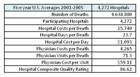
No one would complain about Mayo whose Medicare composite quality score ranks among the highest in the nation.  Key to Mayo’s success has less to do with pricing than with utilization.  Length of hospital stays and physician visits are significantly less than average, yet they handle some of the toughest cases in medical care. It is also noted that health care delivery in other countries is closer to the Mayo model than the more typical fee for service provider.

DISCUSSION

What senior would object to having medical coverage by the Mayo Clinic?  The Mayo Foundation manages 20 hospitals in its network, and has a world-wide reputation as a very high quality institution handling the toughest cases.  Less well-known, is that they provide this coverage at below average costs. For Medicare reimbursements within 2 years of death, Mayo costs average $28,000 per patient.  

This sounds expensive, and it is.  However, the national average to cover the last 2 years costs was just over $30,000.  Multiply that by 930,000 average (2001-2005) annual Medicare deaths and Medicare costs for just this segment are about $28 Billion per year.  This is some serious money.  The first question is where is it going?

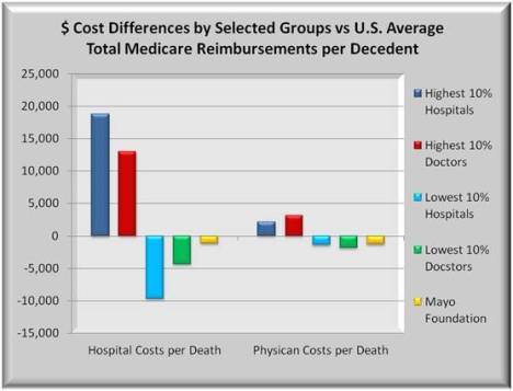
The following graph consists of two groups of bars. On the left are hospital cost differences from U.S. average for the highest and lowest 10% of hospitals, and the highest and lowest 10% of physicians. The 5th bar in each is Mayo. The bars at right are the same except they show physician cost differences from average.

The highest 10% of hospitals incur nearly $19,000 more hospital costs compared to the U.S. average while the lowest 10% of hospitals incur almost $9,000 less than the average, a high/low difference of $28,000. Physician cost differences are similar, but the magnitude in dollars is smaller.

Costs become even more serious when one considers quality scores.  Hospitals whose costs are in the top 10% of all hospitals had lower average quality scores.  Yet, their costs were more than $50,000 per patient.  Similar results occur for hospitals sorted by Physician costs.  In all cases, higher cost providers had lower average quality scores than lower cost providers.  In short, more may not mean better as shown below


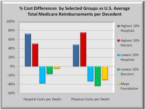
So how do providers like Mayo Foundation and other similar quality hospital and physician systems attain such high quality scores while holding the line on costs?  It may help to first show these costs as percent differences between the highest and lowest cost providers. The graph below uses the same data from the 1st graph but presents cost differences as a percent.

Those hospitals and physicians whose costs are in the highest 10% are nearly 75% above average, while those with lowest costs are more than 30% below average.  Mayo’s hospital costs are slightly below average but its physician costs are significantly lower.

Seniors are worried that proposed reforms and reductions in Medicare spending will reduce benefits.  A greater worry should be why there are such large reimbursement disparities now between providers.  Either some are being over-served or others are being under-served. Neither should be acceptable.

Medicare recipients might rightly ask, since all people pay into Medicare at about the same rate, why isn’t the payout more evenly distributed between high and low cost providers.  The difference between the highest and lowest hospitals and physicians almost equals the average cost of $30,000 per patient. Despite the huge cost differences, the result is the same.  The patient died.

Just as showing percents is more meaningful than dollars, the above cost differences can be further broken down into two components. One component is price and the other is volume or utilization.

Remember when gas prices were over $4.00 per gallon? People cut back on driving so their gasoline consumption (volume) went down. Fewer miles driven helped people offset some of the high price per gallon. A similar outcome occurs in healthcare. 

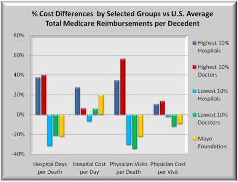
Hospital costs are affected by the cost per day (price) times how many days a patient stayed (volume or utilization).  For physicians, the analogy is the cost per physician patient visit (price) times the number of visits by the physician (volume).  Volume times price equals total cost, and “all in” costs equal total hospital costs plus total physician costs. The graph below shows the four components of price and volume.

Hospital Volume (utilization – length of stay)

The first group of  bars shows differences in hospital days.  Patient stays at the most expensive hospitals were nearly 40% more than average while those at the least expensive hospitals were some 20% less than average. From a utilization view, there is a significant difference in hospital (days) at higher cost hospitals. Higher cost hospitals tend to be larger, more complex and more intensive.  Yet, Mayo hospital days are comparable to the lowest cost hospitals.

Hospital Price (average daily cost)

The second group of bars shows differences in Hospital cost per day, or pricing.  Here both high cost hospitals and Mayo are more than 20% above average reflecting the sophisticated and expensive equipment and procedures performed.  In hospitals where physician costs are high or low, hospital pricing tends closer to the national average.  But Mayo more than not offsets their higher daily hospital costs with shorter length of stays.  The higher cost hospitals compound higher prices with more lengthy stays for a total hospital cost 75% higher than average.

Physician Volume (visits) and Price (cost per visit)

The remaining two groups show differences for physician volume and price.  Visits at high cost hospitals deviate even more from average than length of stays.  Physician visits at low cost hospitals mirror shorter hospital stays.  Physician costs per visit do not vary nearly as much as do hospital costs.

With regard to Mayo, utilization is also below average (fewer visits), but here physician pricing (cost per visit) is also below average.  Combining fewer patient visits AND lower costs per visit, yields a cost difference 30% below average for Mayo.

Medicare Reductions Need not Lower Benefits

What conclusions to draw?  Some legitimate cost differences should be expected.  But data suggests that if the high cost hospitals changed some of the care delivery nearer to Mayo’s performance, significant savings could occur with NO loss in benefits.  The graph below shows the potential savings if these higher cost hospitals had the same price and utilization structure as Mayo.  If the cost structure of the top 50% of all hospitals were the same as Mayo, annual savings would be nearly $4 Billion.

But there is more.  The savings described apply only to the Medicare costs associated with the last 2 years of patient life.  Those costs were noted at some $28 Billion per year.  However, Medicare annually reimbursed over $400 Billion in total. If total savings were comparable to the last two years of life costs, the savings could be 15 times larger than in the above graph. 

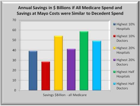
The graph below shows a 15X multiplier effect with annual savings for 6 groups of hospitals: the highest 10%, 20% and 50% of hospitals filtered on total hospital costs.  Plus a similar 10%, 20% and 50% of hospitals filtered on total physician costs.  Significant in this graph is that the differences between the highest cost and the more average cost hospitals are fairly extreme.  If one were to focus reform efforts on just these extremes, Billions could be saved.

The graph shows total theoretical savings. A more reasonable assumption would be to halve the theoretical savings. Thus, if the highest cost 20% of hospitals were to cut in half the differences in cost and utilization between them and the distinguished Mayo Foundation, and if all Medicare cost savings were proportional to Medicare cost savings of the last two years of life, then the annual savings could potentially reach $26 Billion. Over ten years and without cutting benefits, Medicare costs could be reduced by $260 Billion.  Actually achieving this level of savings would be a challenge. But Billions of dollars in waste, fraud and abuse could be safely removed without affecting real benefits. 

Why will those levels of savings not likely occur?  It would require hospitals, physicians and insurers to change their “business model” to achieve significant savings and that is a very broad challenge.  There needs to be a major shift from the “fee for service” model where every procedure, item and encounter are tracked and billed, to a more managed care model.

Insurers are familiar with managed care in the form of HMO policies. In HMO’s, the risk is on the insurer that premiums that are fixed per enrollee are sufficient to cover the health care costs of enrollees.  Some insurers are also providers so they would carry the insurance risk as well as the provider risk.

For health care providers, the risk of managed care is similar. For any specific encounter, like an appendectomy, the provider is paid a fixed amount from the insurer, and the hospitals and physicians are responsible for dividing up the payment and are at risk to deliver quality patient care for that amount.

While much focus has been on insurance reform to make it available to more people, attention must also be paid to wringing waste and abuse out of the system. Some of the currently proposed Medicare reforms include pilot programs to gradually shift the heavily “fee for service” orientation towards manage care.  In fact, of the 1,000 pages in House bill 3200, half are devoted to reducing waste in Medicare and Medicaid and pushing towards less skewed reimbursements than exists in the current environment.

Notes

Sources

Dartmouth 2005 Atlas of Health Care    DAP_Hosp_HRR_ST_01_05.xls

Table 1. Hospital information (2001-05) – Number of deaths among chronically ill patients assigned to hospital

Table 2. Medicare spending per decedent by site of care during the last two years of life (deaths occurring 2001-05)   (HOSPITAL)

Table 3. Medicare Part B spending by type of service (BETOS category) per decedent during the last two years of life (deaths occurring 2001-05)  (PHYSICIAN)

Table 4. The Medical Care Cost Equation: Disaggregation of hospital (facility) reimbursements per decedent into contributions of volume (patient days per decedent) and price (average reimbursements per day in hospital) during the last two years of life (deaths occurring 2001-05)

Table 5. The Medical Care Cost Equation: Disaggregation of payments for physician visits per decedent into contributions of volume (physician visits per decedent) and price (average payments per physician visit) during the last two years of life (deaths occurring 2001-05)

Table 6. Resource inputs per 1,000 decedents during the last two years of life (deaths occurring 2001-05)

Table 8. CMS Hospital Compare technical process quality measures (all patients, 2005)   (QUALITY COMPOSITE SCORE)

Centers for Disease Control:  Table 128. Personal health care expenditures, by source of funds and type of expenditure:  United States, selected years 1960-2006

Download PDF Report >>> Medicare Waste

Medicare Trends

Download PDF Report >>> Medicare Trends

SUMMARY

Medicare became law only in 1965 in part to mitigate the adverse effect of rising health care costs on seniors’ income. Those costs were driving many millions of seniors below the poverty line. In the pre Medicare environment, nearly 30% of seniors had fallen below the poverty level. In the intervening years, the percent of seniors with income below poverty level has dropped nearly three times.

While the benefits to seniors have dramatically improved their lot, the cost to society is the elephant in the room that needs to be addressed in Congress.  This report looks at the components that are driving up Medicare costs as well as increasing seniors’ out-of-pocket expenses.

 Overall population is increasing demands for care

As expected, growing populations result in growing health care costs. What is evident from the graph below is that in addition to overall growth, the percent of people 65 years and old is increasing.

Two factors are contributing. One is that the baby boomers as a group are beginning to move into the senior group. They are followed by a drop off (percent wise), in younger people.  Projections refer to the increasing mix of older people with fewer people working to pay into Medicare. But this trend is not permanent, and once the baby boomer “bubble” works its way through the population, the mix of retirees to workers stabilizes.  But that is out past the year 2040, beyond the range of most forecasts.

In short, solve the Medicare problem expected for the next 30 years and only minor changes will likely be needed after that.

Source: Center for Disease Control – Health, United States 2008 Figure 01

Greater life expectancy adds to aging population

The second factor contributing to the growth of seniors is their increasing life expectancy.  The graph below  shows that all major groups of seniors have benefited from better health care. Life expectancy at birth show lower increases.

The question is whether these significant increases will continue into the future.  If they continue, then the percent of seniors will continue to increase.  If trends tend to slow, then the population age mix may stabilize.

On the other end of the age scale, if birth rates rise, this will create a greater percentage of younger people.  And there is some evidence of this occurring, though not equally among different races. 

Source: Center for Disease Control – Health, United States 2008 Figure 14 

It may be 30 years before age group % stabilizes

On the assumption that the mix of aged people stabilizes in the 2040-2050 range, this still represents a significant change from today where less than 15% of population is 65 and over.  By the time it stabilizes, seniors will represent over 20% of population and may for some time to come beyond that.

Current Medicare premiums assessed on workers is not enough to cover those future costs. Two events clearly need to happen. One is to increase the “premiums” paid into the system.  Options include raising all rates uniformly or raising the wage ceiling on which premiums are based. The other is to take costs out of Medicare.

Another analysis has shown huge discrepancies being paid in Medicare indicating excess care being provided to some and not others that needs to be addressed.

Source: Center for Disease Control – Health, United States 2008 Figure 01

As people get older, their health demands increase

It is common knowledge that seniors slow down as they age.  The graph below shows the five most common reasons seniors reduce their activity level.  As they age, each factor grows in significance.

 Nearly 3 in 10 seniors over 85 will become limited by arthritis or musculoskeletal conditions.  2 in 10 seniors over 85 will be limited by heart or circulatory conditions.  Though climbing with age, vision, hearing and senility are factors in less than 1 in 10 seniors 85 and older.

While the graph shows the number of medical conditions increasing with aging, it does not indicate severity.  But on volume alone, seniors require more health care. This can be mitigated somewhat by more exercise and healthier diets, the two largest slowdown factors. Less can be done about vision, hearing, senility or dementia.

Source: Center for Disease Control – Health, United States 2008 Figure 13 

Medicare a major factor in improving poverty levels

Medicare came law only in 1965 in part to mitigate the adverse effect of rising health care costs on seniors’ income. Those costs were driving many millions of seniors below the poverty line. The success of Medicare was dramatic as shown in the graph below. With pre Medicare environment, nearly 30% of seniors had family income below the poverty level. In the short span of 7 years, the percent of seniors with family income below poverty level dropped to 15%, roughly in half. Gradual reductions since have lowered that threshold to about 10%.  This could partially explain why older seniors are often very protective of their benefits. They remember when there was no safety net.

Source: Center for Disease Control – Health, United States 2008 Figure 04 

 Price inflation creates higher bills for seniors

The graph below highlights cost trends for four groups of people from 1996 to 1996. Except for a slight break around, 1998 – 2000, costs have trended upward every year for every age group. Within each age group there is another consistent trend. Seniors 65-74 years incur only about half the expense that seniors 85 and over do, while those 75-84 years incur more than half again as much as seniors 65-74. This confirms the comments above that as people age, their health demands increase.

Now these data are per enrollee. So price inflation is causing costs for all seniors to rise. As seniors age, their costs continue to rise. And finally, as the baby boomer bubble moves into the senior ranks, the total number of seniors increases dramatically. It is sort of a “perfect storm” where all factors are pointing towards Medicare costs consuming more and more of the nation’s economic output.

Source: Center for Disease Control – Health, United States 2008 Table 143 

Cost sharing of Medical Expense Also Rising

In nearly all cases where medical expense is incurred, insurance picks up a large share of the costs, but not all. Amounts paid by individuals is called “cost sharing” or deductibles and co-payments, or out-of-pocket expense. Below are 6 age groups that incurred over $2,000 in out-of-pocket expense. This threshold allows a focus on the more expensive medical encounters. Cost sharing for all seniors has consistently risen over the entire period.  Any solutions to rising Medicare costs that reduce benefits, shifting more costs to seniors should at least take into account that seniors have for years, been paying higher out-of-pocket costs for health care. 

Source: Center for Disease Control – Health, United States 2008 Table 133

 One Good Example of Government Run Medicare

While overall Medicare costs have continued to rise, there is one component that is trending favorable – Administrative Expense. Early on, there were inefficiencies in Medicare part B as these tended to be smaller dollar claims but the same amount of manual effort to record claims into the system.  As automation and standardization increased, these costs came down such that since 2000, the administrative costs per claim dollar for both hospitals and doctors are roughly equal.

What is far mor telling is that since 2000, these administrative costs have (a) stayed level and (b) averaged just two (2%) of total costs.  In the 1980’s private insurers, primarily non-profit, had administrative costs of about 5%. Today, insurers are frequently incurring administrative costs of more than 20% on large blocks of their businesses.  In at least one area, government appears to have done better.

Source: Center for Disease Control – Health, United States 2008 Table 142

Download PDF Report >>> Medicare Trends

. 

Medical Loss Ratio

Download PDF Report >>> Medical Loss Ratio

Medical Loss Ratio or MLR is a ratio used to measure what percent of Premium revenue for health insurance is paid out in medical claims.  The remainder of premium is used to cover selling, general and administrative (SG&A) expenses as well as operating margin or profit.

In the early 1990’s, the average MLR was over 90% and in 1992-1993 the MLR approached 95%.  Though that may have been a high water mark for MLR, it was not unusual for MLRs in the 1980’s and earlier to be above 90%.  Health insurance companies ran the business with leaner overhead than is seen in more current times.

Wall Street frequently uses the Medical Loss Ratio measure to determine profitability for health Insurers.  For Wall Street, a lower MLR is considered good as it indicates that the insurer has control over its medical claims.  Higher MLR’s may
suggest that the insurer either has a bad book of business or is not so well managed, either or both which could adversely affect profitability.

MLR’s dropped fairly rapidly in the 1990’s and continued a more gradual decline to the low 80% levels in recent years.

Health care reformers have focused on increasing MLR’s as a way to control health care costs. Since MLR by definition is a ratio of two numbers, one can increase the MLR by either reducing premium revenue, or by paying more claims from the same revenue.  Since no one arbitrarily pays claims, forcing an increase in the MLR should put downward pressure on premiums. In that case, what expenses need to be cut.

For them to focus on reducing claims does them little good as lowering claims does nothing to increase the MLR.  For insurers to retain some measure of profitability, they have to look at cutting their general and administrative expenses.

Medical Loss Ratio declining over time

The graph below shows MLR trends from 1992 to 2007.  In the early 1990’s, the average MLR was over 90% and in 1992-1993 the MLR approached 95%.  Though that may have been a high water mark for MLR, it was not unusual for MLRs before 1990 to be above 90%.  Then again, as one goes back in time, more health insurers were non-profit than there are now.  These companies ran the business with leaner overhead than is seen in more current times.

A critical question for health care reform is how fast and how far can these trends be reversed so that more of the premium dollar goes to medical claims instead of overhead expenses and profits.

 Source: Price Waterhouse Coopers Medical Loss Ratio Annual

 MLR includes multiple variables to control

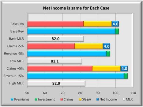
The graph below shows three cases, each with three bars.  The base case is typical of today, the second assumes lower claims, and the third assumes higher claims. 

 The first bar in each case represents claims, SG&A expense  and profit margin. The second bar represents premiums and a small investment income (green). By definition, profit plus expenses must equal revenue so those two bars are always equal length.  The third bar of each case is the MLR. 

In the second case, claims are lower. But unless premiums are reduced, the MLR will go down. Further the premium reduction will eat into profits to maintain the MLR. If claims rise as in the third case, and if the market will bear, higher premiums will generate added profits without incurring a reduction in MLR.

Effect on MLR if profits & expenses held constant

The graph below shows the same three case format as the prior graph. The base case is the same as above.  In the second case, however, both claims and premiums are reduced by 5%.  It also assumes no change in profit or expense.  In an environment of falling costs and claims, the MLR will decline by nearly one %.

But the health care prices have been in an ever increasing trend.  If overhead and profits are held constant, a 5% increase in both claims and premiums will raise the MLR by almost 1%.  But as was shown above, the MLR continues to decline. Unless there is competitive downward pressure on premiums, the profits will tend to rise and MLR’s decline.

A key unanswered question is whether there exists enough competition to drive prices down or at least keep them from rising faster than general inflation. 

Raise the minimum MLR as a step to Cost Control

California is one state that is considering raising the MLR to a minimum of 85%, and increase from about 82%.  The graph below shows two ways this can occur. 

The first is to hold premiums constant as claims rise to 85%.  This will result in significantly lower profits unless overhead is sharply reduced, from around 16% to 13%.

The second method is to reduce premiums to more quickly reach 85% MLR with no changes in claims. If insurers want to maintain current levels of profits, this method will require even steeper cuts in overhead expenses than in the prior case.  Insurers can be expected to resist these moves.

Still, one does not have to go back that many years to find total overhead and profit to be less than 10%.


Sensitivity in MLR to changes in overhead and profit

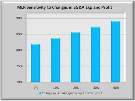
The graph below shows 5 bars representing decreasing levels of overhead and profit and their effect on MLR.  Or conversely, how much do overhead and profit need to be reduced to reach higher MLR levels.

For insurers to reach an 85% MLR without increasing premiums, they will need to reduce overhead and profits by some 20%. An 88% minimum MLR would require reductions of 33%.  Health care reform should allow for significant cuts in general and administrative expenses. With insurance exchanges, selling expenses may be reduced. But it is hard to imagine the levels of cuts needed to help bring about cost control without some reduction in profits as well.

If this nation is serious about reform, it is optimistic to think that insurers’ profits will remain relatively unaffected by these changes. But the high tech industry had a nice ride to new highs, before it was brought back to reasonable levels.

Download PDF Report >>> Medical Loss Ratio

Selected Industries Financial Ratios

Download PDF Report >>> Selected Financial Ratios

A publication in its 40th year titled Almanac of Business and Industrial Financial Ratios tracks 50 operating and financial factors in nearly 200 industries. 4 measures for 8 industries are highlighted in the graphs below. They reflect tax return data (IRS Form 1120) through June of 2006.  In addition, selected 2007 financial data from the nation’s Top 10 for-profit health insurers came from their SEC 10K reports.  The Almanac industries include tax returns for the following:

Industry Tax Returns Revenues
Hospitals , Nursing Care 10,498 $76.0B
Outpatient  Care Centers 4,453 $24.8B
Engineering 60,986 $133B
Computer Systems  Design 62,135 $117.8B
Management Consulting 134,243 $138.7B
Commercial Banking 30,534 $55.4B
Credit Card Issuers 46,735 $28.7B
Investment Banking 5,402 $29.4B

The Top 10 health insurers had revenues of $242.5B. When comparing net income as a % of sales, these insurers ranked lower than other industries as shown in the first two graphs below.  The top 10 are in red below.

The Top 10 pay a higher % in taxes so their before tax ratio is slightly better (upper left graph) than after tax ratio (upper right graph.)  But is % of sales a proper comparison across industries?  Higher revenue industries all tend to have lower Income as a % of sales than do lower revenue industries.

Rather than dividing net income by sales, one can divide net income by equity.  Equity is how much shareholders’ money is invested in the business.  It takes into account loans.  And it puts firms of different size on a more equal footing.

Return on equity or ROE is a recognized way for comparing companies in different industries.  The two lowest graphs show average ROE for the Top 10 compared to 8 industries. Though not the highest before/after tax, Top 10 returns exceed hospitals, outpatient care centers, computer systems design, credit card issuers and investment bankers.  Returns trail highly profitable, engineering, management consulting, commercial banking, and physicians and lawyers (not shown).

In summary, health insurers are fairly profitable enterprises as currently structured.  But some ask whether at least part of that profitability is derived from questionable denials of claims made by their subscribers.

Download PDF Report >>> Selected Financial Ratios

Nixon’s Comprehensive Health Insurance Program

Download PDF Report >>> Nixon Comprehensive Health Plan

Below  is a reformatted version of President Nixon’s Message to Congress on a Comprehensive health Insurance Plan delivered on February 6, 1974.  What is striking is how many similarities there are between it and the Affordability Care Act (ACA). There are, however,  a few key differences between Nixon’s plan and the ACA plan.

  1. In Nixon’s plan, health insurance is mandatory for business to insure full-time employees and optional for individuals. In ACA plan, health insurance is not mandatory for business’ employees but is  mandatory for individuals.
  2. In Nixon’s plan, failure on the part of States to enact the necessary authorities would prevent them from receiving ANY Federal support of their State-administered health assistance plan that includes (current) Medicaid. The ACA plan manages insurance exchange but leaves Medicaid payments to states intact.

A serious problem with the first item is that companies would attempt to minimize full-time employees in order to avoid the mandate. Even without a mandate, employers are currently following this pattern and leaving part-time employees without a safety net. In the second item, the penalty on states for non-compliance is far stricter under the Nixon plan than under ACA. In other words, more power to the federal government and less to the states under Nixon than under ACA.

Democrats at the time opposed this plan and it never became law.

COMPREHENSIVE HEALTH INSURANCE PROGRAM

  1. It offers every American an opportunity to obtain balanced, comprehensive of health insurance benefits.
  2. It will cost no American more than he can afford to pay;
  3. It builds on the strength and diversity of our existing public and private systems of health financing and harmonizes them into an overall system.
  4. It uses public funds only where needed.
  5. It would maintain freedom of choice by patients and ensure that doctors work for their patient, not for the Federal Government.
  6. It encourages more effective use of our health care resources.
  7. It is organized so that all parties would have a direct stake in making the system work–consumer, provider, insurer, State governments and the Federal Government.

THREE PLANS TO OFFER BROAD AND BALANCED PROTECTION FOR ALL AMERICANS

  1. Employee Health Insurance, covering most Americans and offered at their place of employment
  2. Improved Medicare Plan, covering those 65 and over and offered through a Medicare system that is modified to include additional, needed benefits.
  3. Assisted Health Insurance, covering low-income persons, and persons who would be ineligible for the other two programs, with Federal and State government paying those costs beyond the means of the individual who is insured
  • One of these three plans would be available to every American, but for everyone, participation in the program would be voluntary.
  • The benefits offered by the three plans would be identical for all Americans, regardless of age or income. Benefits would be provided for:
    • hospital care
    • physicians’ care in and out of the hospital
    • prescription and life-saving drugs
    • laboratory tests and X-rays
    • medical devices
    • ambulance services
  • There would be no exclusions of coverage based on the nature of the illness.
  • In addition, it would cover treatment for mental illness, alcoholism and drug addiction
  • Certain nursing home services and other convalescent services would also be covered.
  • Home health services would be covered
  • The health needs of children would come in for special attention,
    • preventive care up to age six
    • eye examinations
    • hearing examinations
    • regular dental care up to age 13
  • A doctor’s decisions could be based on the health needs of his patients, not on insurance coverage.
  • Every American participating in the program would be insured for catastrophic illnesses
  • No family would have annual out-of-pocket costs for covered health services in excess of a cap
  • Low-income families would face substantially smaller expenses.
  • A Health-card, similar to a credit card, would be honored by hospitals, nursing homes, emergency rooms, doctors, and clinics across the country.
  • This card could also be used to identify information on blood type and .sensitivity to particular drugs-info which might be important in an emergency.
  • Bills for the services paid for with the Health-card would be sent to the insurance carrier who would reimburse the provider of the care for covered services, then bill the patient for his share, if any.

HOW EMPLOYEE HEALTH INSURANCE WOULD WORK

  • Every employer would be required to offer all full-time employees the Comprehensive Health Insurance Plan.
  • Added benefits may be included by mutual agreement.
  • The insurance plan would be jointly financed, with employers paying 65 % of the premium for the first three years of the plan, and 75 % thereafter.
  • Employees would pay the balance of the premiums.
  • Temporary Federal subsidies would be used to ease the initial burden on employers who face significant cost increases.
  • Individuals covered by the plan would pay a deductible. A separate deductible provision would apply for out-patient drugs. There would be a maximum of three medical deductibles per family.
  • After satisfying the deductible limit, an enrollee would then pay for 25 percent of additional bills
  • There would be an annual max out-of-pocket cost on family’s medical expenses for covered services.
  • As an interim measure, the Medicaid program would be continued to meet certain needs, primarily long-term institutional care.

IMPROVING MEDICARE

  • Medicare’s benefits would be improved so that Medicare would provide the same benefits offered to other Americans under Employee Health Insurance and Assisted Health Insurance.
  • Persons 65 or over, eligible to receive Medicare payments, would pay a lower deductible and a lower separate deductible for out-patient drugs.
  • He or she would also pay 20 percent of any bills above the deductible limit.
  • There would be an annual max out-of-pocket cost any Medicare beneficiary have to pay
  • The premiums and cost sharing for those with low incomes would be reduced, with public funds making up the difference.
  • Those now in the Medicare for the disabled plan would be eligible for Assisted Health Insurance, which would provide better coverage for those with high medical costs and low incomes.

HOW ASSISTED HEALTH INSURANCE WOULD WORK

Assisted Health Insurance is designed to cover everyone not offered coverage under Employee Health Insurance or Medicare, including

  • The unemployed,
  • The disabled,
  • The self-employed,
  • Those with low incomes
  • Persons with higher incomes if they cannot get coverage at reasonable rates including persons whose health status or type of work puts them in high-risk insurance categories.
    • A principal feature of Assisted Health Insurance is that it relates premiums and out-of-pocket expenses to the income of the person or family enrolled
    • Working families with very low incomes, would pay no premiums at all
    • Deductibles, co-insurance, and maximum liability would all be pegged to income levels.
    • Assisted Health Insurance would replace State-run Medicaid for most services.
    • Preempt State mandates, this plan would establish uniform benefit and eligibility standards for all low-income persons.
    • It would also eliminate artificial barriers to enrollment or access to health care.

MAKING THE HEALTH CARE SYSTEM WORK BETTER

To contain medical costs effectively over the long-haul, however, basic reforms in the financing and delivery of care are also needed.

PROFESSIONAL STANDARDS REVIEW ORGANIZATIONS (PSRO’s) would

  • place health services under the review of Professional Standards Review Organizations.
  • These PSRO’s would be charged with maintaining high standards of care and reducing needless hospitalization.
  • Operated ‘by groups of private physicians, professional review organizations can do much to ensure quality care while helping to bring about significant savings in health costs.

STATES would

  • Approve specific plans,
  • Oversee rates,
  • Ensure adequate disclosure,
  • Require an annual physical
  • Assure fair reimbursement for physician services, drugs and institutional services, including a prospective reimbursement system for hospitals.
  • Only with effective cost control measures can States ensure that the citizens receive the increased health care they need and at rates they can afford.
  • Failure on the part of States to enact the necessary authorities would prevent them from receiving any Federal support of their State-administered health assistance plan.

Republican President RICHARD NIXON

The White House, February 6, 1974.

Download PDF Report >>> Nixon Comprehensive Health Plan

Source: Complete speech at Kaiser Health News:  http://www.kaiserhealthnews.org/Stories/2009/September/03/nixon-proposal.aspx


Who Should Help Pay for Healthcare Reform

Download PDF Report >>> Who pays for healthcare reform

 Summary

Health care is expensive and is getting more so.  Further, the government is taking on a greater share as people age and move into the Medicare system.  Attempts that tweak the current system will likely fail to lower costs.  What is needed is a new model that would be phased in.

While the US does enjoy a quality system, it is not the top in comparison to many other industrialized countries.  However, the US does pay 50% or more of its GDP than do these same countries. And with its transaction based model, future cost increases will squeeze our productive sector.

Looking at several other countries, there is a clear difference in the health payment model.  In the U.S. the model has been relatively unchanged over decades.

One goes to a doctor or hospital, is billed for the encounter and the bill is paid by him, a health insurer or both.  It matters less whether the treatment resolved the health issue.

Other countries rely more on outcomes, where “bonus” payments are made to providers who solve the health issue.  Of course, it is risky to completely switch to this method overnight.  Rather it should be phased in over years.

Short term, however, increased costs are expected. And the fairest way to pay is to tax those who benefited more in the past.  Those who did benefit are a small group – the top 5%.

Some will argue that taxing the wealthy will cost jobs. But jobs are created not from income but from net worth, and gains there suggest that other factors weigh more heavily than marginal tax rates in job loss or creation.

Who is paying for healthcare today in the U.S.

The graph below shows 2006 funding of healthcare. With the aging of the population, Medicare creates increased government spending. Close to half of all health care is paid for by government.  For those worried about government getting involved, they are a little late. It’s already involved.

Private insurance is a major funds source, and most of that is provided through employers. Consumers with insurance through work see only out-of-pocket expenses. Even with costs rising, and with insured seeing higher cost sharing, they are still somewhat shielded from total health costs.

Conversely, those without insurance are exposed to the full brunt of higher health care costs.  Combining all people, the costs are not only a heavy burden, but that burden falls heavily on those who lose and do not have insurance.

Source: Center for Disease Control – Health, United States 2008 Figure 19

 What are others paying for healthcare today 

Some believe that the US costs are worth it.  We have high quality care and we pay for it.  But while quality is high, it is by no means the highest in the world.  And as the graph on the right shows, the US stands alone in how much it spends – some 50% more than other highest countries and almost doubles that of Japan.  These other countries must be doing something different and they are.

One factor is the payment business model. The US is primarily a transaction based system.  Higher rates, more revenue. More procedures, more revenues. The combined effect is healthcare costs that are not only more expensive, but rising faster than in the rest of the world.

As for tomorrow, we can learn by looking at components of growth in US health care spend, and how those trends portend future expenditures.

Source: OECD Health Data 2009, June 09

What healthcare increases may look like tomorrow

Aside from any current inequities in who pays for health care, these expenditures are not only rising but at an ever-increasing rate. The graph below shows the growth in costs from 1965. The spike in 1965-1970 was Medicare.

Population and general inflation are reasonably expected factors.  In addition, however, there is medical (price) inflation and intensity (more procedures) driving up costs.

Unless there is a major change in these trends, healthcare costs will consume an ever greater portion of GDP, and squeeze out productive output.

To bring this under control requires more than tweaking around the edges of the current healthcare model.  Other countries spend less on healthcare so how do other countries cover costs for less.

Source: Center for Disease Control – Health, United States 2008 Table 126

U.S. insurers & Medicare are very Transaction based

For decades, the U.S. has had a primarily transaction based model like figure 1 below.  You get treatment from a physician or hospital and pay for their time and expenses.

When Medicare began, it used this traditional model but quickly learned that costs were rising out of control. So they changed to a fixed price model like figure 2 below. But when Medicare squeezed down prices, some providers increased their volume to recoup part of their losses.

Managed care or HMO’s (not shown) had limited success in freezing total payments. But healthier groups can often select traditional coverage at lower cost, leaving HMO’s with more of the higher cost people. In short, reform with only a transaction based model will not likely succeed.


Other countries are more Outcomes based

What other countries did was adopt normal profit-making business models like figure 3 below where the goal is to offer rewards for greater productivity and improved quality, in a word — outcomes. 

It is the basis for most bonuses.  Also many contracts are include a bonus if a project comes in under budget and ahead of time. Healthcare payments in other countries rely far more on outcomes than the does the U.S. And it works.

Medicare is piloting this concept, paying small bonuses to providers who show better outcomes. As data is obtained, base amounts can be reduced and the outcome gradually increased bringing the U.S. closer to the world model.

Will private insurers adopt this model? Unless all insurers are required to do so, it is doubtful.  Alternately, a public option using this model would cause private insurers to voluntarily adopt as a way to remain competitive.

Can the U.S. afford more income taxes

Other industrialized countries are clearly providing quality health care at significantly lower costs than in the U.S.  But what about other taxes or more specifically, total taxes.

How does the U.S. compare in total taxes with these other countries?  The graph below shows tax components. Despite complaints about corporate rates, U.S. take is lower than most countries. Sales taxes are high but discretionary (no buy, no tax) as states rely heavily on this source.

Social Security and income taxes are two mandatory taxes affecting individuals and here the U.S. ranks near the bottom.  Without becoming just like Europe, some increase in mandatory taxes should let the U.S. remain competitive with the rest of the world.  And if real reform does come, higher initial costs can be expected to result in savings down the road as the U.S. costs approach other countries.

Source OECD in Figures 2008 – OECD © 2008 – ISBN 9789264055636

Looking at income tax as a source of new funds

Where does one look for new taxes. While there are several options, one key is to see who is earning what today.  The graph below displays the average after tax income for selected percentile groups.  The small blip at the furthest left is the average income of 60% of the U.S. Those in the 61% to 95% range average somewhat better.  Also noted is the greater number of households in these groups’ results in their paying the majority of income taxes.

But look at the highest 5% earners, and especially the top 1%.  That 1% averages over $1 million per household.  So if there is a tax increase, should all taxpayers contribute the same percent increase?  Or should increases be progressive as is the basic income tax structure.

One way to answer this is to see how income for these same households changed over time.

Source: Congressional Budget Office-Historical Effective Federal Tax Rates: 1979 -2005

Who benefited from income gains over 25 years

The graph below employs the same groups as above.  For several reasons, there has been a substantial income shift with enormous increases in income for the top 1%, with modest increase for the 95%-99% group.  ALL the rest of the percentile groups actually lost ground, and the lower the income bracket, the greater the loss.

Over the past 28 years, there has been a very sharp drop in marginal tax rates leading to two results.  First, high income earners keep more of their income.  But with high marginal rates, companies did not pay extremely high salaries and bonuses as most of it went towards taxes.  With lower marginal rates, executive compensation began an upward spiral that far exceeds their counterparts in other countries.

The combined effect of near runaway compensation and lower taxes is primarily responsible for the shift to the rich.

Source: Congressional Budget Office-Historical Effective Federal Tax Rates: 1979 -2005

Why are so many people afraid of higher tax rates

Some note that total revenues rose when Kennedy cut taxes and apply that logic to every tax change since.  But as the graph below shows, the marginal rate at that time was 90%.  Had the IRS run amuck? Actually, the U.S. raised taxes to pay down war debts, a good habit missing today. 

From the prior graph, one could assume that a fair way to apply new taxes to individuals is to tax those who gained the most relative to others from tax cuts in the past.

Today we have low marginal rates, major gains by the very rich, and a national debt that has been almost ignored. Not to increase taxes but to add to the national debt is to put a heavier burden on the next generations.

In conclusion, a logical and fair place to look for new sources of tax revenue is the top 5% of households.

Source: IRS – SOI Tax Stats – Historical Table 23

Net worth – the job generating engine

Some complain that taxing the income of the rich will cause a loss of jobs.  But income is not the prime determinant in job creation.  To start a business, one in fact, may have to give up current income. 

Businesses are started by those with net worth.  And if they are lucky, they can leverage that net worth with loans to fund their new enterprise.

The graph below shows the growth in net worth from 1989 for four selected percentile groups.  As one would expect, those less well off tend to work for others and their net worth (lower 50%) makes barely a blip on the scale.

Even the net worth of the 50%-90% groups is modest.  The greatest concentration of accumulated wealth is in the top 10%. And that group not only grew more in absolute dollars, but also as a percent gain over prior periods.

Source: Federal Reserve Board, 2007 Survey of Consumer Finance (March 9, 2009)

New worth grew more when tax rates were higher

The graph below details the increase in net worth over the prior period.  The lower 50% experienced inconsistent gains up and down.  Higher groups fared better but all were impacted by recessions.  Of note is that the two 3-year periods ending in 1998 and 2001 occurred during Clinton’s term where he had actually raised marginal tax rates.

One should skip the recession period of 2004. By 2007, the tax cuts of Bush’s term resulted in net worth increases, but they were significantly less than those of the Clinton period.

Obviously, there are additional factors at play, but to simply argue that any increase in marginal rates, and especially raises in the top brackets will result in loss of jobs is a tenuous argument not supported by this data.

Source: Federal Reserve Board, 2007 Survey of Consumer Finance (March 9, 2009)


 Download PDF Report >>> Who pays for healthcare reform