


DISCUSSION – Household Income
GO TO DISCUSSION – Household Wealth
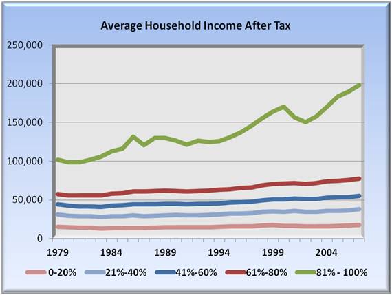
The focus above was on tax components. The graph below shows the net effect of all these factors on household income after tax. Income in the four lowest quintiles grew only gradually over the decades. For the top 20%, however, the increase has been dramatically higher incomes. But even this does not tell the whole story.

When one looks at only the top 20%, we see a further widening of the differences as shown in the following graph. The increase is not in the 80% – 90% bracket, not so much either in the 90% – 95% or the top 5% brackets, but is virtually ALL CONCENTRATED IN THE TOP 1%.
Some pundits have criticized those who speak of taxing the rich as starting a class war. This data suggest that a class war is already underway, has been for some decades now, and the super rich are clearly if quietly winning this war.

The long term effects of this shift to higher incomes can have a serious effect on the economy. People with higher income spend proportionally less of their income than lower income people, the balance going into savings or permanent wealth. The following graph highlights the share of income for income groups, from low at left to high at right. In 1979, 80% of households brought in nearly 60% of all income. By 2007, that had fallen to under 50%. Far and away the greatest increase in share of total income is the top 1%. The top 5% have over 30%, more than the lowest 60% combined.


I will really love for you for guests posting on healthreformtrends.com